GUI: Please improve Border-Visibility of Windows and Dialogs
-
Hello,
first of all thank you very much for the fantastic software and that users of version 1.2 got version 1.3 for free! I was really impressed when I installed the "Trial-Version" of 1.3 and realized, that this was "just another" update for free
 .
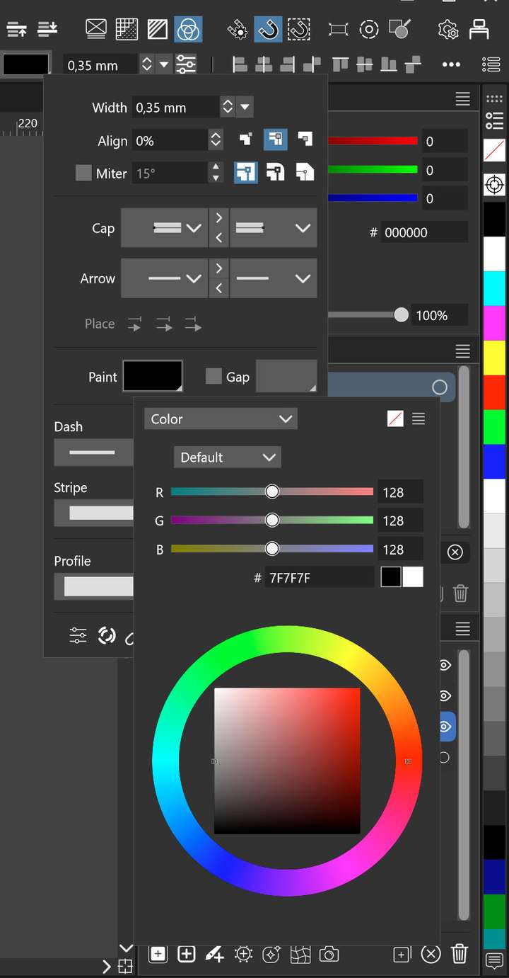
.But I have now one big request, that bothers me since long time: Please make the borders of windows and dialogs much clearer visible (at least for the windows version of VS). I am working on a hires-display (Surface Laptop Studio) and the window/dialog borders are that thin and subtle that I often interpret parts of the palettes of the rear GUI as parts of the currently open window or adjustment dialog.
I think it would help to give the windows a broader outiline with more contrast or at least some kind of shadow, so that one can see the overlap much clearer. Flat design may be very modern and it is no doubt very chic, but if it is too flat, it makes the software difficult to use.Thank you in advance and all the best!
P.S. Here is an example, where I find it difficult to distiguish which part belongs to wich layer of the GUI. And yes, there is a border around the windows, but on a hires screen it is very subtle - at least for people who needs glasses like me.
