update 1.1.044
-
@VectorStyler said in update 1.1.044:
@Ingolf The transform pivot option was moved to the context panel, next to the rotate knob option. The pivot can be shown / hidden using the button in the context panel.
The fix for the regression is uploaded.
Perfect! Thanks!
The X mark is a little big but otherwise perfect. So great to have the option handy, looking forward to the other options.
-
I face some issues with center rotate pivot.
What I did-- Create two rectangle side by side and select both.
- Move the center pivot somewhere and rotate.
- Now select one rectangle and try to place its pivot to the center of the rectangle.
The pivot doesn't stay at the center of the rectangle.
Mac Mini M4 Pro | 24Gb
WIndows 11 | Intel i5 11Gen
Wacom Intuos Pro -
It is possible to do it, but it would make it a little bit harder to locate some of the options.
On the other hand: the next version 1.2 has three additional options added next to those 2 new ones.
So lets see how it goes with that.Yes, but these extra icons don't take up much space. When looking at simplifying context panels, it's not the small icons that need to be reduced, as it's essential that they are quick to access, but rather where elements take up a bit too much. This applies to all context panels:

There is plenty of fat that can be cut away. Many middle spaces, padding in input boxes and stroke and fill color elements are way too wide.
Affinity got their options shaved down to:

And they wisely chose to group a lot of options in a very user-friendly way in a dropdown dialog - which is actually the stroke panel that can pop up/down exactly when you need it.
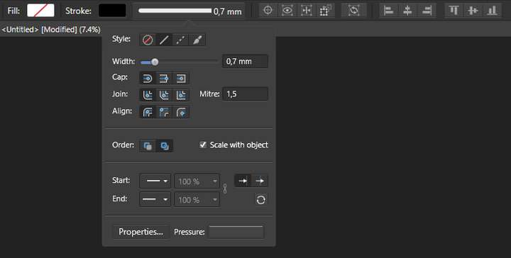
The clever thing about this approach is that no new logic and user interface is invented locally and there are no extra things to remember - "Here are 5 options stored in a menu, remember them?" The Stroke panel is known - it just pops up right there too. And then there's the potential for code reuse.
And this is where context panels can become extremely valuable, when you can actually work without (most anyway) floating panels in semi-full screen.
So the issue is UI wise not to hide new stuff because now the shelves are full, but rather to reorganize and rethink according to some elegant principles. And that's often more complicated than it sounds, so it needs to be given time.
“That's been one of my mantras—focus and simplicity. Simple can be harder than complex: You have to work hard to get your thinking clean to make it simple."
- Steve Jobbs
🍏 macOS Sequoia Apple Silicon
-
@Ingolf You speak often of wanting things to be "simple" like in Affinity's UI, but it appears from my view, that you are also asking for a lot of tools and options to be visible in the UI at nearly all times. I would think tucking things away is more a sign of simplicity than trying to have as many tools as possible filling the UI.
VS is well set up to keep only the most important things at easy reach and deeper options a step behind those. I think in some ways the criticism that VS UI is too busy or clunky Options like choosing whether to rotate with the corner or from a tab in the middle and whether or not the red dot is active or not are not tools frequently swapped and are less necessary to be directly visible at all times in the contextual menu. I don't mind them not being in preferences, but the average user is not going to need immediate access to them at all times either. I tried out the single tab rotate and decided to stick with the corner rotate years ago. There are rare occasions I would switch over. These are features I could see being given a back seat in terms of accessibility.
I do agree there is extra room in the UI that can be eventually consolidated to fit more options if need be.
I think it's also hard to know what needs to be in the contextual menu until @VectorStyler gets to the saved custom panel feature (no rush intended)
Part of the power of the panel arrangement saving and swapping is that it allows the user to set different arrangements of tools for use different different tasks and easily switch when done. So they can afford to have all the text related panels out when doing text work and then switch to common pen tool related panels, etc. This will give the user a lot of custom control over what is made available to do their work -
Yep… is there a reason why these two set-it-and-forget-it options need to be visible all the time? No, not the 'Affinity does it' reason.

As @Boldline said, you set the rotation method (from corners or the detached handle) in the Prefs and that's it.
And since the rotation pivot cannot be moved by mistake (please correct me if it can), I don't understand why is it disabled by default.
Making it disappear depending on the zoom level & object size is better (a la text greeking).Anyway, these two buttons take up valuable space, pushing other often used buttons out of 14" and 15" screens.
And I already need to scroll to get to the text justification buttons… as @Ingolf said, here and there distances between input field labels can be reduced a bit, and also between some dropdown menus in the context bar.
MacBook Pro (Intel) running Monterey 12.6.4
-
@b77 said in update 1.1.044:
And since the rotation pivot cannot be moved by mistake (please correct me if it can), I don't understand why is it disabled by default.
I have commonly grabbed the red rotation dot when what I wanted was the overall object many times - so the ability to toggle it is helpful to me, but I don't need that setting "always accessible" in the UI.
🍎 macOS Tahoe 26.2, Mac mini (M1, 2020), Chip Apple M1, Memory 16 GB
Cintiq 27QHD Display and LG Ultra HD Display -
I face some issues with center rotate pivot.
What I did-- Create two rectangle side by side and select both.
- Move the center pivot somewhere and rotate.
- Now select one rectangle and try to place its pivot to the center of the rectangle.
The pivot doesn't stay at the center of the rectangle.
@Jayanta-Das I tried to replicate your bug report but could not. Can you record a short video with the issue?
-
@Boldline said in update 1.1.044:
I have commonly grabbed the red rotation dot when what I wanted was the overall object many times - so the ability to toggle it is helpful to me, but I don't need that setting "always accessible" in the UI.
OK, but moving it accidentally usually happens when the object is too small or zoomed out, right?
MacBook Pro (Intel) running Monterey 12.6.4
-
@b77 said in update 1.1.044:
Yep… is there a reason why these two set-it-and-forget-it options need to be visible all the time? No, not the 'Affinity does it' reason.
I am not an Affinity fanboy - the reference to their solution is because I find it elegant, efficient and helpful. And don't find hiding options in preferences helpful (just LOOK at the amount of options there, no one will even find most of them because of this, and then the options have little value). A billion preferences in a huge bucket is more suitable for Linux applications. The context panels are there to offer options exactly when you need them.
In my case, the center point is certainly not a "set and forget" feature. It is hide until I need it - show - hide again. Can happen several times a day. The two other options @vectorstyler mentioned are in the same category. Toggles that are not hide and forget.
I do agree though that the rotation method is probably a UI preference.
I am not going to comment further on the subject. It's in @vectorstylers hands now.
🍏 macOS Sequoia Apple Silicon
-
@b77 said in update 1.1.044:
@Boldline said in update 1.1.044:
I have commonly grabbed the red rotation dot when what I wanted was the overall object many times - so the ability to toggle it is helpful to me, but I don't need that setting "always accessible" in the UI.
OK, but moving it accidentally usually happens when the object is too small or zoomed out, right?
correct, usually when it's small, but not always lol

still, it's not something that needs to be on the contextual menu at all in my humble opinion -
@Boldline and @Ingolf OK, all right, a way to toggle the rotation pivot might be needed all the time.
the reference to Affinity's solution is because I find it elegant, efficient and helpful.
The most elegant and efficient solution is the one where the app takes care of the problem automatically, based on object size and zoom level.
If the object looks small, you wouldn't move its pivot unless you zoom in anyway, so you can move it accurately, isn't it?
So you simply zoom in and the pivot shows up. Nice.You make the object very small, or you zoom out, and the pivot disappears.
That's it. Why would you want to click buttons for all that.

-
@VectorStyler Originally I mentioned this hide/unhide pivot point because it is visual noise for as long as I don't need it AND I activated it by accident too many times. Both when objects were small and not. But I use it occasionally. No algorithms can predict when I feel like rotating something with an adjusted pivot point. But I don't need to look at something when I don't plan to use it. I imagine those have been the arguments in Nottingham for their choice.
Now that I can hide it and enjoy my drawings with less visual noise I realized the pivot point and the blue point that marks the center of the object/selection are of course closely related. Apologies.

I suggest that when the pivot point is hidden in the context panel, the blue center point is hidden as well.
To mention Affinity again, they chose a simple solution where this pivot point simply appears when I drag my rotation point around. It makes sense, because what matters now is which pivot point is actually selected. And then there is less visual noise, and no doubt about which point the object is actually rotated around. But that's another matter that doesn't bother me so much. Just had to mention it:

It's possible not everyone understands it, but for some it's wonderful and an incredible help to focus on the design that all sorts of lines and circles and colors aren't visible on top of the graphics when it's not being used right at that moment!
And bingo - there you have the reason for all the praise Affinity has received for their easy-to-use applications, because they actually did a lot of things right - from the customers' point of view - when they designed the applications' basic functionality from scratch.
[ ]
-
@Ingolf A few versions ago the developer improved canvas panning so that when you press the spacebar, all the visual noise (bounding boxes, pivots, center indicators) are hidden. It became a reflex for me to press the spacebar.
-
@b77 I did not notice that! I'm glad you mentioned it because it will become part of my workflow for sure. Great subtle addition to VS. Those are probably things that were listed in the new build notes that I was unable to follow and needed more explanation on
-
Affinity has many fewer options to begin with, so even adding those into the contextual menu for them, does not make the program UI seem too complicated and busy (yet).
The preferences eventually are going to have to be labeled/organized better (easier said than done I know) and there may need to be some way to find the right setting by reverse searching in the documentation - looking under a certain topic like the pen tool and seeing what settings in preferences are applicable to that, etc. This may take a while since @VectorStyler is taking the next couple years to add new features and rework things.
Perhaps these options @Ingolf advocates for could be moved to being an option in the eventual custom contextual menu section down the road? - because I don't see these as being typical regular user requirements to be so accessible
-
@Jayanta-Das said in update 1.1.044:
I face some issues with center rotate pivot.
What I did-- Create two rectangle side by side and select both.
- Move the center pivot somewhere and rotate.
- Now select one rectangle and try to place its pivot to the center of the rectangle.
The pivot doesn't stay at the center of the rectangle.
Tried to replicate the pivot movement issue, but here it seems to be working: https://recordit.co/GvEQoCg7KR
-
-
@VectorStyler said in update 1.1.044:
- Right click should not remove selection.
The issue is still there.
-
@Jayanta-Das said in update 1.1.044:
@VectorStyler said in update 1.1.044:
- Right click should not remove selection.
The issue is still there.
Could not replicate this.
-