The context panel – possible improvements
-
@b77 Thanks for starting this and doing all the work to mock up the examples. Just removing the outlines of the boxes makes a HUGE difference and modernizes the UI considerably.
-
@b77 said in The context panel – possible improvements:
This is very good! I think most of this can be added to 1.2
while a 'Workspaces' dropdown menu is not coming very soon
Correct, not in 1.2
-
.... a variant discussed was for the buttons of the other three modes of the Select/Transform tool (V)
to be moved from the context panel to the toolbox, under the first button ...like that idea
Win 11
CPU: AMD Ryzen 5 9600X, 6-core.
GPU: Nvidia Geforce RTX 5070. -
@VectorStyler Lets give it a little while to get time for further input. I might make a few mockups as well.
The idea about a drop-down with the less used boolean operations crossed my mind recently. Good idea. Far too many on the toolbar as of now.
A good principle when making your custom toolbars or menus is not to choose what you think is relevant, but to start from a minimum viable product, just minimum choices, and then to add more when you see that you have needed something 3+ times that was not already added.
-
@Subpath said in The context panel – possible improvements:
.... a variant discussed was for the buttons of the other three modes of the Select/Transform tool (V)
to be moved from the context panel to the toolbox, under the first button ...like that idea
Yes I agree. The first place I would look for those functions is under the transform tool in the toolbox. I know they were originally located there until someone requested they be in the contextual tool bar instead. Moving them back to the toolbox has always made more sense to me. It seems odd to go click on a selection tool from there instead of pulling out the option from the tool box.
I think it should be there by default and save the code for how they are now in the contextual menu so when the user customization is available, someone could opt to also show them as they are now. -
@Ingolf said in The context panel – possible improvements:
@VectorStyler Let's give it a little while to get time for further input. I might make a few mockups as well.
I agree, and since version 1.2 is not dropping next week, we have time.
The idea about a drop-down with the less used boolean operations crossed my mind recently. Good idea. Far too many on the toolbar as of now.
You had this idea in January, and I didn't quite agree.

But moving the eight Alignment buttons on the same row made me reconsider.
MacBook Pro (Intel) running Monterey 12.6.4
-
@b77 The suggestion to create a drop-down with the less used boolean operations has been brought up and discussed over the last couple years by a few people with some different flavors of solutions. It's nice we can consolidate all the ideas into a thread with plenty of time to think things through and figure out the best options. I'm loving the mockups!
I've always supported a drop-down for the less used boolean operations, the question will be, who defines "less-used" - unless there is a way to customize which remain in full view and which are minimized in the dropdown. I have four or so that I use almost daily and the rest are more occasional use, but that might not be the case for another user. My vote is for the ability to easily customize the boolean operations -
@Boldline said in The context panel – possible improvements:
... My vote is for the ability to easily customize the boolean operations
would like such a option too
-
@b77 said in The context panel – possible improvements:
@Ingolf said in The context panel – possible improvements:
@VectorStyler Let's give it a little while to get time for further input. I might make a few mockups as well.
You had this idea in January, and I didn't quite agree.
But moving the eight Alignment buttons on the same row made me reconsider.Well, I made my opinion clear on that
but if we forget the toolbar for a second, I found that having access to boolean ops, expand/convert, arrange, transform and paste "whatever" from the contextual menu was a dream come true.That menu is will appear exactly where I am working in the document, and when not active, is invisible. Further every action is represented by text-labels that are hard to misinterpret. I don't recall owning another program that let me customize that menu, so I had never really given the concept much thought.
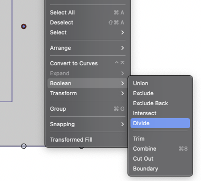
I am experimenting with several variations on several computers but selecting a bool from this menu is a breeze:
By far I prefer to have several options handy in this menu, and fewer in the toolbars. That is how I will organize my setup. Often used features in the toolbars, same and less used in the contextual menu and the rest in the menu system. I still prefer having some features used all the time in the toolbars, it is faster to access them there, while others can be 'hidden' in the contextual menu. Or access faster using keyboard shortcuts.
The part of the interface that always displays icons and labels I try to keep simple - I want my mental focus on the canvas.
So what I am trying to say is perhaps that the toolbars and contextual menu and shortcuts are reduced set of features, while the menu system is closer to the complete arsenal. And for that reason you can reduce a lot.
-
Another way forward could be pre-defined workspace/setup themes:
- Advanced (full)
- Path and shape design
- Page layout
- Light
- Custom (remembering the last custom setting with the option to load saved options/workspaces)
Just example themes. It could be anything, handtracing, shape construction, whatever.
In fact I think this is the most sensible way forward - Adobe and Corel are there already and then we can skip the part where all of us has to agree on something this complex and individual.
-
@Ingolf said in The context panel – possible improvements:
Another way forward could be pre-defined workspace/setup themes:
Advanced (full)
Path and shape design
Page layout
Light
Custom (remembering the last custom setting with the option to load saved options/workspaces)My copy of Illustrator CS6 has a few default workspaces: Automation, Essential, Layout, Painting, Printing & Proofing, Tracing, Typography, Web
Not all of those make sense to me to have defaults for (painting? lol) and I would also want to avoid "dumbing down" the titles of things and losing the professional feel.
I could see making a default "advanced" and a default "essentials" as well as typography, design, and web and allow for any of these defaults to be removed completely and replaced with custom ones and allow workspaces to be saved and exported so they can be shared with others - ultimately users are going to want to customize the workspaces, but having VS open with just the essentials might be less intimidating for a brand new user -
I agree with predefined workspaces/setup themes, I'm used to that from Corel Draw.
Always had my custom defined workspace there.Corel Draw 2020 has these Workspaces
Lite
Standard
Touch
Specialty:- illustration
- Page Layout
- Adobe illustrator
just for inspiration
Apart from that you could always create your own
Workspace and name it where ever you want