Remove selection info from the toolbar please - can be seen in the status bar
-
@b77 said in Remove selection info from the toolbar please - can be seen in the status bar:
any personal reproof should go via private chat.
Let me make this perfectly clear: no one here is going to expose me to any "personal reproof" ! Ever! Got it? Not in the forum nor in a private chat. If you can't handle dialogue or debate, then you'll have to retreat to Twitter.
Boldline is on ignore here, after he sent me several and very personal and intense private angry messages months ago, one-way communication I didn’t reply to, just blocked him to avoid the stream of messages, and therefore I am not going to discuss with him here or via chat.
Since then I have only seen his posts to the extent quotes or the forum accidentally exposed me to.
-
@Ingolf Done, lets see how it works out
")
-
@VectorStyler Can I re-enable it somewhere in Prefs?
MacBook Pro (Intel) running Monterey 12.6.4
-
@b77 No

-
@b77 But it is easy to have it back in the next build if this way is not working out.
Otherwise once I reach the context panel customization (further down the road), this may go either way. -
@VectorStyler I'm not sure there is a way to measure the 'working out' part, and the ones who posted here will avoid stepping on each other's toes.
Either way, I hope some Prefs setting gets included sooner than later, thanks!
-
@b77 @VectorStyler I already miss it! lol. I can be a team player and wait for it to be an option again down the road. We're never all going to agree on these things.
I liked having the option to see my selection and count at the top like that and use the bottom one as a timer.For example, these now stick out to me, lol. They could be part of the vertical toolbar by default and available to add to the transform contextual menu as desired, etc.
The future flexibility of customizing the contextual bar will be the best solution for all. -
@VectorStyler Much better thanks - much calmer interface and the change removed the indent effect that really didn't make it more logical or easy to navigate with the eyes.
I can see selection info in the status bar, if I need to. A selection status in the status bar. Tools in the tool bar. I am pretty sure the masses of users out there will figure this out.

No further comments unless this happens among other users - not us::

🍏 macOS Sequoia Apple Silicon
-
@Ingolf Well, so far the other comments were mostly to have it back.
-
@Ingolf Sorry to say but I have to restore this. Both AI and AD have this in their context panel.
Will be a preferences options enabled by default. -
And I will eliminate it from the context toolbar when I can
-
@VectorStyler In the newer version of AD they removed the info out of the context toolbar/panel. And I think that having the number of shapes when you are making the selection and in the status bar is the place it should be.
One of the problems with a to crowded panel is that there is for smaller screens not enough place for the shown information. See the example screenshot here below where the alignment options are partly 'falling' out of the screen.
-
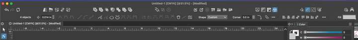
Here an other example. (Don't know if this should be in the beta section of the forum.)
In the first screenshot the layout scale is 100%. The second one is 125%, this is the one I'm using. (Windows even recommends a 150% zoom...).
Windows 10 | 1920x1080 | 125%
-
@FastVector Will be removed in the next beta build.
-
@VectorStyler said in Remove selection info from the toolbar please - can be seen in the status bar:
@FastVector Will be removed in the next beta build.
@VectorStyler We went down this very same road last year (in this very same thread) and people (including myself) preferred it to remain there, so it got reinstalled. This might be a case where out of habit from Illustrator days, I'm used to looking up there for that information. Maybe with time, it would feel better at the bottom. One also could argue in makes more sense in the top menu bar instead of contextual.
I am using a 16 inch M1 Mac Laptop and there is a lot of empty space, even with the selection info in use. So in situations like what I have, its not an issue being there.
I also understand the issue with crowding on the far right side on small laptop screens and that does need to be addressed.Having the ability to remove the info bar from the contextual menu and customize it to fit a smaller screen is a great solution. I went looking in the contextual menu settings, but did not see it there immediately, perhaps I missed it.
Vectorstyler is amazing in its ability to customize but that can be intimidating for the new user to sort through all the available granular options.
A first-setup newcomers simple settings option could be a fast way to get them up to speed and get an immediate layout in this case, that fits their screen. A "fast start" setup customization. The user could quickly click on a small screen/medium screen/large screen option as well as other things like small/medium/large icons, small/medium/large nodes and handles, etc.Other ways to save space in the contextual menu include:
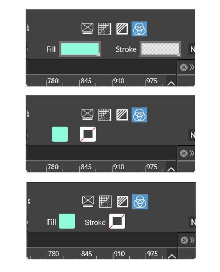
Perhaps a couple different default setups that the user could choose between could be built in to VS for various screen differences? Someone with a 16 inch screen is going to want the status info bar and someone with a 13 inch screen like this example, is going to want it gone in order to gain more space.Another option is the remove the names "fill" and "stroke" from the contextual panel and add the inner square symbol found in the stroke box elsewhere to represent what is the stroke. Adding tooltips over them that tell their names might suffice in further avoiding confusion.
This would gain a solid amount of space back in the contextual menu.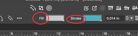
Removing the words and adding the stroke symbol:
🍎 macOS Tahoe 26.2, Mac mini (M1, 2020), Chip Apple M1, Memory 16 GB
Cintiq 27QHD Display and LG Ultra HD Display -
@VectorStyler Another one here who prefers this enabled.
Anyway, Preferences > Selection > Selection Info in the Context Panel doesn't work in 1.2.006 Beta. -
@Boldline There is not customization yet for the second row in that context panel.
-
I do like your ideas about customization. And about creating extra space by the fill and stroke icons. Although I think in my cause both removals are needed.
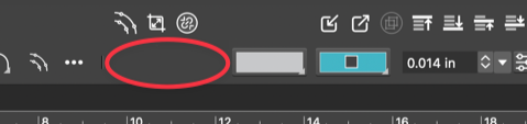
Also played around with the fill and stroke icons. And I've found a third option, where the names don't have to be removed and still getting the same amount of free space.
-
@FastVector No, no, those Fill and Stroke buttons need to be wider, for displaying
gradients and patterns as well, not just solid colors.Btw, do you need to use the 125% UI scaling with that lower screen resolution?
Is it something commonly done on Windows? (You mentioned something about
"Windows even recommends a 150% zoom"). -
@FastVector said in Remove selection info from the toolbar please - can be seen in the status bar:
In the newer version of AD they removed the info out of the context toolbar/panel.
Sorry, I thought i didn't see it in the newer version of AD, but it's still there.