Back and panel knock out issues
-
(? ~1.0.043)
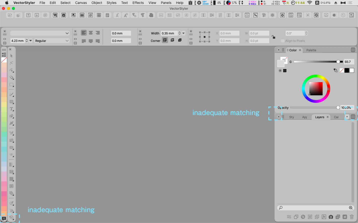
Back and panel knockouts are broken in several places.
The Color Palette Bar adds a black right angle regardless of size or position.
(fig)
I'm curious about this, but is it acceptable?
I remember seeing somewhere in the forum that the Windows version of the palette is right-angled?
Would that UI be possible on Macintosh? I would like to use it.LIc. 0 OS10.15.8
MacBook Air (13-inch, Mid 2012) / Intel Core i5, 8GB / Intel HD Graphics 4000
LIc. 1 OS15.7.4
MacBook Pro (14-inch, 2023) / Apple M2 Pro, 16GB / Apple GPU -
@861475_VctSt The UI theme on Mac is round cornered by design. These gaps are by design. This fits better with the current Mac guidelines.
Yes, it is possible to have (new / additional) themes with different designs, including right-angled corners.
Lets have more input / opinions on this one.
-
@861475_VctSt Since Windows 11 moved to rounded corners for the UI, I would rather suggest the default UI for the Windows version of the app move to that also. This would make the app look as similar as possible on both platforms.
@vectoradmin The gaps between panel stacks in this theme and in Light UI should be the same color as the background, to better differentiate them. But I planned to write more about the UI in private anyway, and I'll do it soon.
-
@vectoradmin
If that's Apple's guideline, then so be it.Is the black part of the Color Palette Bar irreparable?
(fig)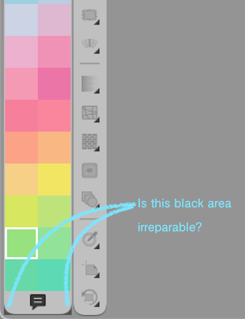
In my previous post, I wrote "right angle", which was inaccurate.
The design up to Catalina is not right-angled, but subtly beveled.
I wish We could choose the beveled corner design used in Catalina as our legacy.@vectoradmin
@b77By the way
I'm happy with the VS design.
I have a few comments for the future.
I can't help but think about the "negative effects of using too many corner Rs".
The outermost R is acceptable for the frame. However, there are many windows with R inside the VS frame, right?
Palettes and bars can be large or small.
The roundness of the R for large and the R for small looks different due to optical illusion. As a result, a sense of inconsistency is created.
You may not feel it on a wide display.
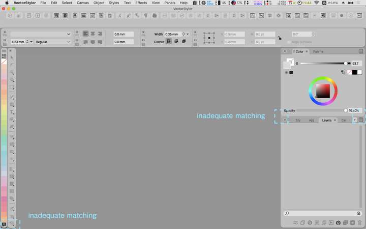
This is an extreme use, but it is what happens with a narrow display.
I feel restlessness and disunity.
(fig)
LIc. 0 OS10.15.8
MacBook Air (13-inch, Mid 2012) / Intel Core i5, 8GB / Intel HD Graphics 4000
LIc. 1 OS15.7.4
MacBook Pro (14-inch, 2023) / Apple M2 Pro, 16GB / Apple GPU -
@861475_VctSt Some elements of the Light and Gray themes still need fixing.
-
@861475_VctSt Indeed, that is a small display. Have you tried setting 'Interface Scaling' to 90% or maybe 80%? This can be done in Preferences > User Interface.
-
@vectoradmin
(1.0.045)
A "Flat" type theme. Thank you very much.
I guess it was a lot of work.I was fully satisfied with the functionality of VS, but I felt uncomfortable with the round screen.
I guess it's because I've been working with square tools for almost 30 years.
The harmony with the gray tone is wonderful, and I feel right at home.