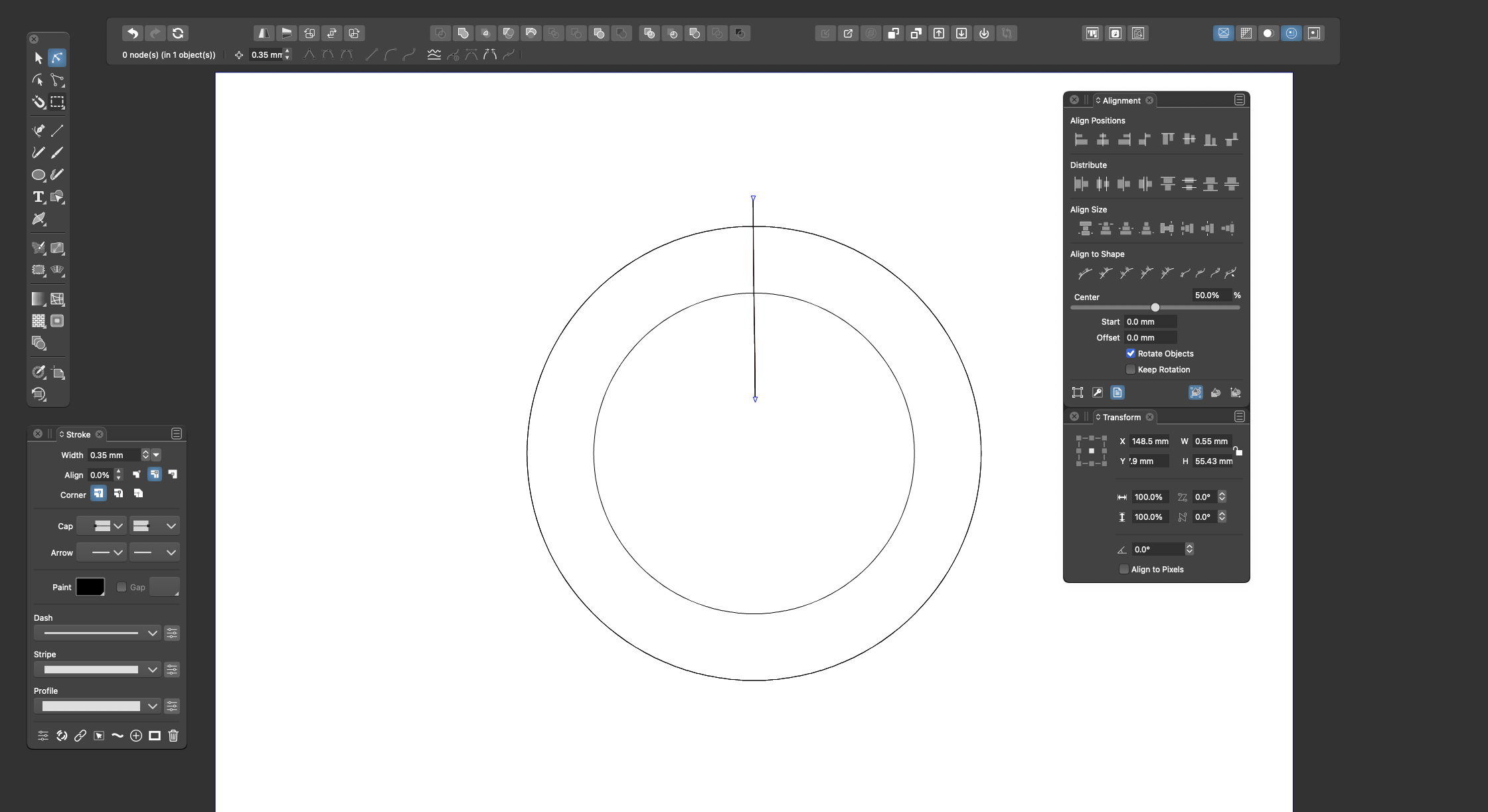
New VS user, help with the interface?
-
@Ingolf In my opinion this approach might be better than having the panel with the shape settings pop automatically when you select one of these tools.
Absolutely.
-
@b77 said in New VS user, help with the interface?:
@Ingolf In my opinion this approach might be better than having the panel with the shape settings pop automatically when you select one of these tools.
I agree that the contextual menu could/should be more dynamic, but I like the way the setup of things is now with a double click on the toolbar menu to bring up the panel for that tool for fine tuning settings.
One of the things new users often mention is the idea that the UI of VS is busy and overwhelming. I can't imagine adding more to the contextual menu bar helps de-clutter the UI.
Like I've said before, once you learn certain behaviors in VS, you can assume they carry over into the rest of the program. So knowing a double-click brings up a bunch of extra controls for the specified tool, you can safely assume that is built in to most other toolbar tools, etc -
@GlassWorkshop Sorry for hijacking your thread…

@Boldline Invoking the settings window/panel with a double-click on the tool and having special buttons for the different modes of the shape and its specific settings can both coexist.
Also, I didn’t want to suggest the developer should cram all the settings of each mode in the context bar at the top — just the most relevant are needed.
The special button to access them all in the settings panel should definitely stay, and also the double-click on the icon in the toolbox/single click on the canvas.I could say that the advantage of the visual buttons is that you don't need to consult the documentation for advanced or "hidden" features.

-
@b77 no worrys mate,. Im all back of the bus and paying attention to the conversations.. thanks for the latest video ..
-
-
Maybe a single button could be enough ?
Something like this "Opt." ?Ore first alternative:
A hint in the tooltips I still find a quite good idea.
This would leave the interface as it is.Ore second alternative:
Maybe a special ToolTip/Help mode for new user would
be possible ? Which you can switch on and off in
the preferences. -
@Subpath Do you mean something else that the button that opens the Ellipse settings?

-
Ouch!
Yes, exactly such a button. Thanks!
I "swear" I was looking and searching, for something like that. -
Common methodology:
-
Activate tool
-
Context bar updates to show essential options for this tool
-
Context bar has open panel button if a panel exists for this tool (far right)
-
If several panels are relevant (I doubt it, but if, button is dropdown with relevant panels listed, focus!)
-
Context bar has options button (far right)
-
Probably access to some of these features available via right click menu (for full screen work)
-
no double click on toolbar for other options, non-standard, certified confusing and often not discovered method
-
Keep it simple
-
Keep options within the workflow UI (see above)
-
-
Looks like a really usefull List.
I guess that List is for UI-Design.

