Usability inconsistency - font list
-
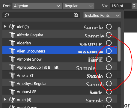
Here the circle works a "Add as favorite font" control. In the layers panel however it means "Select object".
When selected it turns into a solid star. You should use an outlined star when the font is not a favorite.
")
🍏 macOS Sequoia Apple Silicon
-
@Ingolf to me, the aesthetic of an outlined star is a bit jarring, especially when you have so many stars lined up vertically. If it does change from a circle into a star, perhaps lowering the opacity down as well? But the selected "starred" fonts have the star solid and at full opacity
-
@Boldline The outlined symbol = unselected and filled = selected is widely used UI practice out there in apps, programs and websites. It is what any developer should consider. And piggyback on. Often it is even part of the operating system guidelines for the user interface.
Optimal opacity and stroke width of the symbol depends on contrast ratio (accessibility) and user testing feedback - user tests performed by usability specialists. It is worth investing in. It pays back tenfold.Going the other way is like inventing own roadsigns in every city - which is rarely suggested.
Just sharing my professional experience here - not reacting to your words above.
-
I would also prefer a light gray star contour when it's not enabled (favorited). It's less contrasty and less jarring. Something like this:
(When in Light UI mode, it should be dark gray, but not black).
MacBook Pro (Intel) running Monterey 12.6.4
-
@b77 said in Usability inconsistency - font list:
I would also prefer a light gray star contour when it's not enabled (favorited). It's less contrasty and less jarring. Something like this:
(When in Light UI mode, it should be dark gray, but not black).
And that looks beautiful, @b77 - and makes total sense
-
@Ingolf Thanks for the idea.
-
@b77 Yes this was how I was picturing it when I described the lower opacity outlines and then the filled stars for selected fonts. I love that you're always quick to mock it up so realistically so quickly
-
@Ingolf This can be done, added to the backlog