Further improving the gradient editor
-
Apologies if I am missing something important here.
One thing that Affinity got right is a very simple gradient editor:
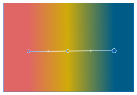
You have a start and end stop, and they mark the beginning and end of the gradient. Elegant, simple and intuitive.
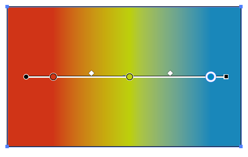
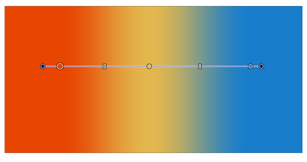
VS and Illustrator both use an additional start and end point. I don't need that nor do I understand that approach. It adds visual complexity:
Illustrator:
VS:
I suggest simplifying the gradient editor like Affinity by removing these start and end nodes.
Thanks for considering.
")
-
@Ingolf This is a bit of a problem, but it could be made an option.
The problem is that in a gradient the first color may start after the starting position and the last color may be before the ending position (when dragging the gradient color knobs at the start or end in the Gradient panel).
In Affinity it is not possible to change the position of the starting and ending gradient colors, so their editor can be simpler.
-
Personally I just don't see the point/value of the Illustrator method. I get exactly what I need with the simpler Affinity implementation.
On top of that the simple method is much faster to decode with the eyes and mind when you look at it dozens of times all day long.
-
@vectoradmin How is insetting the starting color different from simply reducing the length of the gradient relative to the object?
-
@fde101 said in Further improving the gradient editor:
@vectoradmin How is insetting the starting color different from simply reducing the length of the gradient relative to the object?
Nothing comes to my mind right now, other than AI file format compatibility of course (and the AI swatches that can be imported).
-
@fde101 Simply reducing the entire gradient relative to the object changes the distance between all color stops.
MacBook Pro (Intel) running Monterey 12.6.4
-
@Ingolf I was preparing to send to the developer an animation with a suggestion for a more functional (and thus a bit more complex) gradient bar, and here you go asking for a simplified one…

Maybe poor visual differentiation is what you guys don't like…
If you ask me, the problem with the handles at the ends of the gradient bar is that they look too similar in size to a color stop, creating slight confusion. Besides that, they are colored…
In my opinion…
- making all color stops visibly bigger than the handles, and…
- turning the simple line between the first and last color stop into a wide ribbon, so you can clearly see the gradient limits/ends…
…would make the gradient bar look better and help with visual differentiation.
Something like this:

-
@b77 said in Further improving the gradient editor:
@Ingolf I was preparing to send to the developer an animation with a suggestion for a more functional (and thus a bit more complex) gradient bar, and here you go asking for a simplified one…
Anyway… if you ask me, the problem with the handles at the ends of the gradient bar is that they look too similar in size to a color stop, creating slight confusion. Besides that, they are colored in that non-neutral blue…
In my opinion…
- making the handles slightly smaller,
- making all color stops bigger, and also…
- making the "ribbon" between the first and last color stop wider, so you can clearly see the gradient limits/ends…
…would make the gradient bar look better and help with visual differentiation.
Something like this:
Too massive and too many pixels occupied for my taste. I'd prefer the current design just with no start- and endpoint like in Affinity. My hope is that there is some way it can be handled under the surface so compatibility is possible during im- and export.
If compatibility with Illustrator is at stake though, I will retreat, even though I don't need it personally. But I dream of the day when the Frankenstein clumsiness of old software like Illustrator can be abandoned. Noone wants to run with heavy sneakers.
The current and next generation of designers should not be forced suffer from bad design decisions from the 1990's.
-
In this case I don't think the old guys made a bad decision.
If you deal with a complex gradient (3 or more color stops) how do you move the first or last color stop without disturbing all the others? Because if you can't move/unglue a color stop independently away from the gradient start or end, the only way to do it is to scale the gradient from that end. Then you need to readjust the location of all the intermediary color stops.
But anyway, if the developer agrees to also include such an option, I'm not against it (although the Preferences are stuffed already…
) -
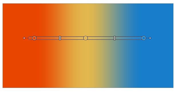
@vectoradmin Another slightly different version, with small squares for handles and thin lines from the handle to the start of the gradient ribbon:
(I'll send the animation with further suggestions before the end of the year, I hope).
-
1+ from me, like this Version
-
I stand by my first post and request without hesitation or doubt but I can live with the current implementation.
I would suggest though to give the start and end point another shape than the gradient stops. Probably mimic Illustrator now that inspiration and compatibility comes from Adobe anyway. Then at least Illustrator users will be pleased and see something familiar.
Disabling colour sliders when non graphical objects like these. are selected would also make sense.
-
My main problem with Illustrator is not the subscription. It is legacy methods and clumy workflows. I don't feel pleasure when using it thus I don't use it when I can find better alternatives. Thats why I spend hours in Affinity despite the extreme lack of features.
A suggestion. The problem I have with the Illustrator method is the area between the gradient areas start/end point and the first/last gradient stop. I get a start-start point and a start point: the first gradient stop. It is so 1988 to me. I find it highly annoying (!) when using Illustrator. I am adapting to a machine not the other way around. Moving the first gradient stop to mark the ACTUAL starting point makes total sense to me. One start. One stop.
I have a suggestion that at least makes some visual sense.
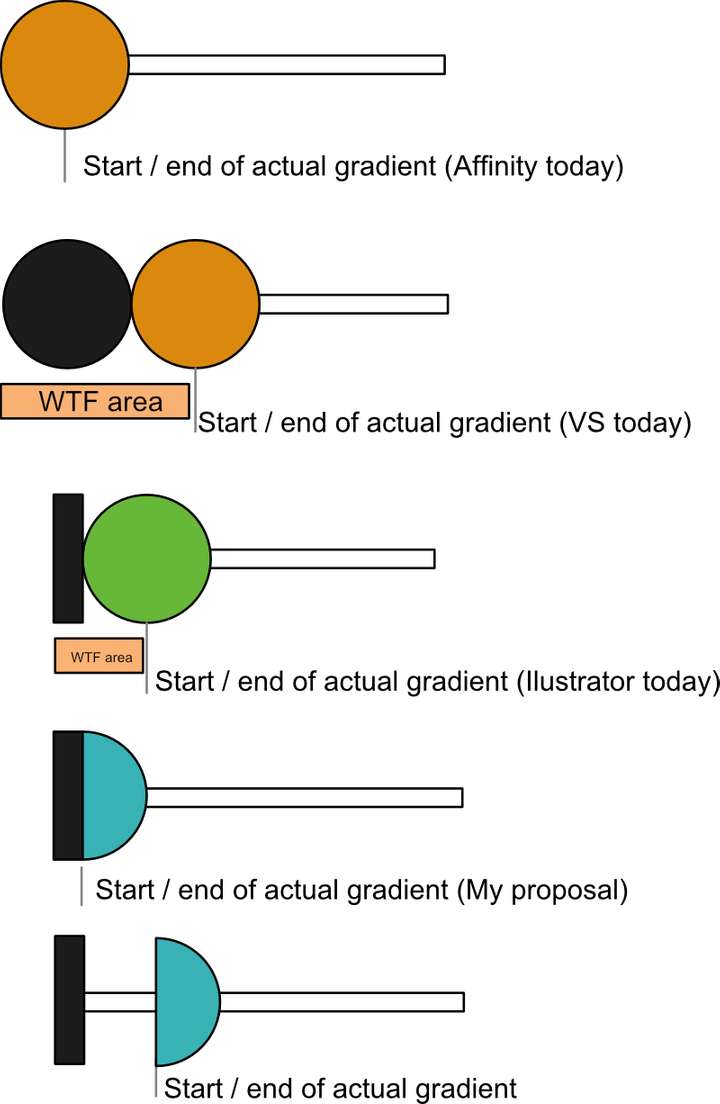
Not sure it solved the compatibility issues though.
But still. The Affinity way is the total Dieter Rams experience. Easy to understand. Easy to use. Will last for decades.
-
But anyway - if a million Illustrator designers are used to the way it works now, I am fine with it. In that case I suggest using a rectangle as start-end symbol like Illustrator.
-
@b77 said in Further improving the gradient editor:
@fde101 Simply reducing the entire gradient relative to the object changes the distance between all color stops.
Suggest that a modifier key could be added to lock the angle and the other nodes in place while dragging either end point, such that the end point is moved (prevented from moving past the next defined point) linearly along the existing axis without disturbing the existing points.
-
Sure, if we want to talk about alternatives, there are indeed — a modifier key like @fde101 suggests is a valid one, another one would be to display handles at a distance only when the gradient has three or more color stops (but I don't suggest it really)…
But none of them skirt the need for better visual differentiation between handles and color stops after you move a color stop away from the gradient start or end.
Anyway, in my opinion apps that require the user to know lots of secret handshakes (in this case a special shortcut to keep the other color stops in place when you want to "unglue" a color stop from the gradient start or end) are less user friendly and more difficult to learn than apps where the UI displays the adjustment handles directly.
My last post on the topic, I rest my case.

Have a nice weekend everyone.