Inspiration - less busy interface in Gravit Designer Pro
-
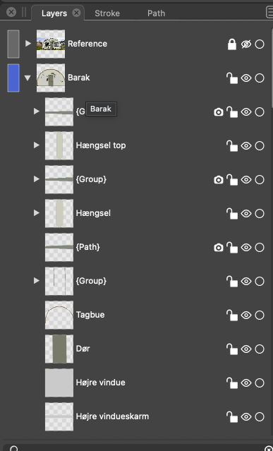
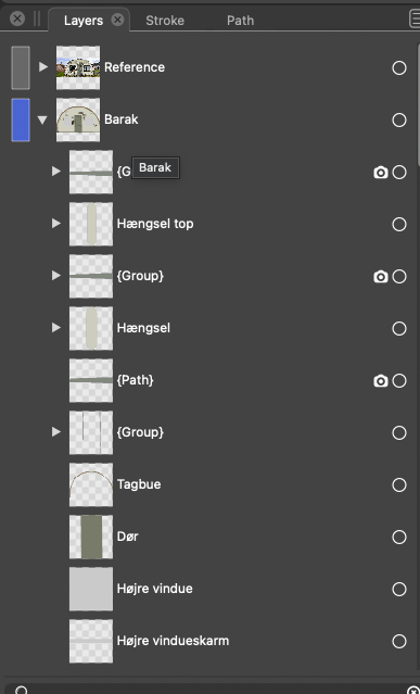
To visualize the difference:

-
@Ingolf Interesting idea.
I'm not sure about the part where Gravit displays these two icons only when you hover the right side of the layer?
If this gets implemented (option in Prefs?) I see no reason to not have these displayed when you hover the layer anywhere. -
@b77 said in Inspiration - less busy interface in Gravit Designer Pro:
@Ingolf Interesting idea.
I'm not sure about the part where Gravit displays these two icons only when you hover the right side of the layer?
If this gets implemented (option in Prefs?) I see no reason to not have these displayed when you hover the layer anywhere.Hovering above whatever part of the layer displays these icons. It is impossible not to discover them and understand how it works.
")

I do not think it should be an option in preferences. The author of a a program should sometimes stand by more basic design decisions. Preferences are so packed with options that it is almost counter productive. Making whatever optional also adds code and complexity to the program. More code to maintain, more risk of regressions and more complexity overall in the product. And we can still count the number of developers with one finger.
🍏 macOS Sequoia Apple Silicon
-
Hovering above whatever part of the layer displays these icons. It is impossible not to discover them and understand how it works.
Yes, I wasn’t sure it does that.
Then it sounds good to me.
-
@Ingolf I thought about the second part in your last reply (hiding these buttons by default, with no Prefs option), and I’m not sure everyone would be OK with having to move the cursor over the Layers panel to see what’s locked or hidden and what’s not, especially on big screens and maybe tablets.
Other users care to chime in about this?
Btw, let’s not forget the approach where only the current layer is active and objects on all other layers are selectable with Cmd/Ctrl-click. This would make locking layers unnecessary most of the time.
I hope this will become an option in the future, even the default one.
MacBook Pro (Intel) running Monterey 12.6.4
-
@Ingolf I like the idea of only seeing the icons when you over (deactivated) or visible when activated.
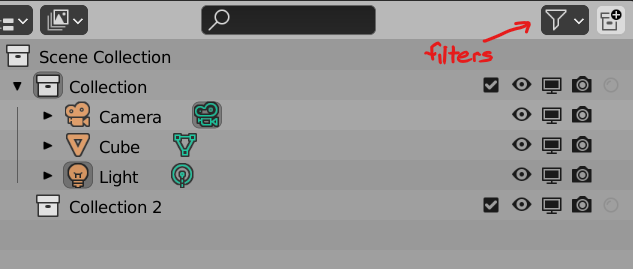
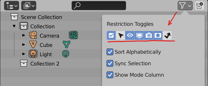
Another possible idea is the way Blender handles it. The user can check and uncheck the options they wish to have visible allowing complete configurability.
-
@Victor-Vector said in Inspiration - less busy interface in Gravit Designer Pro:
@Ingolf I like the idea of only seeing the icons when you over (deactivated) or visible when activated.
Another possible idea is the way Blender handles it. The user can check and uncheck the options they wish to have visible allowing complete configurability.
Interesting but in Blender the interface is extremely busy everywhere so I understand they make it optional to see this and that whereever they can. In the layers panel they show 5 icons and in a worst case 7. With the filter they are trying to put out a usability fire.
In Vectorstyler the interface is generally pretty clean (except for the too many combine icons) and in the case of Vectorstyler I think the most elegant and user friendly method would be to just hide them like in Gravit. I think it would also work in Blender.
🍏 macOS Sequoia Apple Silicon
-
@b77 said in Inspiration - less busy interface in Gravit Designer Pro:
I’m not sure everyone would be OK with having to move the cursor over the Layers panel to see what’s locked or hidden and what’s not, especially on big screens and maybe tablets.
I would make more sense to me to have them be a faded shade of gray so they are still somewhat visible and can be clicked on - any that are active stay lit up
-
@Boldline said in Inspiration - less busy interface in Gravit Designer Pro:
@b77 said in Inspiration - less busy interface in Gravit Designer Pro:
I’m not sure everyone would be OK with having to move the cursor over the Layers panel to see what’s locked or hidden and what’s not, especially on big screens and maybe tablets.
I would make more sense to me to have them be a faded shade of gray so they are still somewhat visible and can be clicked on - any that are active stay lit up
Not to me. I know they are there after hovering them a few times. After hovering them a billion times even more so.
-
@Ingolf said in [Inspiration - less busy interface in Gravit Designer Pro]
Interesting but in Blender the interface is extremely busy everywhere so I understand they make it optional to see this and that whereever they can. In the layers panel they show 5 icons and in a worst case 7. With the filter they are trying to put out a usability fire.
In Vectorstyler the interface is generally pretty clean (except for the too many combine icons) and in the case of Vectorstyler I think the most elegant and user friendly method would be to just hide them like in Gravit. I think it would also work in Blender.
I disagree, I think filters are a perfectly viable way to handle this particular interface situation that you have an issue with. I think your proposal is just another way of doing it. Like I said, I don't mind if they are hidden, or less visible, or of there are filters. They are all good options.
-
@Victor-Vector said in Inspiration - less busy interface in Gravit Designer Pro:
@Ingolf said in [Inspiration - less busy interface in Gravit Designer Pro]
Interesting but in Blender the interface is extremely busy everywhere so I understand they make it optional to see this and that whereever they can. In the layers panel they show 5 icons and in a worst case 7. With the filter they are trying to put out a usability fire.
In Vectorstyler the interface is generally pretty clean (except for the too many combine icons) and in the case of Vectorstyler I think the most elegant and user friendly method would be to just hide them like in Gravit. I think it would also work in Blender.
I disagree, I think filters are a perfectly viable way to handle this particular interface situation that you have an issue with.
Yeah, but if you take a close look, filters are often introduced when the interface gets complex and it is best to avoid that scenario alltogther if at all possible.