update 1.1.042
-
Here some uses of:
"Blend object inside pattern and other brush types"
(It offers the possibility to use a blend inside a pattern brush)At first glance it appears somewhat unimpressive.
But there is something in it
How to create it:
At first you need a simple Blend.
Create two Shapes and create a Blend between them.
Now select the whole thing and group it.In next step go to Styles and create a Pattern Brush preset from it.
Select the Artistic Brush and paint a few strokes, choose one of them
and select your previously created pattern brush to paint with it.Here a few uses i found so far.
-
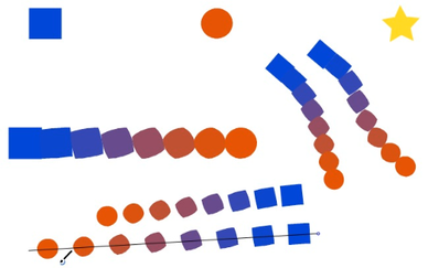
use rigid shapes with scaling
your shape will then be not deformed as you paint
(its a pattern brush feature) -
you could use colored Blends !
-
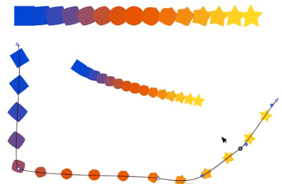
as some of you may know you could create multi Blends in VS
but there some quirks with them as you would like to move them
with the Shape Editor Tool
( but works if it is a Pattern Brush now )
.
.
Video with simple Blend
.
.
.
Video with multi Blend
.
.
.
Finally "Big thanks" to @VectorStyler for that.
-
-
@VectorStyler said in update 1.1.042:
I tested the Save panel issue and it works here (have to test it on Monterey).
If I understand what the fix is supposed to do - I can copy text from another source and paste it into the file name section inside the save and the save-as panels. Testing this on the M1 mac with the newest build and for me, it's NOT working as it should. Nothing gets pasted.
I tested it on the Intel computer in VS and that was successful -
@Boldline As I understand it, this doesn't work on Monterey, but it works on Big Sur and older.
-
@b77 ok.. I have El Capitan on that intel machine so that makes sense.
@VectorStyler mentioned it should be working on M1 macs and that has not been the case for me so far. -
@Boldline It works on M1 Macs with Big Sur, I guess.
-
@b77 I keep this issue open.
-
I have reported this issue way back in beta, but it wasn't really an issue for me because switching to Collections seemed to work, but now that doesn't work anymore. When I scroll with mouse, or use the slider, the top of the fontlist becomes empty the more I scroll down, to the point only a couple of fonts are displayed.
-
@Gremriel said in update 1.1.042:
I have reported this issue way back in beta, but it wasn't really an issue for me because switching to Collections seemed to work, but now that doesn't work anymore. When I scroll with mouse, or use the slider, the top of the fontlist becomes empty the more I scroll down, to the point only a couple of fonts are displayed.
Yes, I remember this. The problem is that I could not replicate it.
-
@VectorStyler said in update 1.1.042:
The overlapping node click-through works only for nodes in different objects.
I tested this on a some overlapping nodes (from the forum post Selecting Contiguous Nodes in a Sub-path), using this Vstyler file: 0_1653449050525_Overlapping nodes.vstyler
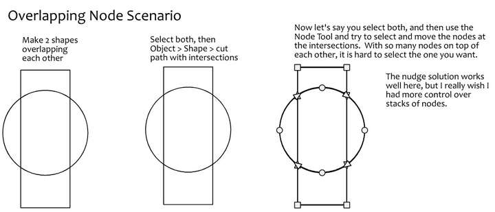
Here is what I discovered:
If I have nothing selected, switch to the node editor tool, and click on an intersection of the circle and the rectangle, say at the bottom left: It selects the top node; second click, it selects the next node underneath; click again, the next node; click a fourth time and it selects the bottom node.I can only tell this by watching the layers panel and see progress through.
Unfortunately, a fifth click does not start at the top node and go in a cycle again. One has to click off the object, then click on the intersection again.
It works, but it is not elegant. I am not sure how to solve this elegantly...
Here is a first shot suggestion: I wonder if the segment next to the node could be highlighted? Perhaps the user can turn this on or off in the preferences if this is distracting for some users?
Something like this mockup:
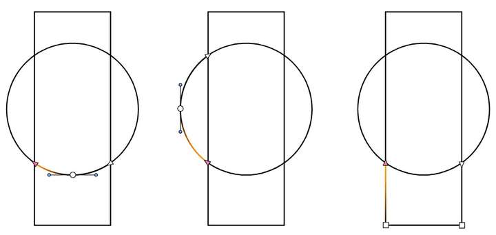
I think this might be a good way to augment the display of node selection in general. Thoughts?
-
@Victor-Vector Not sure about the usefulness of highlighting just a segment in a more complex drawing. Would it be a problem if the entire shape is highlighted?
-
@b77 if the entire shape was selected using the node selection tool, it would highlight ALL the segments in the selection color chosen in the preferences (in this case I illustrated it as orange), which for me would not be a problem, because most often I would be using the Transform Tool for those type of operations.
Where this idea really shines is for using the Node Selection Tool for individual nodes. I think it would help the user see the specific selected nodes especially in busy areas of artwork.
-
@Victor-Vector When an individual node of a shape is selected, the other nodes of the shape also become visible by showing small (non selected) circles.
Currently, this should indicate which shape contains the node.In the earlier drawing, I see that the orange highlight is sometimes drawn before and in other times after the selected node. Is there some rule for this? I'd like to explore this idea a bit as a new feature.
-
@VectorStyler
Thank you for considering this idea. I will offer the disclaimer that this is by no means a fully thought out solution, just an initial concept for a way to offer more clarity in feedback to a user in a situation with complex node selection relationships.I made another mockup to help illustrate the issue and the potential solution:
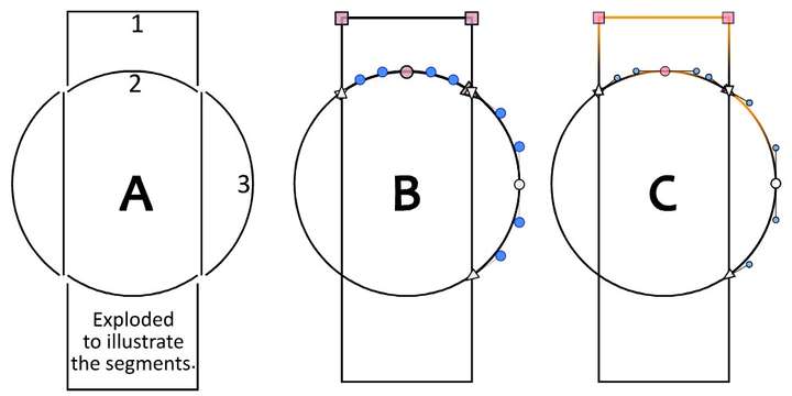
Figure A shows two shapes, a rectangle and a circle that have been cut into separate pieces using Menu > Object > Shape > Cut Path with Intersections.
The result in Figure A has been pulled apart so one can understand the separate segments, but in the example, the shape would not be pulled apart, and it would look like Figure B. I have labelled key segments with numbers 1, 2, and 3.Figure B shows the intended selection as it currently works in VectorStyler. Of course the colors and shapes of the nodes are user choices. I have chosen a dull magenta for "selected" and various shapes to represent the smooth, cusp, and end nodes. These are not defaults and your choices will be different.
Selected are: the two top nodes of segment 1, the middle node of segment 2, and the top node of of segment 3. The representation becomes particularly confusing where segments 1, 2, and 3 meet. It is hard to determine what end point arrow is selected; is it segment 2 or segment 3?Figure C shows a mockup of what a selected node's segment highlight might look like. The color can be user configurable, of course. I have chosen orange to illustrate the idea here.
I feel like it is more clear what is being selected, and helps the user navigate such complexities with a decent amount of visual feedback, while hopefully not being too complex to implement.Figure C also shows the highlight color behaviour of the segments when multiple nodes are selected i.e.: segment 1, and when a middle node is selected, i.e.: segment 2.
I would add that this is not an original idea. I have used software where selection of individual nodes is illustrated like this for clarity, I think it was FontLab, if I am not mistaken..
I hope that clarifies the idea more. Again, just an early idea...
-
@Victor-Vector When the paths are a lighter color you can see that both the nodes of the path and the path itself are highlighted:
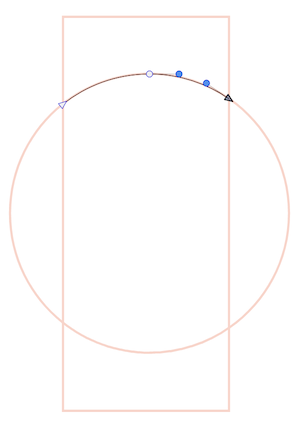
But when they are black like in your screenshot, indeed the highlight of the path — its spine — is not visible.
@VectorStyler Maybe use a (thicker?) light blue highlight for the spine of the path when selected, so it works for black and darker strokes?
-
@b77 said in update 1.1.042:
But when they are black like in your screenshot, indeed the highlight of the path — its spine — is not visible.
Wouldn't this be fixed by changing your layer color indicator? I worry that if we thicken those lines, it's going to be less useful and look less professional
🍎 macOS Tahoe 26.2, Mac mini (M1, 2020), Chip Apple M1, Memory 16 GB
Cintiq 27QHD Display and LG Ultra HD Display -
@Boldline I don't insist on thicker, no.
-
@b77 lol I was just wondering if switching the layer color itself solved the problem for you. Out of curiosity, how thick would you want it to be?
🍎 macOS Tahoe 26.2, Mac mini (M1, 2020), Chip Apple M1, Memory 16 GB
Cintiq 27QHD Display and LG Ultra HD Display -
@Boldline said in update 1.1.042:
Wouldn't this be fixed by changing your layer color indicator?
You're right, but…
Why not have the app override that color and always use something that has enough contrast no matter the color of the stroke?
MacBook Pro (Intel) running Monterey 12.6.4
-
@Boldline said in update 1.1.042:
@b77 Out of curiosity, how thick would you want it to be?
At least on Retina screens it seems to be 1 pixel thick. 2 px would be better, IMO.
-
@Boldline said in update 1.1.042:
Wouldn't this be fixed by changing your layer color indicator?
Actually, no. It's the same standard blue, no matter what the layer color is.
@VectorStyler Can this be changed somewhere?
MacBook Pro (Intel) running Monterey 12.6.4