Need for improvements when navigating list menus
-
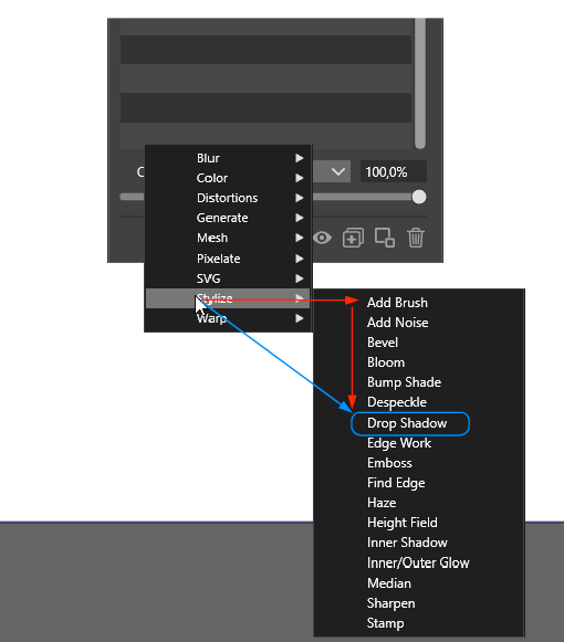
This problem applies to all list menus. Could you please add a delay to the menus and deactivate the parent's menu items while the lower level is opened, so you can navigate diagonally without activating the unwanted options. Currently you have to follow the red arrows, and a shortcut like the blue one usually fails
MacBook Air M4 24Gb, Tahoe 26.3.1
-
Those nested drop down lists should be avoided, the best solution IMO would be some tabs and fully unfolded lists available for an instant use. There is so many features that navigating that is a waste of time.
-
@plrang If by 'unfolded list' you mean all the effects listed one after the other, wouldn't that make the list taller than some screens and also difficult to navigate? Sorry if I misunderstood.
-
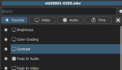
@b77 If divided to TABS and the list looking like the Brush Presets + a search box, it would be ok.
This is used in Shotcut, Kdenlive and Blender. -
@plrang Here is an example from Shotcut.
-
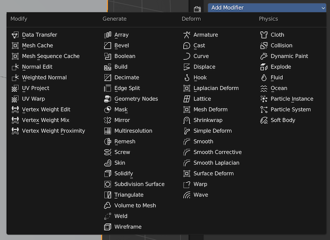
@plrang Got it. But I think the way modifiers are grouped in Blender is better:
-
@b77 I don't thinks so, it always drives me crazy and doesn't even have a search. Yet you have the global command/option search, which is amazing, and that could be great in VectorStyler.
- Although it's still better than a nested drop down. *
-
@plrang A very wide popup is needed to accommodate nine tabs for the nine FX categories.
Wouldn't that leave so much empty space below the tabs if only some effects are to be displayed (the ones of the clicked tab)?Again, maybe I don't get it, sorry.
-
@encart I will try to figure out a way for a better menu navigation. Currently, this issue also occurs in the MacOS version, where the Mac menu navigation is used (on Windows, VS implements its own menu navigation).
But I'm not sure yet what would be the best solution.
The problem is that there are a large number of effects, and because of this, these need to be grouped. -
@b77 So it could be created like in DaVinci Resolve. Scrolled like the "Brush presets", always available and keeping the scroll position. That way it can be drag'n'dropped and previewed instantly.
-
@plrang I do video editing so often that I deleted DaVinci Resolve to free up space.
Why not use the free recordit.co app to record the screen and show how it works in DV Resolve.
-
@b77 lol, I removed it a few days ago, switched to Shotcut and Kdenlive.
But here is the Shotcut Filters selector.
It's not ideal, because it disappears after adding a filter, yet again - still better than any dropdown. -
@VectorStyler Of course. I have no technical knowledge, my suggestion are based more on intuition.
It is good that there are ideas for a deep redesign, but for now making these small( from my perspective) changes is enough for me. I think that for such a serious modifications will come time.
-
@encart I'm OK with the current menus and submenus system, but we need to continue the discussion…

@plrang All right, thanks for the video.

While a Search field would be useful (but not a must for now) what do we do with so many tabs?
Icons instead of tab names could be a solution, but… they need to be really good. -
@b77 You can then drag and drop the effect on a shape and preview it with a single click, also the next effect you want to see is another single click because the list doesn't disappear. Can't be any faster.
-
@plrang Sorry, but your tabbed menu solution somehow doesn't convince me. I don't see such clear advantages.
You have to click through them anyway. I have an impression that it may take more time than using the current list.
The @b77 proposal is better for me, because I have access to everything at once without unnecessary steps. To simplify the use of effects as much as possible, I would add such an effects menu as one of the Double Click actions
example:
1.Select object
2.Shift+ Double Click -menu appears
3. Select Effect (+maybe preview on hover) -
@encart Popups always get in the way. It's better to focus eyes on the view while just moving the mouse and selecting the effect. Otherwise you have to popup select hide, popup select hide. If you have a whole day to do so;)
For example the Shape Effects/Filters panel can have upper tabs for categories (if they exist), tabs on the left, it may be icons.
Vectorstyler has so many options that a search box is a must in my opinion for such panel (no need to remember where the effect is in the list). Preview on hover or on click.
DaVinci Resolve Effects Panel no way you can do it faster with any popups.