Usability bullseye
-
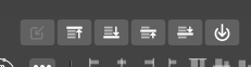
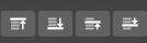
Finally a program with icons for this that I understand instantly:
Send to top/bottom/rise/lower

🍏 macOS Sequoia Apple Silicon
-
yes, a little easier to understand
but I found them harder to find
than the others at the beginning -
@Ingolf said in Usability bullseye:
Finally a program with icons for this that I understand instantly:
My sentiments exactly

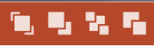
Try guessing which one is which in PowerPoint:
-
@Ingolf said in Usability bullseye:
Finally a program with icons for this that I understand instantly:
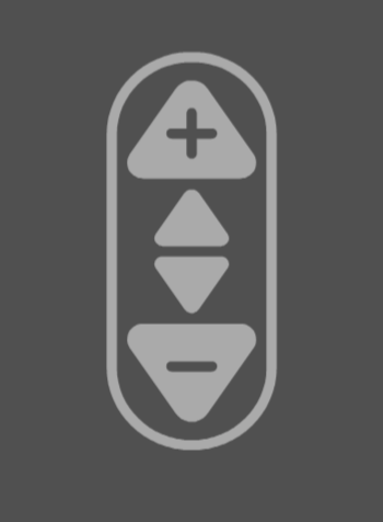
LOL, so what is the one on the right then, is that the power switch
")
Have to say that having them on my right click menu is a lot easier than looking for an icon.
They are fairly explanatory 'though, short of a button saying up/down/top/bottom
Neil
-
@Igull said in Usability bullseye:
LOL, so what is the one on the right then, is that the power switch

The first and the last icon from the group is the old one — I agree something better is needed. -
@b77 said in Usability bullseye:
something better is needed
This is one from an old CNC app I wrote some years ago, maybe it could be adjusted to suit ...
Neil
-
@Igull Something like this might have worked if the context panel was tall like in Ribbon UIs.
-
@b77 said in Usability bullseye:
if the context panel was tall like in Ribbon UIs.
Just rotate it to the right by 90deg, it will still function
You can always make it smaller of course ...
-
@Igull Since the two rows of the context panel are separate rows, a button that goes across two rows doesn't work.
And I cannot say rotating it 90° would make sense visually (left-right instead of up-down).The horizontally docked panels, like the Alignment panel in your screenshot, do allow for such a button, but then having two different sets of buttons for ordering objects is not exactly right, I think.
I plan to start a thread about the context panel soon, and I will include some new icons in place of the old ones. See you there.
MacBook Pro (Intel) running Monterey 12.6.4
-
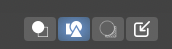
I also prefer the context sensitive menu, where I added them, but these four at the best I have personally seen. I was never in doubt. They illustrate exactly what they do:
More generic icons like +- up/down require a bit of tooltip reading. And it could represent volume, saturation, brightness or position.
The arrow into a circle on the other hand is not illustrative enough.
BTW you probably figured out I don't like clutter - I removed the other two from the toolbar a long time ago.
-
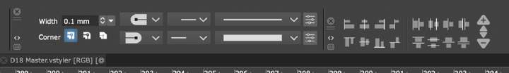
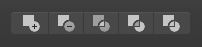
I do have some trouble remembering these ones - I always have to read the tooltip:
These from Affinity are not much better - but they do not differ as much in style and make some sense:

And these always made sense to me:
-
i agree that these Vs Icons are easier to understand now
thought that maybe a thin frame around it would increases their perceptibility
one is used to the old icons from other programs
-
I don't mind these icons has a whole. but I think the first one, "Draw on top" should have the two underneath shapes be outlines and not fills so its clear that the filled top object is on top of all and fits in line with the same symbol concept as the others.

-
Frames around buttons are gone in modern software. They will probably be back some day like round corners vs sharp corners.
-
@tudor said in Usability bullseye:
@Ingolf said in Usability bullseye:
Finally a program with icons for this that I understand instantly:
My sentiments exactly
Try guessing which one is which in PowerPoint:
I memorized those icons decades ago but the orange background is a total turn-off also mixing the icons makes my eyes scan them all four every time, I never identify the button I need in the first attempt. I also still haven't forgiven Microsoft for kickstarting the ultra-flat and minimal design trend.

We are one step from an all black and white trend.
🍏 macOS Sequoia Apple Silicon
-
@b77 said in Usability bullseye:
And I cannot say rotating it 90° would make sense visually (left-right instead of up-down).
LOL, I was joking
But you could split it to fit on two separate rows OK on the context panel, it would be really nice to be able to finally edit that as a preference.
Neil
-
@Ingolf said in Usability bullseye:
We are one step from an all black and white trend.
Hurray, flat is good
That means I can use up all that black vinyl I bought
iMac 27" 2015 Catalina 32Gb, MacBook Pro 13" 2016 Monterey 8Gb, Mac Mini M2 2023 8Gb
-
@Igull said in Usability bullseye:
@Ingolf said in Usability bullseye:
We are one step from an all black and white trend.
Hurray, flat is good
That means I can use up all that black vinyl I bought
It is indeed the best of times for you.

-
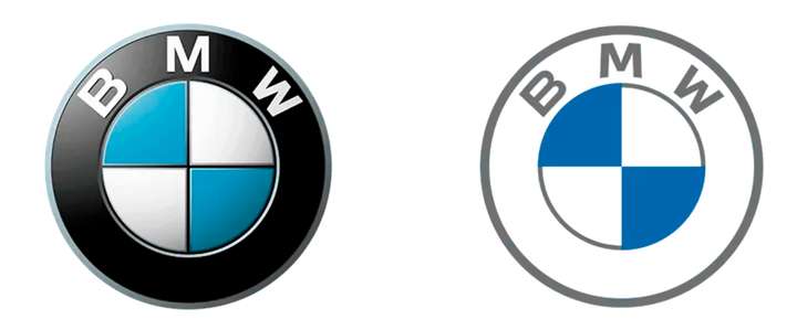
thought something similar, that the flat design is a blessing
for the people who cut logos from foilson the other hand I wonder how someone comes up with this idea.
(i know is design)
Where everything in the world is 3-dimensional and we are actually
adapted to this circumstance
( yes on screen is pseudo 3-D, but...)Win 11
CPU: AMD Ryzen 5 9600X, 6-core.
GPU: Nvidia Geforce RTX 5070. -
@Subpath said in Usability bullseye:
Where everything in the world is 3-dimensional and we are actually
adapted to this circumstance
( yes on screen is pseudo 3-D, but...)You're not a member of the flat earth society then - you need to shape up, the world is truly flat it seems, don't believe all this 3D nonsense, it's just an artefact
It's certainly flat from a VS perspective at least LOL
It is indeed the best of times for you.
Ha ha, it is if you just bought a pile of black vinyl on the ultra-cheap