Offset Path GUI Change
-
While using the offset path panel, I came across what I initially thought was a real bug and with some reading of previous posts to see if anyone else had come across it before adding it to the list, I find out that it seems to be a 'feature' that has been concocted to perform another function.
I'm referring to the preview checkbox.
Now, a checkbox in any language is a binary thing, it's either checked or it isn't - it's what it says on the tin - there is absolutely no place for a third (or fourth or fifth) option that cycles through a bunch of checkable options ! While some may actually find this useful, it (to me at least) is up there with some of the worst bits of basic GUI function defacing I've ever seen /RANT")
Now, I've been doing this stuff for a number of years let's say and I cannot imagine what a newcomer would think when they come across this.Can we please have this removed and replaced with a correct method of choice selection - perhaps add another checkbox to do what the third option does or at the very least, use some other way to perform that third function without interfering with it's basic binary operation - let's not go adding a brake function to the clutch pedal again.
For those of us who would never use that third option, it becomes utterly confusing.
There, I feel better now
-
@Igull Can be fixed easily. I have to see how it would go with the 2 state mode.
-
The low-opacity preview option in the offset path panel is certainly a well hidden feature that the average new user would not stumble upon too easily.
I don't mind if it stays the way it is now or if a dedicated second control checkbox is added, just so long as the lowered opacity preview is NOT completely removed! I LOVE that feature and use it daily in my work .
Even though a checkbox is traditionally a binary choice, the preview checkbox changes icon shapes based on what is selected, so it makes sense to me. I can also understand the view @Igull brings to the discussion.
Maybe it needs to be a three choice dropdown? none- preview- low opacity
-
@Boldline said in Offset Path GUI Change:
Maybe it needs to be a three choice dropdown? none- preview- low opacity
Yes, I can understand the functionality wanted from an artistic standpoint and it should be kept
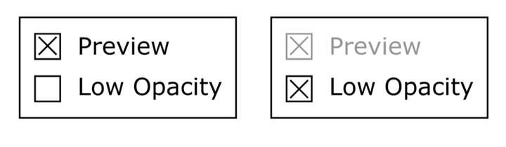
How about a two checkbox option, one checkbox gives the traditional preview/no preview and a second opacity checkbox that overrides and greys out the preview checkbox ? IIRC, for the two checkboxes to indicate interaction, they should be within the same bounding box (might be wrong on that 'though).
Neil