VectorStyler
    • Categories
    • Unread
    • Recent
    • Tags
    • Popular
    • Register
    • Login

    Folder icon looks great - group icon seems to blend in with name of group

    Scheduled Pinned Locked Moved General Discussion
    4 Posts 3 Posters 5.3k Views 3 Watching
    Loading More Posts
    • Oldest to Newest
    • Newest to Oldest
    • Most Votes
    Reply
    • Reply as topic
    Log in to reply
    This topic has been deleted. Only users with topic management privileges can see it.
    • BoldlineB Offline
      Boldline
      last edited by

      I like the new folder icon for "folders" in the font manager in the newest update. The "group" icon being letters seems to blend in some with the letters in the name.

      I'll see if I can find some options that might work better in my opinion. final decision is of course, up to you @VectorStyler
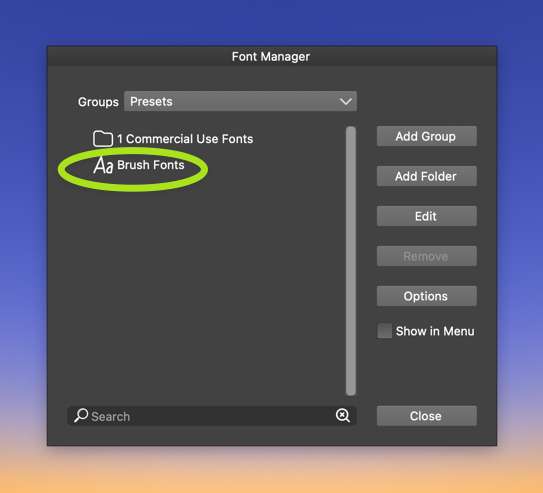
      0_1671400358256_3495c085-304f-486d-a356-def28b2505c7-CleanShot 2022-12-18 at 16.51.44.png

      🍎 macOS Tahoe 26.2, Mac mini (M1, 2020), Chip Apple M1, Memory 16 GB
      Cintiq 27QHD Display and LG Ultra HD Display

      b77B VectorStylerV 2 Replies Last reply Reply Quote 2
      • b77B Offline
        b77 @Boldline
        last edited by

        @Boldline Maybe just a few pixels more between the icons and the label could improve this?
        Not to say that I'm against better icons.

        MacBook Pro (Intel) running Monterey 12.6.4

        BoldlineB 1 Reply Last reply Reply Quote 2
        • BoldlineB Offline
          Boldline @b77
          last edited by

          @b77 yes that could also help

          🍎 macOS Tahoe 26.2, Mac mini (M1, 2020), Chip Apple M1, Memory 16 GB
          Cintiq 27QHD Display and LG Ultra HD Display

          1 Reply Last reply Reply Quote 0
          • VectorStylerV Offline
            VectorStyler @Boldline
            last edited by

            @Boldline Will add a bit more spacing.

            1 Reply Last reply Reply Quote 0
            • First post
              Last post