Order of arrangement icons

-
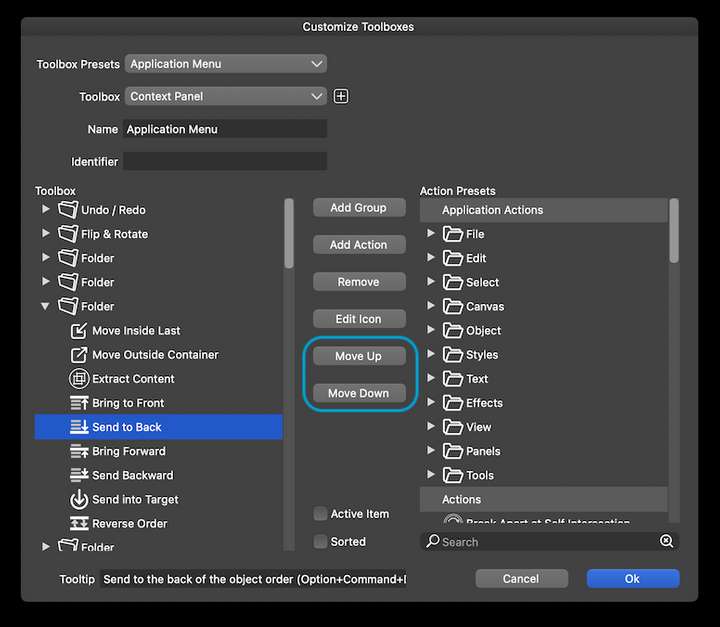
@encart Well… you can rearrange them with the 'Move Up' and 'Move Down' buttons in 'Customize Toolboxes':
-
@Ingolf said in Order of arrangement icons:
THAT icon order in Affinity always annoyed me. That means I have to mentally stop and decode the icons again. 'Aha, you have placed two related icons furthest apart because... because?'
I would need to go in the other direction on that one: two of the buttons move things forward and two of them move things backward. Your preferred order separates BOTH sets of related buttons from each other.
The Affinity order seems most natural, as it places the resulting layer order of the commands from back to front.
-
... but when you find one icon that is related to what you need to do, the other one is far away. It's like putting cake forks between forks and knives in the cutlery drawer.
-
With the Affinity (normal) ordering, if I need to move a layer backward, and I find the button that moves it to the very back, then the one that moves it one layer to the back is right next to it. If I need to move a layer forward, and I find the button that moves it to the very front, the one that moves it one layer forward is right next to it. With the order you are listing, there is a button in between either way.
-
Well, my eyes look for symbols, decode them, then I move the pointer. I simply find it easier to find (decode) and remember the location when things are strictly grouped like in VS. On top of that, I find the symbols in VS much easier to decode.
I'm referring to my own preferences. I don't find Serif's order natural at all when used in a drawing program.
Because you see, when two icons that are relatively similar are next to each other, I take a second or two to make sure I've understood them correctly. Worst case I use the tooltip to make sure I understand and an extra second is wasted.
The model in VS I never, not once doubt because the two juxtaposed icons on the left clearly identify their function by the icons next to each other much more clearly showing they have the same functionality (just opposite each other) and the two icons on the right are clearly related in the same way.
Viola; good and effective usability. In Affinity you have to let your eyes run all the way over all the icons.
-
This is why it's great that VS has so many customization options! Edit the order to what works best for your workflow
-
…or just use the shortcuts. It's what I do.

MacBook Pro (Intel) running Monterey 12.6.4
-
I actually prefer the Affinity style symbols for these functions - they read better at a glance to me - but it's not a big deal. Keyboard shortcuts are the best!
-
@Boldline The problem with Affinity's symbols for ordering is that they look similar to
the symbols for Boolean operations AND those for Draw on Top/Above/Behind.
Too much visual similarity, IMO. -
@b77 said in Order of arrangement icons:
…or just use the shortcuts. It's what I do.
True but quite a few of the shortcuts require:
- That you remember them (I try but use too many programs to remember them for long)
- That you let go of the mouse/pointing device (to use Option+Control+Up for example)
- Or touch those keys using one hand with a focused, slow touch that only a squid can compete with
That is why I often (during the most hectic drawing phase) move some panels close to/over the artboard - and even make custom panels with the features I need when working in these phases with the mouse on the canvas. No keyboard interruptions. Just A, V, G, C etc. at most - my left hand seems to remember them for me.