VectorStyler
    • Categories
    • Unread
    • Recent
    • Tags
    • Popular
    • Register
    • Login

    A set of new icons for the context panel

    Scheduled Pinned Locked Moved Features and Ideas
    31 Posts 5 Posters 42.5k Views 4 Watching
    Loading More Posts
    • Oldest to Newest
    • Newest to Oldest
    • Most Votes
    Reply
    • Reply as topic
    Log in to reply
    This topic has been deleted. Only users with topic management privileges can see it.
    • S Offline
      Subpath @Victor Vector
      last edited by Subpath

      @Victor-Vector said in A set of new icons for the context panel:

      I was confused about the folder path you listed here as it did not correspond to how my VectorStyler is installed on Windows 11
      My default program install folder for VS is here:
      c:\Program Files\NumericPath\VectorStyler\vector\data

      It's not as complicated as it seems.
      I use the C : Partion only for the Windows Operating system
      and install Programs on a Partion F:
      and all other Data, Games and Programs which i only try out
      on G: to keeps things a little in order.

      Win 11
      CPU: AMD Ryzen 5 9600X, 6-core.
      GPU: Nvidia Geforce RTX 5070.

      1 Reply Last reply Reply Quote 0
      • S Offline
        Subpath
        last edited by

        @b77, @Victor-Vector

        In the meantime i tried also the Folder @Victor-Vector mentioned
        c:\Users\Your_Name\AppData\Roaming\NumericPath\VectorStyler1.0\vector\data\

        and create here the settings folder with Icon file in it

        The Icons Sets are listet in the Toolbox Panel
        but would not shown in the Context Bar

        @b77
        they did also not shown as i load the other
        files you have send me

        Win 11
        CPU: AMD Ryzen 5 9600X, 6-core.
        GPU: Nvidia Geforce RTX 5070.

        1 Reply Last reply Reply Quote 1
        • S Offline
          Subpath
          last edited by

          @b77

          please correct the File Path above
          c:\Users\Your_Name\AppData\Roaming\NumericPath\VectorStyler1.0\vector\data\

          seems the correct Path where VS store settings
          and the Icon Set are listed in the Toolbox Panel
          if a user put it here

          While
          your Partition:\your Folder\VectorStyler\vector\data
          will mysterious also work, it seems me not the right folder
          for that

          Win 11
          CPU: AMD Ryzen 5 9600X, 6-core.
          GPU: Nvidia Geforce RTX 5070.

          1 Reply Last reply Reply Quote 0
          • b77B Offline
            b77 @Victor Vector
            last edited by b77

            OK guys, whatever the location is, it looks like nobody can install the icon packs. πŸ€”

            Could be a limitation or bug of the app, or it's some other file that needs to be installed
            which I didn't find. I don't know, and the developer probably didn't get around to test.

            I posted a download link for the screenshots with the icons in original post of the thread.
            Please download those.

            MacBook Pro (Intel) running Monterey 12.6.4

            1 Reply Last reply Reply Quote 2
            • IngolfI Offline
              Ingolf
              last edited by

              Didn't @VectorStyler add the new icons - or new icons inspired by - in the latest update?

              🍏 macOS Sequoia Apple Silicon

              b77B 1 Reply Last reply Reply Quote 0
              • b77B Offline
                b77 @Ingolf
                last edited by b77

                @Ingolf Those included in version 1.1.086 are indeed the three selection mode icons suggested by VictorVector.

                This is a new set of icons for all the icons of the context panel, those three selection modes, and more.

                And three workspaces.

                But for whatever reason it won't install… so I'm posting a link to screenshots instead:

                https://www.dropbox.com/sh/rnugyaf9tb88evi/AACARHpG8F3G-IeqXXeCvmZsa?dl=0

                MacBook Pro (Intel) running Monterey 12.6.4

                1 Reply Last reply Reply Quote 0
                • IngolfI Offline
                  Ingolf
                  last edited by

                  I have this now from the default install:

                  0_1685490806390_3fb2d9f1-eda2-4252-8052-a9d8b92111f1-image.png

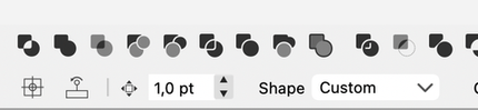
                  Room for small improvements πŸ™‚ The image icon has too many details. They result in a mess of tiny details that are hard to recognize, and it doesn't look much better on my Mac, where I've scaled up the interface a bit. Gradually, all the lines and slashes/shadings look indistinct and muddy, so I suggest the icons move towards the flatter and simpler:

                  0_1685490972539_b1d2889b-4e89-4e45-8f9c-cfb2a9c15800-image.png

                  As can be seen in this icon:

                  0_1685491127297_d4a8ae0e-b6dd-4a1f-ae72-d2e5466f0907-image.png

                  Strokes/outlines in icons are not really nescessary so I prefer that icon too in real life use. πŸ™‚

                  🍏 macOS Sequoia Apple Silicon

                  1 Reply Last reply Reply Quote 1
                  • S Offline
                    Subpath
                    last edited by Subpath

                    @b77

                    here a video to see the result after my latest try
                    ( the one with the .vstyler File )

                    i know that the Step with loading the Quick Panel.vstool
                    wasnt necessary in this latest try. But i made it to show
                    whats happen here too

                    Here the Video

                    Win 11
                    CPU: AMD Ryzen 5 9600X, 6-core.
                    GPU: Nvidia Geforce RTX 5070.

                    b77B 1 Reply Last reply Reply Quote 0
                    • b77B Offline
                      b77 @Subpath
                      last edited by b77

                      Thanks @Subpath, indeed they won't load… 😐

                      At least the screenshots can be downloaded, so you guys can see how they look and offer feedback:

                      https://www.dropbox.com/sh/rnugyaf9tb88evi/AACARHpG8F3G-IeqXXeCvmZsa?dl=0

                      MacBook Pro (Intel) running Monterey 12.6.4

                      1 Reply Last reply Reply Quote 0
                      • S Offline
                        Subpath
                        last edited by Subpath

                        Of course it would be better if i could judge the icons in VectorStyler.
                        But despite all attempts, so far no way could be found to install
                        them on Windows.
                        .
                        .
                        When i looked at the screenshots with my normal user eyes.
                        The following points stood out for me.

                        The icons in the light version are too dark for my taste,
                        especially the boolean icons.
                        0_1685528653443_Light-Icons-too-dark.png

                        Like the icons in the dark version better.
                        Generally, i prefer to use the dark mode.
                        .
                        .
                        I can't really get along with the Undo icons.
                        For some reason I don't like the design.
                        0_1685528543062_Undo Icons - Dark UI-1.png

                        maybe more like this one ?
                        0_1685528363463_Undo Icons - more like this.png
                        .
                        .
                        Find the space between the groups, sometimes too big
                        I think it makes the bar look so empty.

                        Win 11
                        CPU: AMD Ryzen 5 9600X, 6-core.
                        GPU: Nvidia Geforce RTX 5070.

                        b77B 1 Reply Last reply Reply Quote 0
                        • b77B Offline
                          b77 @Subpath
                          last edited by b77

                          @Subpath said in A set of new icons for the context panel:

                          The icons in the light version are too dark for my taste,

                          You're right, corrected.
                          See the new screenshots for Light UI mode here:
                          https://www.dropbox.com/sh/rnugyaf9tb88evi/AACARHpG8F3G-IeqXXeCvmZsa?dl=0

                          ………………………………………………………

                          I can't really get along with the Undo icons.
                          For some reason I don't like the design.
                          0_1685528543062_Undo Icons - Dark UI-1.png

                          These fill the square area for an icon better IMO, but OK, I tried (reverted) to a
                          horizontal design for the Light UI screenshoots.

                          ……………………………………………………

                          I find the space between the groups, sometimes too big
                          I think it makes the bar look so empty.

                          A bit of space between the groups of icons is necessary.

                          Unless you mean that on bigger screens this space should be fixed and not grow to
                          "fill" the available space?

                          ………………………………………………………

                          Any other opinions based on the screenshots?
                          https://www.dropbox.com/sh/rnugyaf9tb88evi/AACARHpG8F3G-IeqXXeCvmZsa?dl=0

                          MacBook Pro (Intel) running Monterey 12.6.4

                          S 1 Reply Last reply Reply Quote 0
                          • S Offline
                            Subpath @b77
                            last edited by Subpath

                            @b77

                            First of all, of course, i still want to tell you how much
                            i appreciate your work, with the creation of these icons.
                            Well done
                            .
                            .
                            Took an extra look at the standard UI Light variants of VS
                            and noticed that there are already a lot of dark icons.

                            In general i could say that i don't like already the VS standard Light UI versions.
                            I think i am apparently so used to the Dark version.
                            .
                            .
                            Im fine with that between the groups should be some distance.
                            I noticed my previous complaining, as i compared the screenshots
                            of the "New Icons Dark" Versions in the same magnification.
                            Compare "New Icons - Dark UI" and "New Icons 2 - Dark UI"
                            I know that shows different Icons, so compare only the space.
                            .
                            .
                            As for the Undo arrows, i was fine with the 45 degree rotation.
                            I just found that little tail at the back a bit strange. Even though
                            I know that you probably referred to the original Undo icons.

                            Found the new Undo Icons (the straight ones) you made in
                            the Light Version also good looking.
                            0_1685559309097_New Undo Icons - Light UI.png
                            .
                            .
                            Here's what I thought of:
                            But i think i like your new ones more.
                            0_1685558406233_Undo-try.png

                            Win 11
                            CPU: AMD Ryzen 5 9600X, 6-core.
                            GPU: Nvidia Geforce RTX 5070.

                            1 Reply Last reply Reply Quote 0
                            • S Offline
                              Subpath
                              last edited by Subpath

                              @b77

                              for the Quick Panel Icons
                              i like that the Combine Icon (from Boolean)
                              and the Composite Icon are a bit different

                              and find the "Select and transform members of grouped Objects" Icon
                              very well made
                              0_1685559122114_members of a group.png

                              Win 11
                              CPU: AMD Ryzen 5 9600X, 6-core.
                              GPU: Nvidia Geforce RTX 5070.

                              1 Reply Last reply Reply Quote 0
                              • First post
                                Last post