Ten points for VectorStyler, my experience and ideas

-
After a week of playing around with VectorStyler with the aim of seeing if VS can become my new working environment, I am happy to share my experiences.
After Freehand's assassination, I was forced into Illustrator. That's why I'm very happy with this new promising true vector application. I am impressed with the feature richness of VS. Some are very good. Take for example the ShapeBuilder Tool which works super well and intuitively compared to Affinity which struggles between Flood Fill and ShapeBuilder. But there are some important fundamental issues that I believe need to be improved upon to become a professional player.
MY ISSUES AND IDEAS
1. Selecting objects
Show segment and node indicator selection vs bounding box
Marquee selection for larger number of objects or cmd 'A' shows only bounding box frame. It seems that there is a threshold value somewhere that determines the display. My preference is to show all selected segments and node indicators using 'shape editor' tool. WYSIWYG like; What you "select" is what you get (and see).
This way you can see what has been selected, what the structure of line segments is and how it is composed. Valuable information.In editing (de)selecting more complex assemblies, the user experience feedback is unclear and confusing. Because the bounding box selection indicator is outside the visual window. Especially at high zoom factor it is difficult to select or deselect objects. Larger object select easier than smaller ones. Sometimes it feels like VectorStyler is arbitrary willing to select or not.
A selection settings option: 'Always show segment indicator and nodes.' would be welcome.
I have the idea that selection in general is quite unstable. Also text fields with the text tool cursor. Sometimes it will and sometimes it won't. After duplicating an item, a selection of the copy triggers/flashing also the original. Weird.
2. Selection of multiple styles
Selections with contains more than 1 color, font, stroke weight, style, size etc. gives no feedback in the way of being 'multi-defined' in selector panels. Selectors seem to give first selected value. This should be of blank or a multi-defined sign like a gamut warning or so.
This is important UX feedback to check if there are any errors in your artwork such as an unintented strange styles.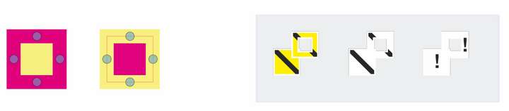
To the left selected items, to the right suggestions for color inspector
To the left selected items, to the right blank fields3. Scaling
Scaling options are difficult to manage and spread across various menus and panels.
Suggestion:
Put scaling options in the Transform panel as a global setting
☐ item
☐ stroke
☐ corners
☐ effects4. Organizing and selecting objects in the layers panel
Especially when using layers with large number of items, sorting or splitting items to other groups is difficult.
Some ideas for options in the pop up context menu:- select all items in layer
- select inverse selected in layer
- promote groups to layers
Move selection by dragging indicator/radio button to another layer without the need to copy/paste or open the layer and dig into a list of sometimes more than 1000 items.
5. Use of tints
Would be nice to use tints for colors. Tints are useful especially when linked to global or spot colors.6. Effect like Feather.
All blurry image effects are affecting the total shape. A feather keeps the inner shape sharp. This would be a nice feature. like so...
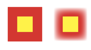
Just a simple rectangle with Feather applied in Illustrator7. Selection count, objects or items
Selection count inspector top left in contextual panel alternately indicates the number of selected count in 'objects' or 'items'. In my layers panel they are all {Path}s. What's the difference?8. Self snapping
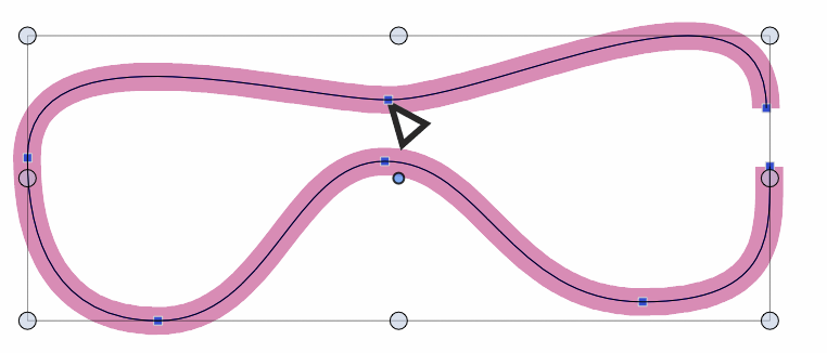
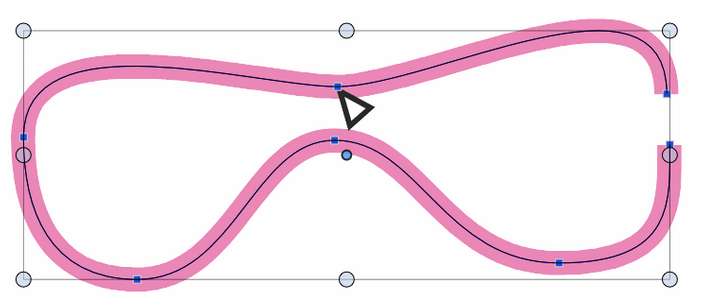
Snapping a multi-node path only wants to snap to itself with the end nodes. A middle node does not snap to another node on the same path. See image; the top middle node in pair of glasses shape will not snap to the node below. Not a big deal but strange.
9. Selection X cross hair
The selecting/transform tool gives an X crosshair snapping to objects. This shape is quite disturbing, X means 'NOT/NO', quite large and sometimes gets in the way. I think this important indicator should be present in the indicator settings and change in shape (cross, circle square) and size.10. Settings extensive and unclear
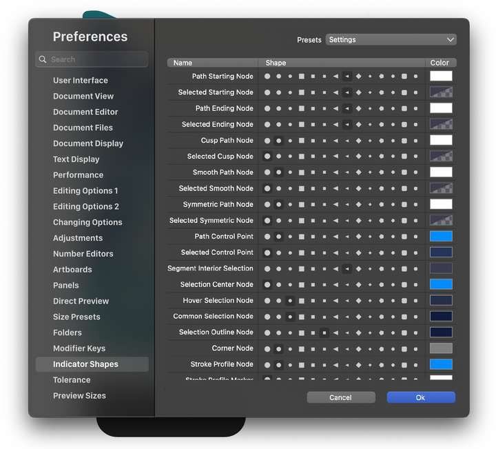
Contrary to the previous point, I find that the settings are sometimes quite extensive and unclear what they stand for. Most annoying is the huge list of node indicators. If I want to change something it is very difficult to find the right name for the node I am looking for. Trail and error and finding out by deduction takes a long time.
Changing shape, size and color for nodes is desirable but I think choices can be made easier by grouping options.So far my 10 points. Feels a bit like complaining and criticizing but it's not meant that way.
All the best, Ayo
Job: Designer, illustrator
Field: Corporate Branding, Typography, Maritime illustration, cartography
Software: Freehand(formerly), Fontographer, FontLab, Illustrator, Indesign, Qgis, Moi3D, Cheetah 3D, DelftShip -
@Ayo Great list, thanks!
Some questions and comments:
- Selecting objects: Show segment and node indicator selection vs bounding box
Does this refer to showing nodes in normal selection mode?
Currently this indeed is blocked for too many nodes, as it can slow down the UI.
Maybe an option for the number of nodes would help here.- Selection of multiple styles
Yes, this is a problem currently. I will try to find a solution for this in the future (same goes for Appearance panel).
- Scaling
Can be done, except for corners.
- Organizing and selecting objects in the layers panel
Added this to the backlog as a feature.
- Use of tints
Possible to do it already with Global and Spot colors from the Color Palette panel (set some of the colors to Global or Spot using the panel menu).
- Effect like Feather
I think this should be in 1.2 (later).
- Selection count, objects or items
"items" is shown when the selection contains mixed selection types. For example some nodes and then some other objects are selected.
- Self snapping
Snapping panel menu -> enable "Snap to Original" option
- Selection X cross hair
I will try to find a solution for this.
- Settings extensive and unclear
The Preferences panel will be simplified a bit in 1.2 but the node indicators list will be the same. Not sure what is a good solution here.
-
@VectorStyler said in Ten points for VectorStyler, my experience and ideas:
Thanks for your comment and openness.
Selecting objects: Show segment and node indicator selection vs bounding box
Does this refer to showing nodes in normal selection mode?I think for both the pointer (now called 'Transform tool' which is a bit odd, more like a Common Selection tool) and the Shape Editor tool.
I'm afraid I'm entering into one of the fundamentals of Vectorstyler. A very important one for the user experience and workflow for any vector drawing program in general. If you want I can dive in and give my opinion on it.
Currently this indeed is blocked for too many nodes, as it can slow down the UI.
Maybe an option for the number of nodes would help here.A 'threshold' setting could be a possibility next to a selection option setting: 'Always show segment indicator and nodes' but still two more settings to explain.
-
@VectorStyler said in Ten points for VectorStyler, my experience and ideas:
Snapping panel menu -> enable "Snap to Original" option
Naming it 'Snap to Self' could be more clear for users.
………………………………………………………………
The Preferences panel will be simplified a bit in 1.2 but the node indicators list will be the same. Not sure what is a good solution here.
I'm resubmitting this idea:
MacBook Pro (Intel) running Monterey 12.6.4
-
@b77 said in Ten points for VectorStyler, my experience and ideas:
Naming it 'Snap to Self' could be more clear for users.
………………………………………………………………
I'm resubmitting this idea:'Snap to itself' or 'Allow self snapping' is indeed more self-explanatory.
As for the indicator shapes, I think the problem is not so much understanding the shape and size and color as understanding the species names. What is the difference between a Common selection node, Path control point or Stroke profile node.
Try yourself
Draw a simple line and change the appearance of the nodes. Not easy at all. -
@b77 I will try to implement that preferences view.
EDIT: but one problem is that the color setting and the shape setting are not done on the same indicator set (colors can be changed for more indicators).
-
@VectorStyler If I understand correctly, some colors are hardwired to multiple indicators.
In that case, listing those indicators one after the other could help with this — so that
when you hover the color button all four can highlight with a thicker light gray stroke
around the button?Also: using an empty row as "separator" between groups of indicators can definitely help.
Question is what the criteria for grouping should be used — selected and unselected?
Object mode and Node editing mode? -
-
@b77 I love your idea for the node Indicator Shapes preferences!
So fast and easy to see!
