Pen Tools Dot
-
As previously posted, I am very pleased with the new design without the rounded corners. Much more mature and no residual forms.
Even though I know that there are more important issues that need to be resolved, I feel free to give reflections on the design. Just to pass on a user's experiences to the developer. I do this more often and often a huge conversation arises which is not my intention but may not do any harm also.
In line with the new modern window and panel design, I would like to draw attention to the pen tool symbol. The mother of all symbols in a drawing program, this symbol must be of excellent quality. The fact that it symbolizes a classic dip pen is a convention that we have to deal with. However, this does not mean that you can make it contemporary.
If you, as a professional, want to switch to VS as your primary drawing program, you know that you will spend hours staring intently at the tip of the pen tool to create new things.
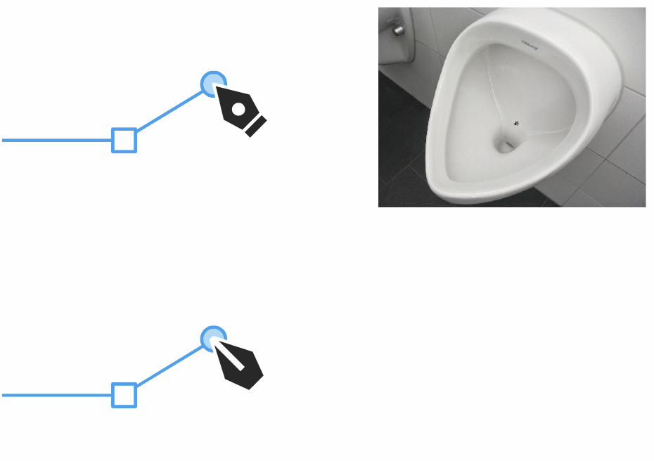
My problem with the pen tool symbol lies primarily in the fact that the focus lies not on the point. This is caused by the distracting white dot. A target like the fly in a urinal, known as a urinal fly or urinal bee. An image or mark placed inside a urinal to encourage users to aim in a particular place so as to avoid messes and reduce cleaning costs.
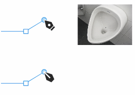
Secondly, it is still too classic. Eliminating the dot is already a good step to make the symbol more modern. In addition, the cuff, which is more decorative, could be omitted in the context of the new sleek design.
Where lies the target?
-
The gap in the new one could be a little narrower for my taste
-
@Subpath said in Pen Tools Dot:
The gap in the new one could be a little narrower for my taste
It's just a suggestion to illustrate my point. No optimized design. However, I immediately noticed when creating the symbol that a center line must be thicker than the white overall outline. For overall weight balance and preventing filling up in tiny size.