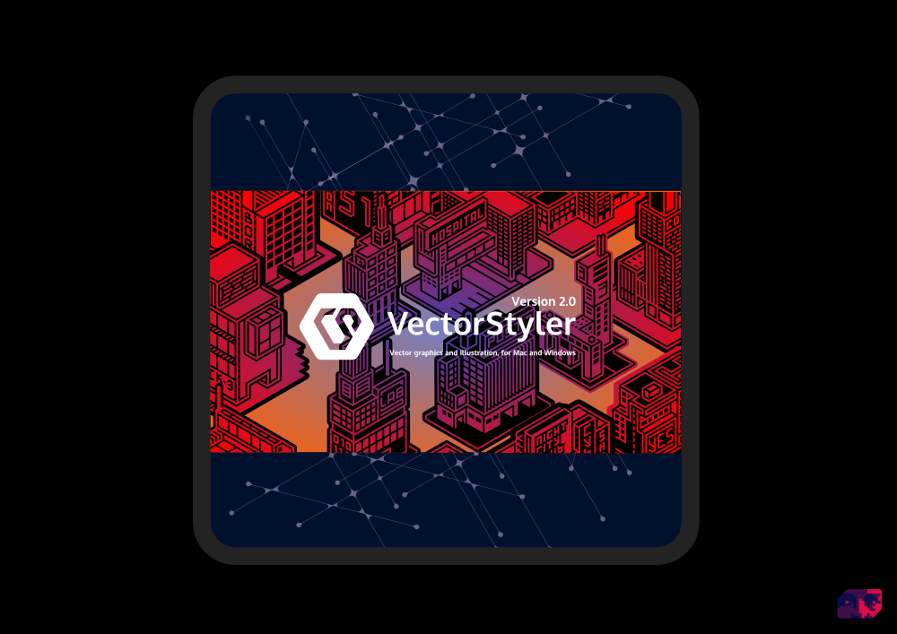
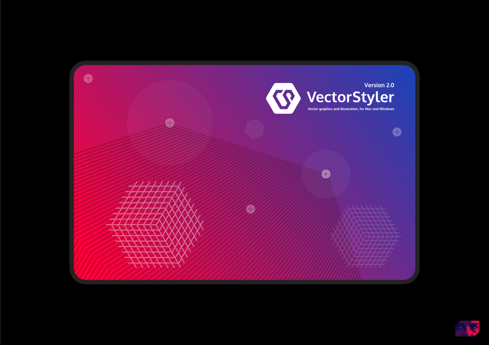
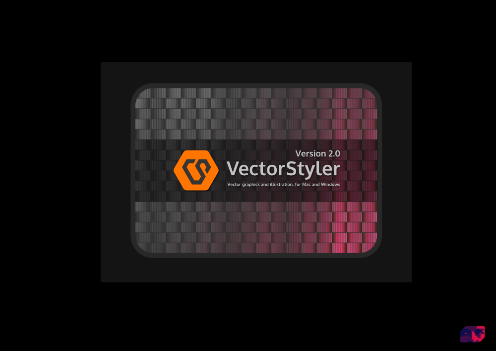
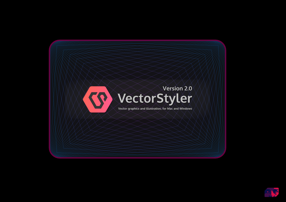
New VS logo and splash screen concepts
-
@VectorStyler
Makes me a little scared.
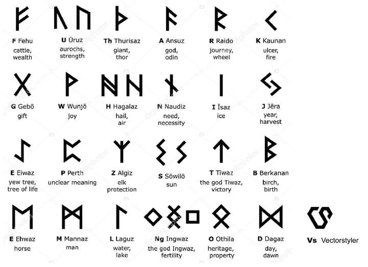
Beware that it is not too much like 'Runic' Glyphs.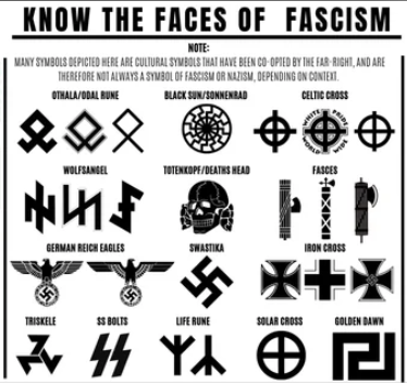
-
sorry, find this comparsion way too much

-
@Ayo I also have to disagree with you on this one. "Fascist symbols" never crossed my mind when I saw the logo idea. Instead, I immediately saw the creative way the "V" and "S" were connected. I love the simplicity of the overall design because that works well as a symbol and for printing on shirts and letterhead and anything else. I love most of it - there are some things I would change but each time I think of ways to modify it, I go back to what he has already as to not break the pattern.
All symbols, both for good and evil use lines, angles and shapes and at some point there's always going to be some crossover. How can there not be? Everything has already been done before, there is nothing new under the sun.
-
@Ayo Swastika or HAKENKREUZ?
To know watch https://www.youtube.com/watch?v=HspDwwVv1Fk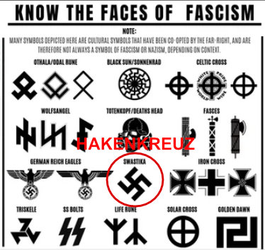
-
@Ayo
Don't be scared")
I want to cut off the speculations.
There is nothing sinister behind this logo.
Let me explain it visually:
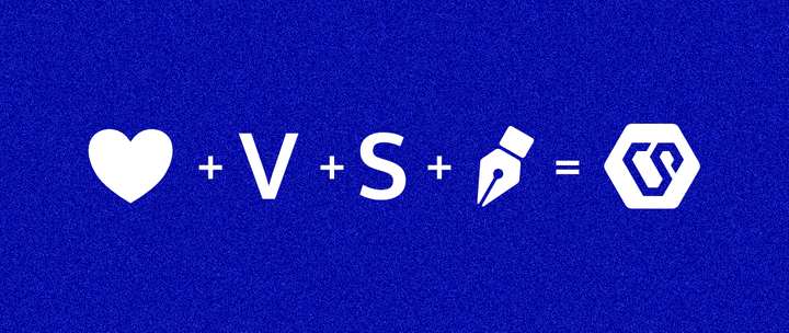
I love vector styling/drawing - the result, abstract logo representing this equation.
End of story

-
@visualrevolt said in New VS logo and splash screen concepts:
Let me explain it visually
Primitive tools typography -
Oh Lordy…

I didn't want to comment on all this for obvious reasons, but hey…Did you guys consider that Ayo might have went too far by bringing up
a supposed fascist look of VRev's logo, and now you guys are throwing away
everything he said, when in fact he might be right about the rest?@VectorStyler Sigh… Stop at a gas station like I told you in private.
I'm available to help with the "technical requirements" for the right kind of gas
and can also recommend some great gas stations. -
Well, that's the thing about associations.
At no point did I have any associations with fascist symbols
when it came to the Logo from @visualrevolt and
I find this comparison a bit far-fetched.I've seen similar typography in sci-fi, so that Logo
has more of a futuristic sci-fi vibe to me. -
@Ayo said in New VS logo and splash screen concepts:
@visualrevolt
Why a logo with shabbily forced grid-based typography that harkens back to the limitations of digital technology of the 20th century? Vectorstyler can do better!
Unlimited (possibilities) should be the message.I can understand what you are saying about the forced grid-based typography in the example provided. That limitation was what I was referring to when I said I liked most of the idea. You phrased it much better than I could have said.
I am not a software logo designer but his example inspires me to get creative and play around with possibilities. What tangible ideas do you have for improving the logo?
-
Lets close this discussion for now.