Lets close this discussion for now.
-
Why closing? One last thing...
I can only respond to what I see, what I feel and share my first associations. In addition to the aforementioned objections to which b77 referred, the runic thing. What you certainly don't want with a new logo are negative associations. There is potential because of the design languange used. I just wanted to warn about that.
I am also not very happy with the current VS logo. It's too detailed with faint contrasts lost in the small sizes. In the Apple Dock the icon conflicts quite a bit with Pages. However, I do like the simple concept of the initial capital of the name that reminds me of an approving checkmark and victory of course.
The point is that if you want to design a new logo you will first have to ask yourself what kind of message and/or feeling you want to express. From there you can also evaluate or judge design proposals.
-
@Ayo Initially the app icon had a faint gradient from orange to lighter yellow-orange.
Should it go back to that so that it looks noticeably different than the orange icon of Pages?
-
Glad you're coming back to it. Don't dare say anything anymore. But when it comes to branding, the following remarks.
I think restyling the current logo is the best path to take. Keep the good and remove and/or improve the bad. Build on what you have if it is fundamentally/conceptually solid. And that is good. Adjustment or restyling does not alienate or disaffect early users or market partners.
The good
- Capital 'V'. Simple robust and strong concept with a positive connotation (victory), that is exactly what a logo needs to make it strong;
- the folded/divided asymmetrical marking with the one longer leg (checkmark) makes the V distinctive.
The bad
- Overall line characteristics are over-rounded (similar to the old Vs user interface panels). This means it lacks sharpness and shape contrast. Could be a little more angular, sharp edged;
- fingerprint background, too vague, makes no sense for the intended use. Is not visible and therefore does not communicate what it was once designed for
The doubts
- The light sun or spark, don't know exactly what it should be. Could be a better spark or better left out. This creates a stronger logo;
- the color orange, originally a weak color and equal to the primary corporate color of competitor illustrator. Doesn't have to be a problem. Orange is friendly and warm. Perhaps more distinctive by making more use of the warm yellow gradient to reddish orange. However a single mono color variant should be possible if a logo is strong.
To get back to your question; I don't really see a difference in your before > after example. The left is slightly darker than the right. I think if you want to improve you really have to do something in shape and color and not just pull some color or contrast curves.
-
@Ayo Thanks for explaining how you see it — answers below:
The white dot and yellow lines are a stylized
path point (a node) with crosshairs around it.
So it's not a sun, nor a spark.The dotted concentric circles in the background
bring focus to this white node and crosshairs.The concentric dots are visible when switching
between apps with Cmd-Tab (the icon is big enough),
and I was careful so their color and size won't steal
focus from the white node and crosshairs.So indeed these background dots are not visible when
the icon is small, but that is no reason to eliminate them.
As an example, the Safari icon also has those small
subdivisions around the compass despite them not
being distinguishable when the icon is in the Dock.……
- Overall line characteristics are over-rounded (similar to the old Vs user interface panels). This means it lacks sharpness and shape contrast. Could be a little more angular, sharp edged;
This has nothing to do with the rounded UI (which btw,
I think you guys would like if the context panel would
be flush with the background like this).So anyway…
Since the big white V-object is the tip of a stylized drawing tool
(think stylized pen or Apple Pencil tip) with a "wave" or "wing"
that makes it look like a 'V' (vectors, VectorStyler)……Making the tip of this "pencil tool" less round (pointier) than
the white dot is out of question — would be a mistake — and
making the 'V' shape much less rounded (or not rounded at all)
would make it visually incompatible with the roundness of the
white dot. (And a square dot would be a terrible idea).……
The doubts
- The light sun or spark, don't know exactly what it should be. Could be a better spark or better left out. This creates a stronger logo;
Sorry, I disagree… this would leave us with a
quirky 'V' shape that has… no point, nothing
vector-related.
And the app cannot afford a generic logo like
established apps (AI or CDR) or mistakes like
what Quark did with their logo back in 2005.……
- the color orange, originally a weak color and equal to the primary corporate color of competitor illustrator. Doesn't have to be a problem. Orange is friendly and warm. Perhaps more distinctive by making more use of the warm yellow gradient to reddish orange. However a single mono color variant should be possible if a logo is strong.
If I remember correctly, I changed the background from
the initial yellow-to-orange gradient to plain orange
not because I didn't like it, but because it reduced
contrast at small sizes.I'll try to arrive at a middle ground with the color of
the background, to make it sufficiently different
from the orange of the Pages icon, and send the
updated icon to the developer.But regarding the logo itself (the shapes and their
roundness)… see above.Thanks again!
-
@b77
So you see that all the meaning and symbolism attached to it is not recognized by everyone. Be aware that a logo does not have a leaflet with a legend.Thanks for your explanation.
-
@Ayo OK, so… Yesterday I downloaded Pages from the App Store (didn't
have it, I don't use it) just to see what is the "conflict" between the icons.I expected the orange of the VS icon to be identical to Pages, but…
it doesn't seem that way to me — VectorStyler's icon is a slightly darker
and more saturated orange (MBP screen here):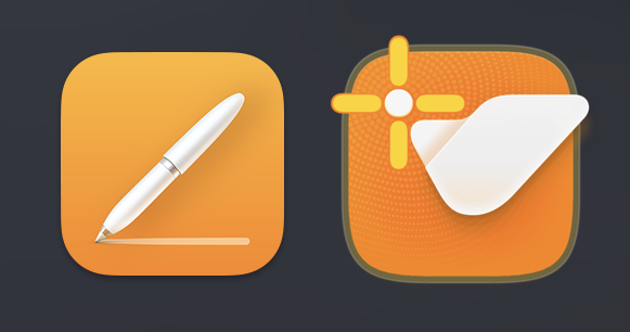
Maybe it's something else you meant?
(And I'm not sure the color similarity with an app that not everybody has
in the Dock would be a valid reason to modify the other one).Thanks.
-
@b77
Of course it is different in all aspects if you put it side by side and compare. I did not claim that the icon is equal to, but conflicts with. Besides, it was a sub-argument in my motivation.Lets close this discussion for now.
