NEW UI

-
 Can you create a UI interface for a traditional vector program with a white background? And make the icons colorful. It won't cause too much visual fatigue during long - time work.
 -
@monsterfox There is a "light" theme, and the canvas background can be made white in settings.
The color icons is a bigger issue, but of course icons can be customized in VS 1.2, so this is solvable also.
-
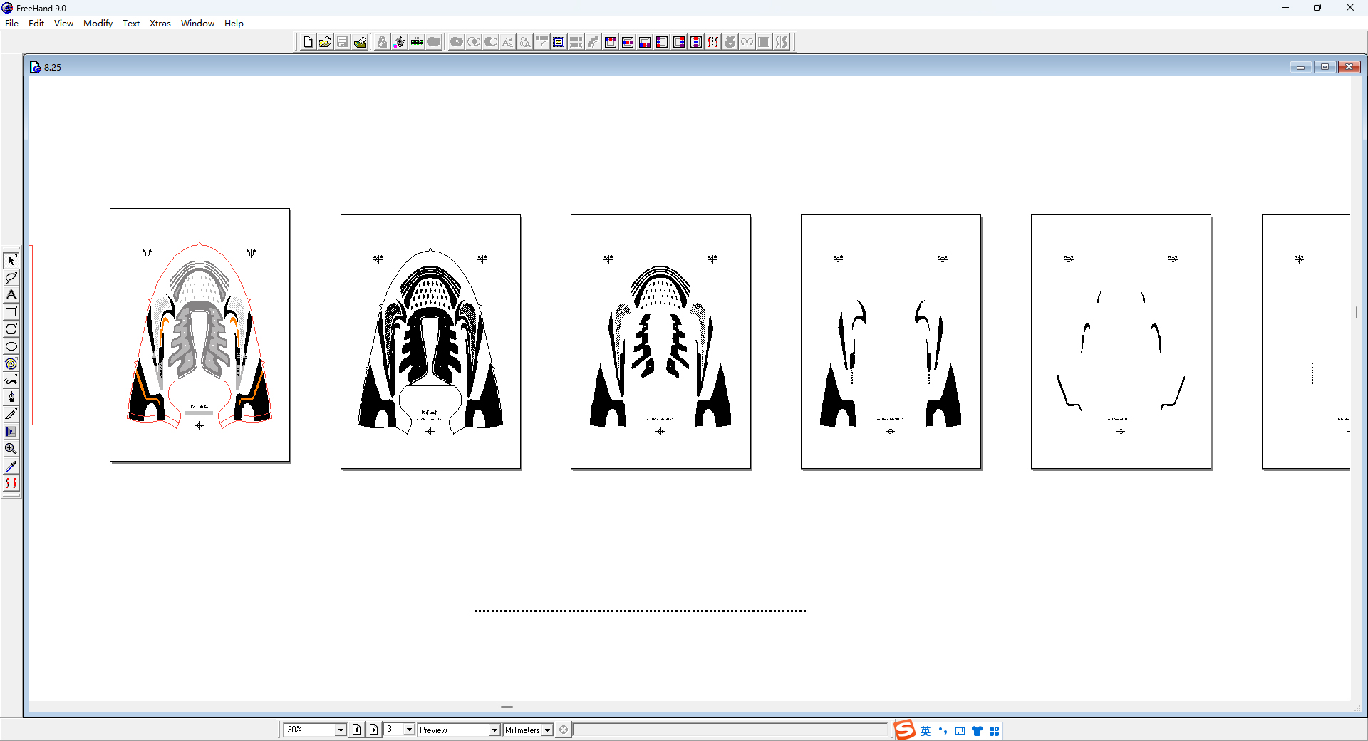
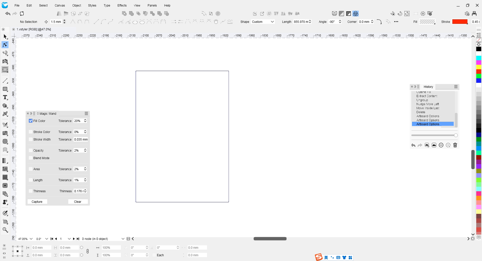
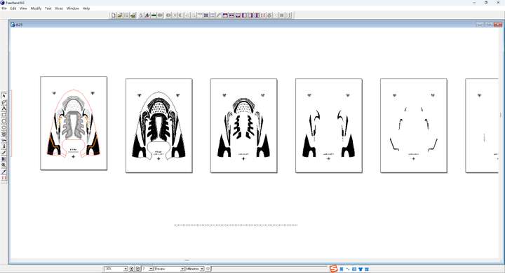
@VectorStyler 1. The VS image above me has a background modified with the theme of light. The original background is not white yet. Overall, it looks a bit glaring and somewhat inharmonious when combined with the panel. I need you to modify and produce it. 2. The icons may need to be made by myself. The workload is a bit large. Can these original icons be exported for secondary color modification? By the way, what is the pixel size of this icon?
-
@monsterfox said in NEW UI:
Overall, it looks a bit glaring and somewhat inharmonious when combined with the panel.
I will check this (dont have freehand), is the issue with the page shadow?
By the way, what is the pixel size of this icon?
All the icons are vector, in a 100x100 point (not pixel) grid. I might add a color icon set in later versions as an option, but the default icons of VS will stay monochrome.
-
@VectorStyler The colors in the operation interface I modified above will be more harmonious than those in the original light theme. However, the colors of the toolbar and the panel are still a bit disharmonious. There should be some shadows. It is too flat. It is a bit difficult to express. Only by testing the detailed matching of colors multiple times can one feel it.
-
The colors in the operation interface I modified above will be more harmonious than those in the original light theme. However, the colors of the toolbar and the panel are still a bit disharmonious. There should be some shadows. It is too flat. It is a bit difficult to express. Only by testing the detailed matching of colors multiple times can one feel it.
-
@monsterfox said in NEW UI:
However, the colors of the toolbar and the panel are still a bit disharmonious
Could this be a contrast issue? Did you check the "extra light" theme?
-
@VectorStyler said in NEW UI:
Could this be a contrast issue? Did you check the "extra light" theme?
I feel that the area outside the red line is not harmonious. It's a bit glaring and will make people's eyes involuntarily look outside. It's uncomfortable. -
@monsterfox said in NEW UI:
It's a bit glaring and will make people's eyes involuntarily look outside. It's uncomfortable.
Ok, but what would be the solution for this? Color icons would make it even more glaring.
-
@VectorStyler said in NEW UI:
Ok, but what would be the solution for this? Color icons would make it even more glaring.
The effect is similar to this. Now, the gray color of the left - hand toolbar and the menu bar still needs a little modification so that it is not so dazzling. -
@monsterfox , it sounds like you want exactly the things I do not want in a user interface.
-
An overly bright image (too much white) means more energy hitting the eyes means more work for them to do, wearing them out more quickly when working longer sessions. A darker theme means the ability to work longer without the eyes becoming overworked.
-
Too much color in the interface can throw off your ability to perceive the colors of the document, as can too much contrast in the interface. The ideal surround would be a flat neutral gray right in the middle of the tonality range, to avoid allowing the eyes to be biased by too dark or too bright a surround, but if not right in the middle, better a bit darker than a bit lighter, to keep the eyes rested. In case you haven't seen some of these:
https://www.youtube.com/watch?v=ELDj6vqPgMI
The surrounding interface can easily throw off your perception of the document you are working on. The more neutral the interface is, the less of an impact it will have on your design.
-
-
I have only used dark interfaces and mono icons for as long as they have been available in programs due to professional and color perception-related reasons. In this context, mono icons drawn with light lines fit perfectly.
On the other hand, I can hardly stand light themes with mono icons drawn with dark (or worse, medium) gray lines, and I can hardly believe they are real when I see them. Ugly, harder to decode, hard to tolerate. I think they only really worked in the past before dark themes, because the icons were colored.
Anyway, not a relevant discussion for me. I just think light themes have different conditions for working properly.
-
@fde101 Everyone's work habits and the program interfaces they use are different. It's fine to find what suits you. You should be used to the interface of Illustrator software, while I'm used to the interfaces of FreeHand and CorelDRAW. I have been using them for more than ten years. It's very difficult to change this habit.