Talking about popup windows...
-
For some reason I keep getting a negative feeling about the popup window design and styling. It's cluttered, inconsistent and immature.
A few observations that can help make the design more crisp and consistent.
- The triangle pointer on the edge of the frame is unnecessary. Feels a bit childish, like a LibreOffice or Powerpoint-like environment. Also does not match in directional sense with the black triangle above it.
- Behandel het zwarte driehoekje als "more" symbool als andere.
- Frame has too thick a line in my opinion, a bit blunt.
- Be consistent with color and gradient swatches;
– frame or no frame; (none imo)
– square or rectangular; (square imo)
– too much drop shadow, preferably no drop shadows behind (gradient) swatches (dirty).
An exercise
On the left the original, on the right with adjustments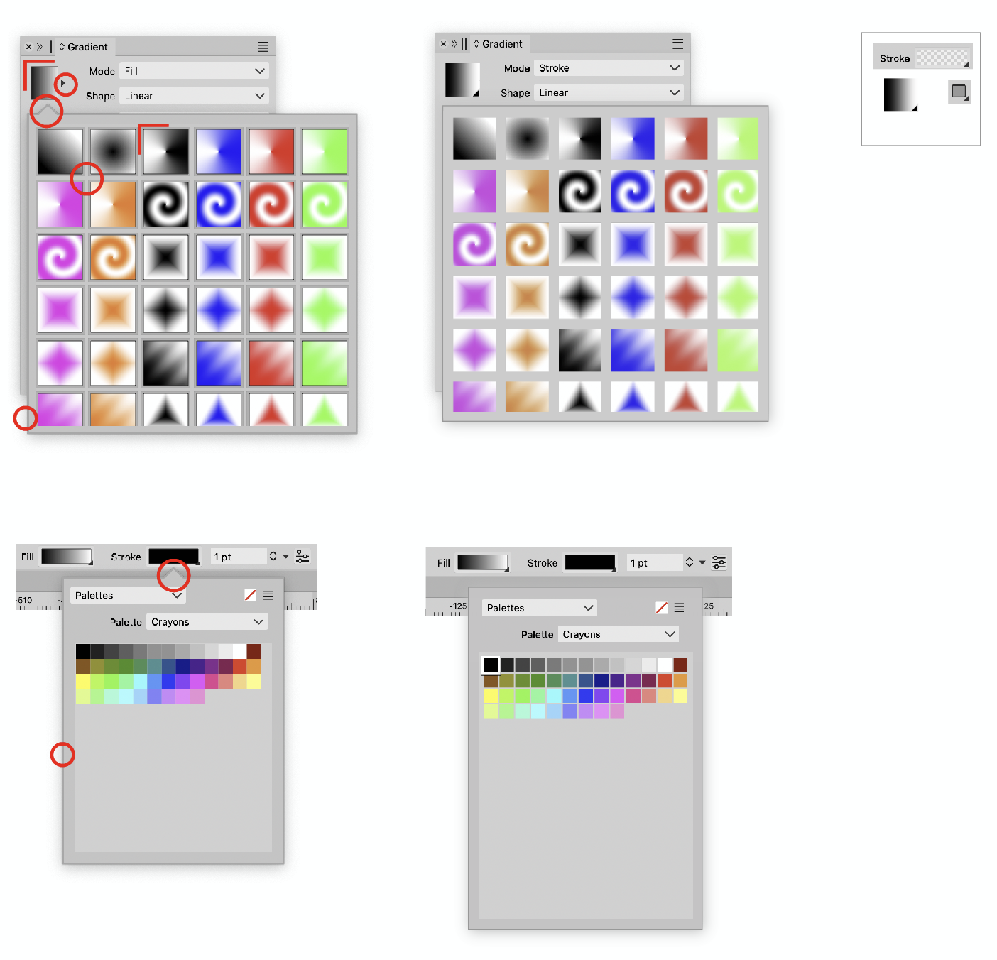
-
@Ayo I opened a bug on this. The drop shadow is controller by MacOS, but I think it can be disabled.