Font Preview Size
-
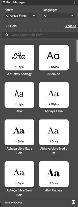
Check out Freehand excellent font preview where the selected word is used for preview within a small preview window.
-
Just as another Example for Inspiration purpose.
CorelDraw has also a separate Fontmanager. But the intern
one is also pretty fine. -
@Subpath Cool! I like it. I only would make it a panel, or tab, instead of a drop menu. IMHO is more handy.
-
@Daniel An screenshot?
-
Fonts should be similar to how Stroke\Brush style has its own panel and we can change a stroke from its panel.
Should be similar with changing Fonts → a Font panel (tab, floating panes) → open it and font previews be there.
Select a text box\frame → go to tha panel and hover with the mouse pointer for a change with the font under the cursor to reflect in the text frame inheriting the size or rather! its string of symbols (not height) to fit the text box\frame as some fonts are either too wide or too narrow.Which reminds me of a VectorStyler UI bug (Windows 10 Pro ×64 bit 22H2):
change the font of the UI to a narrow or condensed font
bug: some on the text on panels\menus gets cropped ("obscured") at the far ends (changing UI scale does not help) -
dont worry, i am also more on the panel side because
it is moveableit was just for inspiration and to show how CorelDraw have
solved this i think it may also fit in a panel -
This is what it looks like in current versions of QuarkXPress:
I personally haven't made friends with this yet and am likely to keep this hidden most of the time, as I don't feel like this is an appropriate feature for professional desktop publishing. For a vector design tool it might make more sense for certain use cases, and for certain categories of "off-the-cuff" type designs, but not for professional work in a desktop publishing app, and considering the price point of QuarkXPress that is clearly what the product is intended for.
Professional publishing designs should generally have all of the font selections embedded into text styles and the styles used instead of having one-off inline font choices made from a panel like this. I could see a preview like this being nice if it were selecting full styles from the document's collection of text styles, but for individual fonts I think those choices should normally be made when setting up the styles, then those styles used during the creation of the document. It would therefore make more sense for this to be part of the style editor, rather than an independent panel - but again, that is for a desktop publishing app; for a tool such as VectorStyler, it makes enough sense to offer it separately if people find such a thing useful; I'm not really sure how often I would use it myself.
-
@fde101 when making books you work with styles, is true. But when working with illustrated books, covers, children activity books, etc, font choosing is important. Need of design are wide and people works their way. The standardized professional way of work offenly is bypassed by creative people.
-
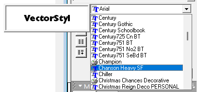
Here's how FreeHand does it. And frankly, I prefer this. Because your text can be completely out of view, and you still get to see how it appears. The only improvements I'd make to this is to have option to toggle which will decide whether the list themselves show the typeface or not (because it is much faster when they're just a list of names like here) and two, to be able to dynamically resize the preview window to see everything I've highlighted.
")
-
@marce said in Font Preview Size:
@fde101 when making books you work with styles, is true.
Not just with books, but with just about any kind of formatted content - newsletters, newspapers, etc.
But when working with illustrated books, covers, children activity books, etc,
Covers are a different sort of beast, and are more of an illustration project than a publishing project. Agreed that the regular use of styles for a cover is not as relevant as for the body of a publication.
On the other hand, I am less inclined to agree that styles lose relevance when making "illustrated books" or "children's activity books" - there is ultimately still a level at which consistency throughout such books is perfectly relevant when creating a cohesive product and while such books are likely to contain a larger number of illustrative works (which individually might fall outside the normal use of styles) there are still elements that tie these things together for which the primary use of styles is still a good idea.
font choosing is important.
That is true for any kind of project in which text is involved if that project is going to be distributed.
Need of design are wide and people works their way. The standardized professional way of work offenly is bypassed by creative people.
True, and sometimes that is completely appropriate, other times it is bypassed to the detriment of the outcome or to the time taken to achieve it. Different projects and different situations call for different ways of working and different sets of tools. As I said in my other post:
again, that is for a desktop publishing app; for a tool such as VectorStyler, it makes enough sense to offer it separately if people find such a thing useful