Arrange order icons - more intuitive and clean option?
-
the "arrange order" icons in Affinity seem more intutive to me than what we have in VS and it looks cleaner:
Here's Affinity's icon set
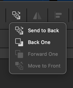
Here is VS:

I like that they can all be in one drop down grouping - making the UI cleaner and preserving more space at the upper level for other future icons for other tools.
🍎 macOS Tahoe 26.2, Mac mini (M1, 2020), Chip Apple M1, Memory 16 GB
Cintiq 27QHD Display and LG Ultra HD Display -
@Boldline yes, but that is two clicks to access
-
I am against of solution like in Affinity.
Because one use these order icons soo often
i want a easy and fast way to reach them. -
The two clicks does not bother me personally but I respect that its an issue for others. What about an option to let the user condense or leave expanded the view? Similar to what we can do with panels to show a minimalist set of tools, double click to see more, etc. Not that it's identical, just the concept
-
It's Vectorstyler's decision, of course, what he wants to do.
As always, I'm just expressing my personel preferences or dislikes
and i like it in the way it is by now.Now, in both cases, I see an additional step that isn't needed at the moment.
Although in the second case, the additional step might be less frequent.All this just to make it look tidier? I actually find the icon bar at the top quite tidy.
Although I do miss a few Boolean icons that were displayed before. -
Just to add to the general poll, I use keyboard shortcuts for managing layer stacks if I want to do that and most of the time it's to push something to the bottom of the stack. I use the menus to refresh myself of which key combinations to use for these scenarios.
In Affinity's case, it makes sense why they've placed "Send to Back" as a default at the top as it's an often used shortcut in many workflows. However, it's also only a one shot press when used. It does not require successive clicks.
The 2nd/3rd options are often used by used for keyboard bound users because it's easier to press that option successively with a shortcut until it's properly moved where it needs to be in the stack. For mouse heavy users, it's easiest to just drag the selection in the Layers panel, but of course it depends on how many objects/layers it's being moved between...
Send to Front isn't often used for multiple selections and even if so, Send to Back might actually be more intuitive to work with. Clicking an object/group in the front of the stack is quickest. To get to the object in the back of the stack, that person might already be in the Layers panel possibly anyway so the 2-click access isn't that much work...
I don't think either method is "bad". I would say the one that has all the options laid out is more for touch or tablet users who don't want to access the keyboard nearly as often. I'm a bit of both but only tablet when needed. . I have a pull tray/drawer I attached to my table to put my large tablet into when it's not being used because I find that I have a better grip of the interface usually when I'm mouse & keyboard-only.
I don't think these icons make it less tidy at all, but I'm on a 4K setup so it may look very different for a laptop user.. I can understand why Affinity needs tidying because they've applied metamorphic rock processes to their applications and so users need clearheaded, decisive labeling and lots and lots of tabbing just to get around and even access the basics...
Anyway, just some thoughts.
-
I am a more mouse oriented user and avoid Shortcuts if i can.
Like to use my second hand to drink a coffee.")
One key shortcuts are fine, two keys also ok. But 3 key shortcuts
sorry, didnt like it. Of course i know Shortcuts allows to work faster,
but i am not in need to be the fastest.To arrange the Order of Objects is also needed with Booleans,
take the "Substract Boolean" as an Example where the order matters.Been using Xara for a while Coreldraw too, in both you could create
your own Toolbar which i did.Its also possibel to create your own Toolbar in Vectorstyler
but sadly they are not free scalable like in Xara and Corel.
So i didnt use this.Here a Toolbar Example from Coreldraw:
.
.
-
@Subpath I know exactly what you mean. Here is mine in CDR. Custom toolbars that are resizable are a big help especially when there are dividers present. It helps make the layout more visually legible.
I think Outline Tools is a default-ish one. I've forgotten because I have saved Workspaces that I use, but I seem to remember I added things like the individual stroke configurations:
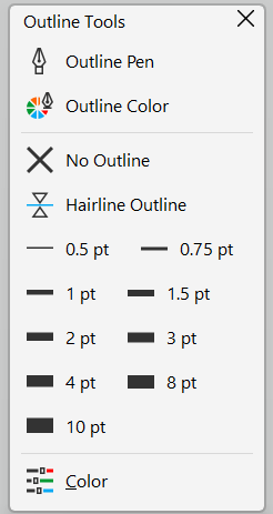
Similar to VS and some of the complaints above about options being hidden by a toggle, some common tools for my workflow like the Pen tool in CDR can't be used by default with keyboard at all (kinda crazy to me), so having these selectable by mouse is certainly handy. VS responds very slowly at times at least on my end, so I tend to avoid using it and referring to shortcuts where possible.
VS's UI by comparison lends itself to mouse-heavy users more than most other design/art programs I've used. CDR's interface is more bare bone until tools are actually in use causing a change in the context toolbar or dockers are opened. Otherwise, it is deceptively simple looking.
-
@VectorStyler
New objects should be inserted above the currently selected object in the layer stack (context aware), instead of always going to the top. This would greatly improve workflow and reduce manual layer reordering.Not sure if this behavior already exists or can be enabled in VectorStyler, but it would be a very valuable addition.
-
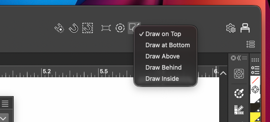
@Honor Is already available
Select > Drawing > Draw Above -
@encart Thank you very much.
 I had no idea it was there. Every time I think VectorStyler is missing something, I end up discovering it already has it
-
@Honor You're welcome. Each of us experiences this
-
We all experience this quite often.
See this thread of mine:
https://www.vectorstyler.com/forum/topic/5677/houston-i-have-a-problem-vectorstyler-solution-is-already-build-inIt's incredible what Vectorstyler thought ahead.
In addition, he's very open to user suggestions, many
of which have found their place in the app Vectorstyler over time. -
@Honor If you encounter things like this, always feel free to post a new thread. That way we all know how others are using the program and if they're having the same difficulties. Some of us don't even know all the options and little operations that exist within the program and so teaching some of us that there are other solutions... for example, I didn't know about this option and I will definitely be using it..
-
There is also an icon dropdown in the upper right corner of the UI that also accomplishes this:
-
@Subpath Totally agree
There are definitely features in VectorStyler that keep surprising me the more I use it. It’s quite impressive how many things already have well-thought-out solutions in place, especially considering the app doesn’t have a 20–30 year legacy behind it.@debraspicher Same here I honestly thought this behavior was something only Affinity had turns out I was wrong. I’ll definitely start using this more now.
@boldline Having it in the UI like that makes it much easier to switch quickly during frequent use. Thank you
-
@Boldline said in Arrange order icons - more intuitive and clean option?:
the "arrange order" icons in Affinity seem more intutive to me than what we have in VS and it looks cleaner:
I like the VS solution better and faster to use. In my opinion, even icons are clearer in VS.