App Icon, still strangely blurry
-
Hi VS Team
please check this comparisson. I am not sure, if this surrounding blur is by choice or not intended. Here is a comparisson between sketch and AD. Both sharp.
https://www.dropbox.com/s/qom4s8s8x2g6s51/vs_appswitcher.png?dl=0When you open the "About" window, the icon is destorted.
https://www.dropbox.com/s/45wm391rg0jnh79/vs_about.png?dl=0Screenshots made on MacOS 11. On MacOS 12 beta this looks the same.
-
@michaelokraj I will try to fix this. Are you using M1 Mac?
-
@vectoradmin This is also happening on my intel version - I think the image just needs to be a higher resolution
🍎 macOS Tahoe 26.2, Mac mini (M1, 2020), Chip Apple M1, Memory 16 GB
Cintiq 27QHD Display and LG Ultra HD Display -
@vectoradmin no. I tested it on a Mac mini 2012 with the latest macOS, as on a MacBook Pro last Generation Intel with macOS monterey beta
-
@Boldline @michaelokraj This should be fixed in 1.0.044
-
@vectoradmin Thank you for getting back to me. Just updated … but the icon has still a blur. have a look:
https://cln.sh/aFVc3K -
@michaelokraj Will keep the issue open. No image was attached.
-
@vectoradmin said in App Icon, still strangely blurry:
@michaelokraj Will keep the issue open. No image was attached.
have a look
https://cln.sh/aFVc3K -
@michaelokraj You could send the developer a timed screenshot — it's saved as lossless PNG, so it doesn't have the typical JPEG compression "jaggies" which don't help identify the issue.
https://www.laptopmag.com/how-to/take-a-timed-or-delayed-screenshot-in-macos
And don't post it here on the forum either — it gets converted to JPEG.
-
@michaelokraj
@vectoradminThe reason why the icons are blurry or halos is that I think it is a resource problem. However, if this is the design, we have to accept it.
I would guess that all users see it more or less this way. Of course, there are differences in the way it looks depending on the monitor environment, etc.I) Factors and considerations
Let's take a look at the resources.
a) 1024 x 1024
/Applications/VectorStyler.app/Contents/vector/data/resources/appicon.png
(fig. Copied from Resources)

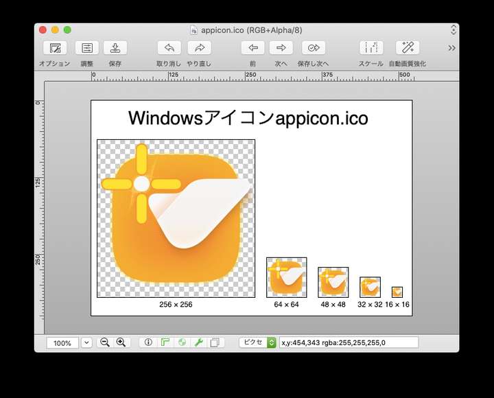
b) (256, 64, 48, 32, 16)
/Applications/VectorStyler.app/Contents/vector/data/resources/appicon.ico
(fig. Copied from Resources)
II) First, the factor
The icons look fuzzy because of the icon design. The originals must have been created in VS. The resources are images.Main factors
- Appearance of the outer corner R-frame: blur, transparency, etc.
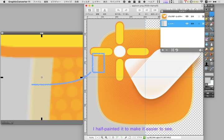
When the blur of the frame overlaps with the background, it appears to stick out or false color is generated. - Inner orange dot pattern and gradient.
The image has lost its original form due to image interpolation.
Solution to 1
Change blur to solid.Solution to 2
If you want to make use of the current design, create a dot pattern for each icon size.
However, I think it is unrealistic to create such a pattern for 64x64 or smaller.
So, you have to change the design. For example, create a rough pattern with solid colors for the dot pattern, etc.III Considerations for issues
issue-1
please check this comparisson. I am not sure, if this surrounding blur is by choice or not intended. Here is a comparisson between sketch and AD. Both sharp.
Causes
The color is mixed with the background gray due to 1. Or false color is occurring.(fig. )
issue-2
When you open the "About" window, the icon is destorted.
Cause
I assume that when you made b) from a), you simply used a reduction process.
The orange part is filled with irregular dots and gradients.
Because of the direct reduction, the image was interpolated and deformed.
At 256x256, the dots have already been destroyed, causing halos.(fig. )
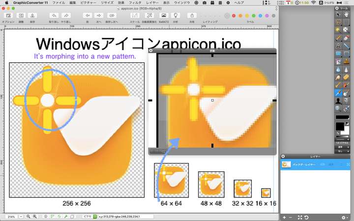
At 64x64 and below, the original taste is lost.
- Appearance of the outer corner R-frame: blur, transparency, etc.
-
@861475_VctSt Are you running the latest version on the Mac? Here in version 1.0.044 the dots of the "spiral" pattern around the white dot are bigger and with more space between them:

…
But indeed there is a difference between the icon for Mac (.icns) and the one for Windows (.ico) — on Windows the spiral pattern around the white dot has an overlap, and the orange background is a bit lighter. I guess it was left that way from an older beta. Easily fixable, I think.Anyway, should the semi-transparent contour around the rounded square be changed to opaque because it creates unintended blur?
Doesn't seem blurry on my Retina screen, but…MacBook Pro (Intel) running Monterey 12.6.4
-
@b77 said in App Icon, still strangely blurry:
Are you running the latest version on the Mac? Here in version 1.0.044 the dots of the "spiral" pattern around the white dot are bigger and with more space between them:
Yes, I do.
My VS is ver1.0.044 for intelMAC. I did a clean install, not an update.By the way, your icon image, from the file name, it is a screenshot, isn't it?
"1628413856594-icon_screenshot.png"What I uploaded is not a screenshot, but the VS resource data itself.
I also took a screenshot.
This result depends on the monitor environment, so it's not really comparable.(fig.)

The dot pattern is now larger.
The outer frame is even blurrier. -
@b77
@VectoradominThis is a continuous post from before.
Since I was curious, I examined the icon data in a different way.
I extracted the ICNS data from Finder by the following procedure.
-Select the VS icon from Finder
-Copy VS from the contextual menu
-Create a new image from the clipboard in Preview
-Eight different icon images are created.I laid out the background in gray to make it easier to see.
(fig.1024×1024)

It seems to look different from the original VS resource.
The dots are also larger now.
It looks like b77's icon image.
It seems that ICNS data is processed in some way in the Finder and clipboard process.
I thought I should scrutinize the original resource itself.In any case, I think the following should be considered for icons of 256x256 or smaller.
-Dot pattern in the orange area
-blurred corner R-frames -
@861475_VctSt Not sure what happened and why your first screenshot was different.
Anyway, can you confirm you downloaded and tested with the .icns file I sent via forum chat?
-
@b77
@vectoradminNot sure what happened and why your first screenshot was different.
The following resources I uploaded in my first post may not be for Mac.
In particular, the ".ico" extension is for Win.- /Applications/VectorStyler.app/Contents/vector/data/resources/appicon.png
- /Applications/VectorStyler.app/Contents/vector/data/resources/appicon.ico
I found ".ics" in another directory. This seems to be the resource for Mac.
- /Applications/VectorStyler.app/Contents/Resources/AppIcon.icns
There are 10 images in "AppIcon.icns".
I exported the 144DPI, 1024x1024 image from this one.(fig)

Anyway, can you confirm you downloaded and tested with the .icns file I sent via forum chat?
I DL'd it from Dropbox.
This is a VS resource.This is the same as your image.
The difference is that yours is a screenshot image (1012x1047). Mine is a resource image.Improvement Case
Below 72DPI 128x128, false colors occur in relation to the background.
Two suggestions for improvement are as follows- Make the blur of the corner R frame a solid color stroke.
- Eliminate the dot pattern.