Padlocks for Purity
-
Hello,
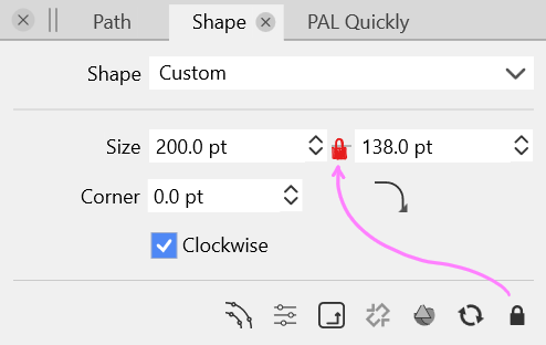
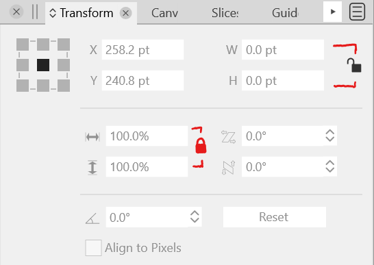
I would like to suggest that all aspect ratio-style locks are in the same place, as close to being between the two numeric fields horizontally or vertically, for consistency.- Also, in the Transform Panel, adding one to the scale value fields.
- Some brackets for vertical numeric fields wouldn't hurt.
Thank you for considering the suggestion.
-
@Victor-Vector I agree with this. It ties in with a feature request I made a couple months back for a flip option to be added that would switch the height and width instantly. Maybe @vectoradmin could add both in somehow at the same time. Here is the link to that post.
-
Those two concepts could theoretically be combined into one control: left-click to toggle the lock, right-click to flip the W/H...?
It might not be the most discoverable (unless explained in a tooltip perhaps), but if implemented consistently it doesn't seem particularly unreasonable.
-
@fde101 your simple idea inspired me to think about how to represent the two controls as visual user interface elements. I took a stab at it, using a link convention in place of the padlock convention.
I presented two options. Of course, there are all kinds of ways to represent.
Food for thought...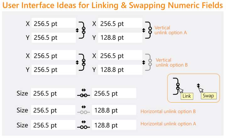
-
@Victor-Vector Those buttons are so small… there's not enough room for two buttons of acceptable size IMO.
I'm wondering, do you guys need to flip the width with the height value often, so that it warrants a button for that? I don't remember ever needing this for objects.
-
@b77 Yeah, I attempted to integrate the "flip values" into the "link" angles but it was muddy.
Indeed, the need for a "flip values" icon I am neutral on, and I recognize it's small in the illustration, more to see if it could be incorporated in both the horizontal and vertical layouts. I would defer to what @vectoradmin and the community would ultimately decide when it comes to these options. -
@Victor-Vector Added this to the current feature backlog (for version 1.2).
-
I don't see much need for the option to flip the values myself, but if someone does have a use for it, this should be a simple enough thing to provide. How to handle it in the UI becomes the question.
A bit more space could be made for the vertical format link/swap buttons @Victor-Vector is suggesting if the curved lines from the link buttons were extended to the top and bottom of the controls instead of being centered on them. If there is a corresponding adjustment to the horizontal scale this would in effect make the whole thing just a bit larger without looking too much out of place.
The horizontal format could be made wider by moving the fields further apart, but not much to be done about the vertical scale on that one if you want to keep them as separate indicators. This is one of the reasons I had suggested having a single control and using two different mouse buttons for the two functions, but I cannot think of a way to represent that visually while still making its function comprehensible. If you want them separated you could also consider putting them side-by-side (a lock or chain link next to the double-arrows for swap) between the two fields, leaving just a bit more space for them.
-
@fde101 said in Padlocks for Purity:
It might not be the most discoverable (unless explained in a tooltip perhaps)
Exactly and then it will only be used by a small minority in the end. A better usability concept is needed.
-
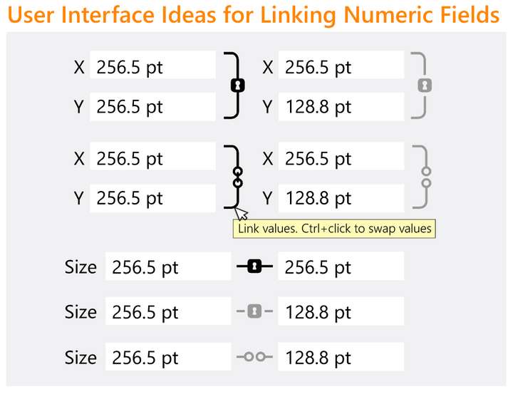
@fde101, @Ingolf, @b77
I couldn't help myself from playing with your constructive suggestions. Here is the result of my geeking out. Handled the questionable use case "swap" with a mod. key and a tooltip, eliminating the need for an extra UI element. I also tried the lock concept as well. Other popular vector software packages seem to favour the links.
I am in no way married to any of this, merely brainstorming ideas!
-
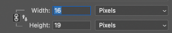
I would personally go with something widely used and known from Adobe - the minds adores familiar objects:
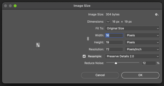
With an additional icon for field swapping - with a tooltip I think people would understand - and it is quite inobtrusive in the interface when not activated / in use:

-
Another idea:
These three buttons (two for copy to the other field, and one to flip values) could pop under the cursor only when you hover between the fields:

…… . .
For fields positioned horizontally only a 'flip values' button would have enough room:
-
@b77 Yes, this idea is a nice solution for both horizontal and vertical, the flip is always between the two numeric fields and the lock/link is always at the right-most end.
@Ingolf I do like Adobe's swap icon better than what I came up with. I was referencing both Photoshop and Affinity Designer to look how they represented lock/link. I had forgotten Adobe has a swap icon. Interesting to see how tiny they felt was acceptable for the icon. -
@Victor-Vector said in Padlocks for Purity:
@Ingolf I do like Adobe's swap icon better than what I came up with. I was referencing both Photoshop and Affinity Designer to look how they represented lock/link. I had forgotten Adobe has a swap icon. Interesting to see how tiny they felt was acceptable for the icon.
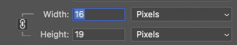
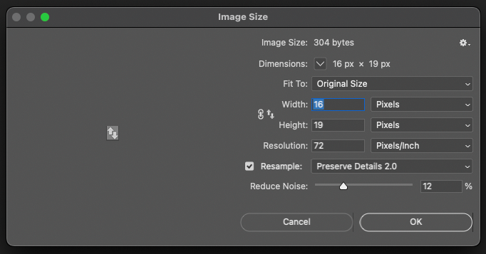
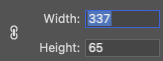
Adobe has no swap icon; the first two images in my post show the existing link fields (constrain dimensions) chain icon.
")

I simply added a standard swap icon to the dialogs to illustrate how both icons could co-exist wasting almost no screen estate:
The real fancy detail in Adobes UI is that the lines are only displayed when the lock dimension icon is pressed. Otherwise the interface is calm and clear:
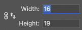
Notice that the standard swap icon I added doesn't attract any unnecessary attention:
-
@Ingolf I see what you did there. Thank you for the clarification.