Panel Sizing - The often overlooked customization
-
@vectoradmin
The shift key for the backward movement
would work, of course and that would be better
than now.How about using the mouse scroll wheel ?
Would be an idea of mine.Position the mouse pointer over the arrow and then
use the scroll wheel to move forward and backward
through the different states of the panel ?Seems a bit too much, but is just an idea.
-
@vectoradmin said in Panel Sizing - The often overlooked customization:
I would suggest using a modifier key to move backward among the panel states, keep the icon as it is (up/down, left/right), move forward with regular click, and backward with shift+click. Would this work?
Yes, keep the icon. I find it quite meaningful even with a personal interpretation. It makes sense.
It would work - but I think only if the shortcut is revealed in the interface, otherwise no one will discover it. A bit too much information for a tooltip, better for a status bar (I think you once said you are considering one with dynamic help).
But honestly - cycling through a handful of states is something I can easily live with for decades.
-
@vectoradmin said in Panel Sizing - The often overlooked customization:
I would suggest using a modifier key to move backward among the panel states, keep the icon as it is (up/down, left/right), move forward with regular click, and backward with shift+click. Would this work?
Yes, Shift- or Option-click would work (with a tooltip?), but if possible display an upward arrows button when the panel is maximized and downward arrows when is at minimum size. If it's not too much trouble.
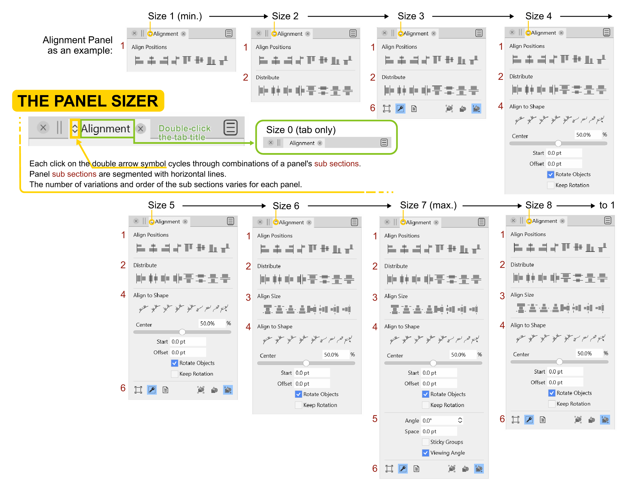
Speaking of 'minimum size':
This would be the panel showing only its tab, when you still want it in the column of panels, but not gone. This would also minimize (show just the tab of) all the other panels stacked under it. -
What I mean:
LATER EDIT: Double-clicking the panel's tab does this already.

Btw, the white text of active panel tabs and also the one inside the panels could be 90% white. It's too bright now, IMO.
-
@b77 said in Panel Sizing - The often overlooked customization:
Btw, the white text of active panel tabs and also the one inside the panels could be 90% white. It's too bright now, IMO.
Well, that should be a user setting.
")
On my Eizo screen the balance between the text and panel brightness is perfect.
-
@Ingolf Eizo makes great monitors no doubt, but the screen of my MacBook is nothing to sneeze at
, and I feel like there would be just enough contrast against the dark grey with text and panel icons at 90% white. Having text at 100% white like the artboard is too contrast-y and a bit distracting IMO.Same with panel text and buttons when in Light UI Mode — it should not be 100% black. 90% is better. (100% black text and icons in UI looks like burnt matches).
All right… UI details…

MacBook Pro (Intel) running Monterey 12.6.4
-
Shift clicking the icon for changing the panel size is a good idea.
I also like @Subpath's idea of using the hover scroll wheel. It would be super fast, and require a degree of mouse precision.
And to incorporate @b77's idea, how about a Shift double-click to instantly minimize the panel to the tab only state? -
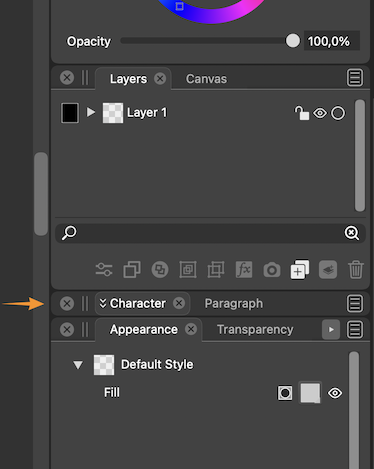
@Victor-Vector I just double-clicked a panel's tab and it does what I suggested…

So tab-only is implemented already.MacBook Pro (Intel) running Monterey 12.6.4
-
@b77 said in Panel Sizing - The often overlooked customization:
@Ingolf Eizo makes great monitors no doubt, but the screen of my MacBook is nothing to sneeze at
, and I feel like there would be just enough contrast against the dark grey with text and panel icons at 90% white. Having text at 100% white like the artboard is too contrast-y and a bit distracting IMO.Of course not but it may appear brighter. My screen brightness is pretty relaxed here, even at 100% strength, perhaps because of the monitor profile I use (created by me with my own colorimeter). Monitor profiles tend to dampen the harsh icecold default profile that is the factory default on most devices (It is mostly a profile suited for office software and youtube). I often get more eye strain from the brightness of my new Lenovo laptop (uncalibrated) than from this far bigger monitor.
I really think this should be an option in preferences. Some with reduced sight may prefer even more contrasty settings.
🍏 macOS Sequoia Apple Silicon
-
@b77 said in Panel Sizing - The often overlooked customization:
@Victor-Vector I just double-clicked a tab's panel and it does what I suggested…
So tab-only is implemented already.I have always said, the best requested features are the ones that are already there. Haha!
I am grateful our discussion has lead us all to a new discovery. -
@Ingolf said in Panel Sizing - The often overlooked customization:
I really think this should be an option in preferences. Some with reduced sight may prefer even more contrasty settings.
I think 'Extra Dark' is the mode intended to maximize contrast — 100% white text on even darker background, or vice versa for 'Extra Light' mode.
-
@Victor-Vector Please update the reference guide accordingly.
-
@b77 Updated!

-
... It would be super fast, and require a degree of mouse precision....
No precision degree of mouse is needed. Because it could also be sufficient
if the mouse pointer hover only over here instead of the arrows.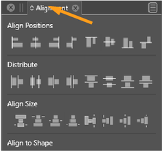
-
@Subpath yes, good point, it does provide way more real estate leeway.
-
The use of the mouse wheel seems a little bit over the Top, even to me.
But it offers a seamless way to scroll back and forth in a panel.And the mouse pointer would be used anyway to click the arrows or move the Panel.
I only see one problem, trackpads on notebooks don't have a mouse wheel and
graphics tablets might have problems too. -
@Subpath I understand what you mean by "over the top". It does seem like the user would be using a very primary control (scroll wheel) for such a small adjustment. But it sure would be the quickest way of sizing a Panel!
I use the scroll wheel on the main window as my go-to zoom method as I have the muscle memory for it from using 3D software. My Panels are generally not overlapping the main window, only sometimes, but since the zoom is centered around the mouse cursor, there is little danger of accidents if the user is paying attention. It seems like the scroll wheel could be used for more things.Re: trackpads in notebooks: Don't they have a double-finger scroll function, or a scroll area? I don't use one, but they may be able to scroll.
It is fun to collaborate thoughts on various ways to make the software more accessible or easy to use. Innovations can happen in such an environment. I really enjoy hearing the different perspectives as it opens my mind to many possibilities. Thank you for unabashedly sharing your thoughts!
-
I don't know what trackpads have to offer as a mouse wheel, and purely personally,
i really don't like Trackpads.Find it equally enlightening to share thoughts and ideas. Using the scroll wheel
for zooming is also my preferred method since i start using CorelDraw, because
it feels so naturally when you have to move forward and backward. -
@Victor-Vector The problem with using the mouse wheel is that besides trackpads, on Mac the mouse scrolling is much smother that the regular mouse wheel.
I think Click and Shift+Click with a tooltip, would be a simple solution.
-
@vectoradmin
...on Mac the mouse scrolling is much smother that the regular mouse wheel...
interesting to know...I think Click and Shift+Click with a tooltip, would be a simple solution....
No Problem for me with that way.