Posters using VS: from blend, image effect,... to pattern etc.
-
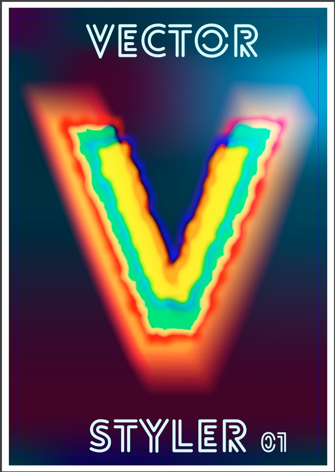
@VectorStyler When I sent you the 5-artboards file, I described an issue with colour blending that I could not see in the pdf file after export (artboard n°3). Could you reproduce this issue?
Thanks
-
@Pat said in Posters using VS: from blend, image effect,... to pattern etc.:
I described an issue with colour blending that I could not see in the pdf file after export (artboard n°3). Could you reproduce this issue?
Yes, I noticed are several problems on artboard 1 and 3. I added this to the backlog, but could not yet find a solution.
-
For what it's worth... an attempt to recycle some previously produced graphics. There some issues with pdf export and colour blending.
Mesh, mask (gradient mask), blending, transparency, transform...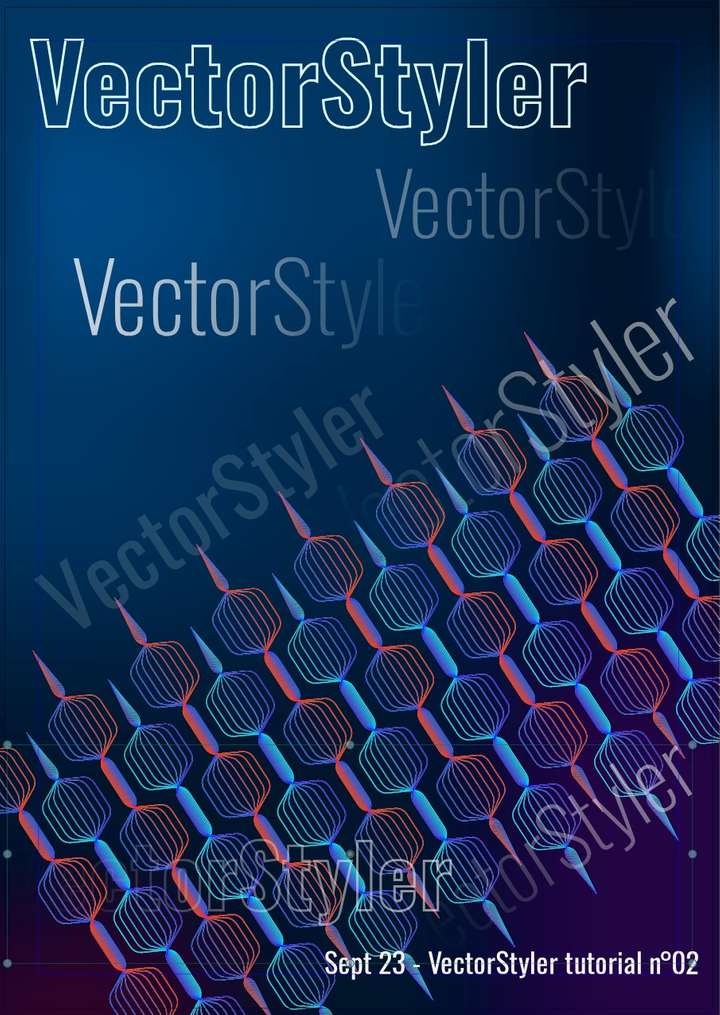
-
@Pat yes, some of these PDF exporting issues can be replicated here also.
-
I wanted to test the knife tool and then the contour tool and the pdf export.
It was first a sphere that I cut in 3 parts (knife tool) and I've applied the contour tool (Q), changed the stroke profile etc.
Many options & some glitches but fun to use... this is an exported pdf cymk, therefore the colours are a bit... well less vivid than in rgb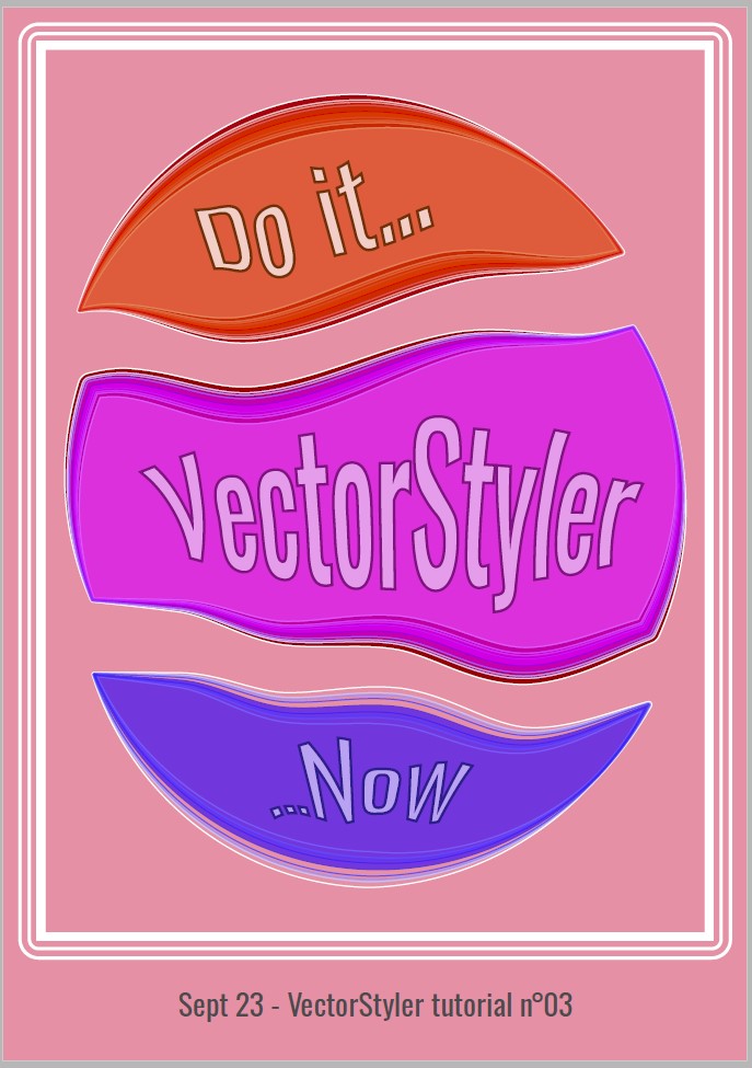
-
@Pat
like the colors
the contour looks nice too -
@Subpath thanks but this is very simple because it's mainly to learn (and memorise, which is more difficult
 ) the many features & functionalities of VS.
I'll start a bigger project when I'll have more free time. -
@Pat said in Posters using VS: from blend, image effect,... to pattern etc.:
it's mainly to learn
Yes, this is also one of my main fun when creating tutorials
and you always learn a thing or two too, when you have to explain a thing -
Very simple design almost monochromatic - Blending, colour gradients & white noise, transform
-
@Pat
great, like it
even for the color
good has nothing to do with complex designs")
so, no need to excuse for simple thingsreminds me a bit on "Russian Futuristic" graphics style
-
@Subpath Thanks
well I don't really know what is this kind of design but I'll look for it -
@Pat
"Russian Futurism" is a kind of painting style
from the 1920 i guessand there was i time where kind of modernize
graphic style came up which going back to this graphic
style languageHere a link i found, not really what i meant
but gives a impression
https://www.google.de/imgres?imgurl=https%3A%2F%2Fmir-s3-cdn-cf.behance.net%2Fproject_modules%2F1400%2F6d57ea38406405.5766c7842bf3d.jpg&tbnid=geLceAPiDX9SBM&vet=12ahUKEwiiwoKk1YSAAxWJmycCHYh2DrIQMyg3egQIARBJ..i&imgrefurl=https%3A%2F%2Fwww.behance.net%2Fgallery%2F38406405%2FHistory-of-Russian-Graphic-Design%3Flocale%3Dde_DE&docid=Nkzbp2oYp8shOM&w=1400&h=1277&itg=1&q=russian futurism graphic illustration&ved=2ahUKEwiiwoKk1YSAAxWJmycCHYh2DrIQMyg3egQIARBJ -
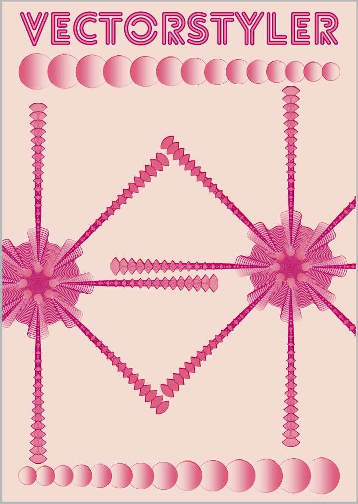
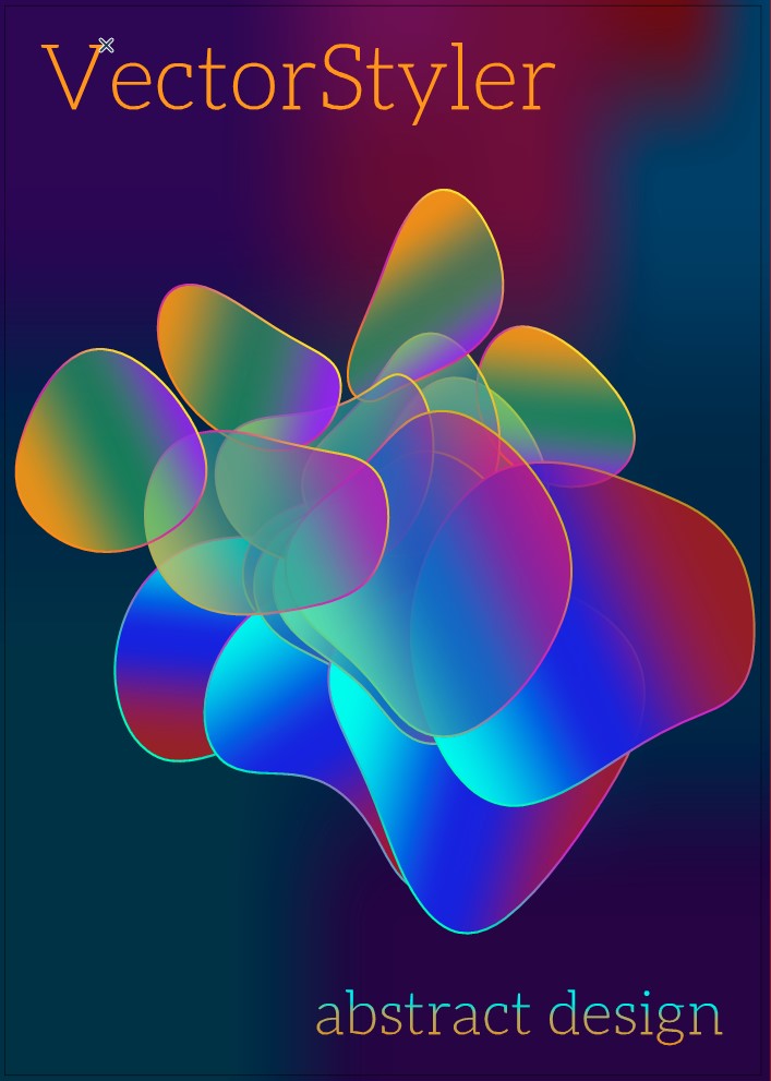
Well, I'll finish the thread with this one for now... VS, it's so much fun and creative to play with, all these shapes and distortions etc.
The starting shape is only one circle
-
I've tried to get a particular poster-look

 but stop now before it is finished because with the blend function for several objects with gradients, VS becomes rather slow.
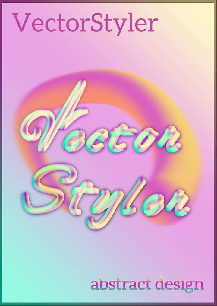
-
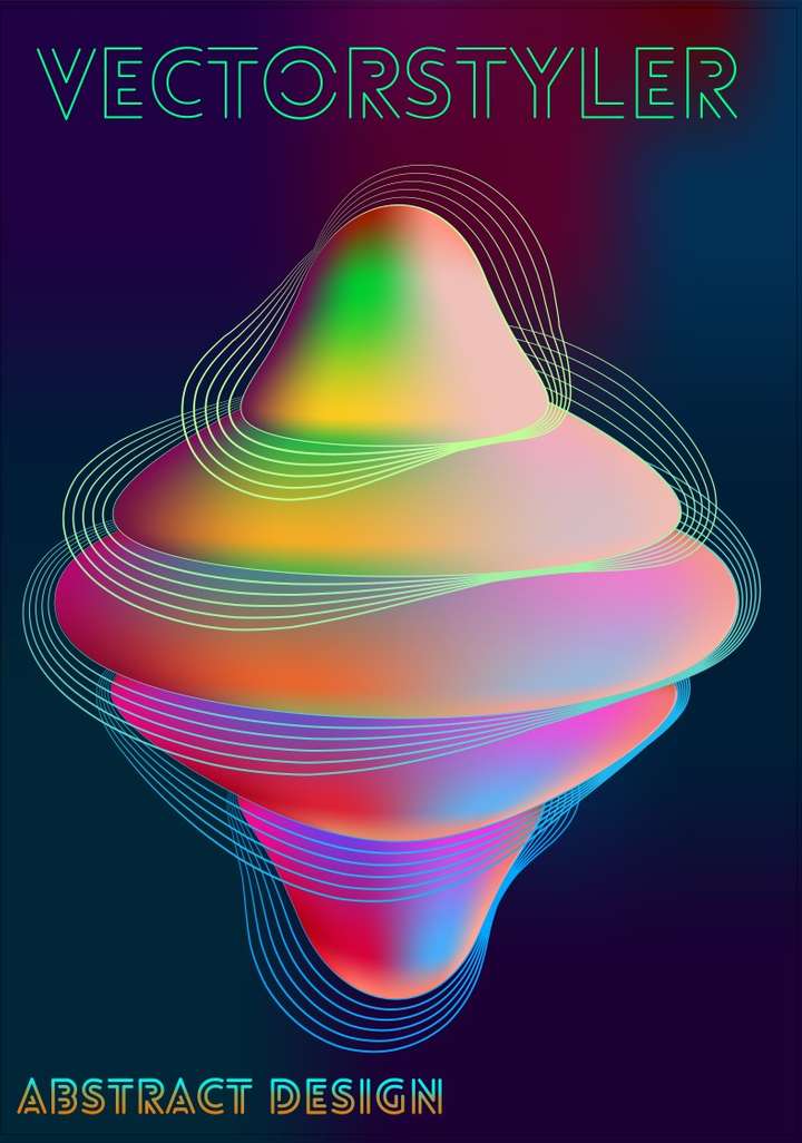
Testing new features, just for fun and WIP:
-
@Pat
How dit you create the gradients ?
Are those mesh gradients ?
I also would guess that a Blur Effect
may involved, is this the case ? -
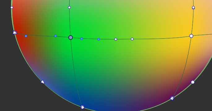
@Subpath Yes, they are mesh gradients and blended objects but I did not apply any blur effect.
I also applied an offset path keeping the original stroke (changed the profile of the strokes, I can't remember if I did it on all the objects or just one?)
-
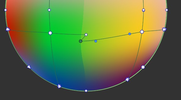
@Subpath I've noticed that to obtain such a colour transition (kind of blurry effect), one has to make sure that the nodes are far apart to avoid overlapping handles nodes
:
-
@Pat
thanks for explaining
btw the colors blends pretty well, like it -
@Subpath said in Posters using VS: from blend, image effect,... to pattern etc.:
@Pat
btw the colors blends pretty well, like itVS feature