VectorStyler
    • Categories
    • Unread
    • Recent
    • Tags
    • Popular
    • Register
    • Login

    text color indicator

    Scheduled Pinned Locked Moved Features and Ideas
    15 Posts 3 Posters 12.8k Views 2 Watching
    Loading More Posts
    • Oldest to Newest
    • Newest to Oldest
    • Most Votes
    Reply
    • Reply as topic
    Log in to reply
    This topic has been deleted. Only users with topic management privileges can see it.
    • 861475_VctSt8 Away
      861475_VctSt @VectorStyler
      last edited by

      @VectorStyler

      That was already mentioned. (Of course.)😅

      I don't know if this is helpful in a completely different app, but in QuarkXpress, the color buttons are displayed in the palette.
      It's useful to be able to see the text color at any time.

      0_1732065506300_2024-11-20.png

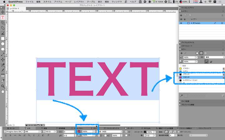
      It would be nice to be able to easily check the text color while working in some way.

      LIc. 0 OS10.15.8
      MacBook Air (13-inch, Mid 2012) / Intel Core i5, 8GB / Intel HD Graphics 4000
      LIc. 1 OS15.7.4
      MacBook Pro (14-inch, 2023) / Apple M2 Pro, 16GB / Apple GPU

      1 Reply Last reply Reply Quote 1
      • 861475_VctSt8 Away
        861475_VctSt @VectorStyler
        last edited by

        @VectorStyler

        ver.1.2.051

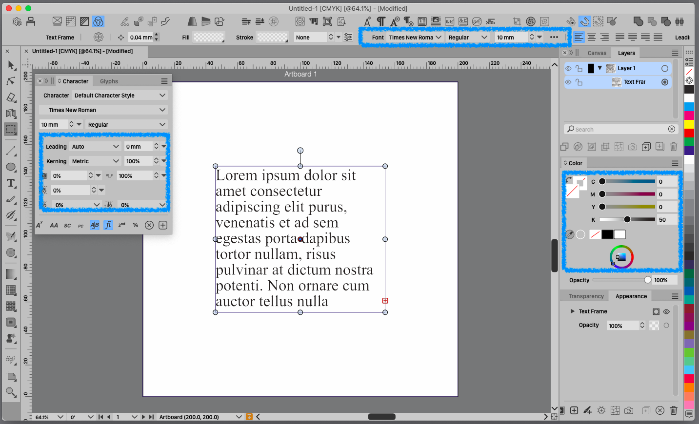
        Added a text color selector to the character panel.
        😃 😃 😃
        Words cannot express how much I appreciate this.
        I was waiting for this.

        LIc. 0 OS10.15.8
        MacBook Air (13-inch, Mid 2012) / Intel Core i5, 8GB / Intel HD Graphics 4000
        LIc. 1 OS15.7.4
        MacBook Pro (14-inch, 2023) / Apple M2 Pro, 16GB / Apple GPU

        1 Reply Last reply Reply Quote 2
        • 861475_VctSt8 Away
          861475_VctSt @VectorStyler
          last edited by

          @VectorStyler

          I have a few suggestions for improvement.
          I think it would be more useful if it looks like the image.
          It would be nice if opacity has a popup and a slider.
          If you think it would be good, please consider it.

          0_1732755311376_plus_opa.jpg

          LIc. 0 OS10.15.8
          MacBook Air (13-inch, Mid 2012) / Intel Core i5, 8GB / Intel HD Graphics 4000
          LIc. 1 OS15.7.4
          MacBook Pro (14-inch, 2023) / Apple M2 Pro, 16GB / Apple GPU

          VectorStylerV 1 Reply Last reply Reply Quote 2
          • VectorStylerV Offline
            VectorStyler @861475_VctSt
            last edited by

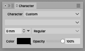
            @861475_VctSt I will add the opacity.

            861475_VctSt8 3 Replies Last reply Reply Quote 2
            • 861475_VctSt8 Away
              861475_VctSt @VectorStyler
              last edited by

              @VectorStyler

              Thanks for agreeing to the suggestion.
              😄
              I've thought it over and it might be confusing to have opacity here. I would rather have a popup for screen density, which QuarkXpress does.
              Because text is more likely to KNOCK OUT than OVER PRINT. (Just my opinion).
              Please consider.

              LIc. 0 OS10.15.8
              MacBook Air (13-inch, Mid 2012) / Intel Core i5, 8GB / Intel HD Graphics 4000
              LIc. 1 OS15.7.4
              MacBook Pro (14-inch, 2023) / Apple M2 Pro, 16GB / Apple GPU

              1 Reply Last reply Reply Quote 1
              • BoldlineB Offline
                Boldline
                last edited by Boldline

                Can someone explain in basic terms what the value of the color box is? I can see how it affects the text color but there type is also affected by the stroke and fill tools.
                The color square in the contextual menu adds some confusion. The name “Color” does not explain its purpose.
                Thanks in advance!

                🍎 macOS Tahoe 26.2, Mac mini (M1, 2020), Chip Apple M1, Memory 16 GB
                Cintiq 27QHD Display and LG Ultra HD Display

                861475_VctSt8 1 Reply Last reply Reply Quote 0
                • 861475_VctSt8 Away
                  861475_VctSt @Boldline
                  last edited by

                  @Boldline
                  Do you need an explanation from “screen density” (or screen percentage) of printing technology?

                  LIc. 0 OS10.15.8
                  MacBook Air (13-inch, Mid 2012) / Intel Core i5, 8GB / Intel HD Graphics 4000
                  LIc. 1 OS15.7.4
                  MacBook Pro (14-inch, 2023) / Apple M2 Pro, 16GB / Apple GPU

                  BoldlineB 1 Reply Last reply Reply Quote 1
                  • BoldlineB Offline
                    Boldline @861475_VctSt
                    last edited by

                    @861475_VctSt apparently! lol Maybe point me in the right direction 🙂

                    🍎 macOS Tahoe 26.2, Mac mini (M1, 2020), Chip Apple M1, Memory 16 GB
                    Cintiq 27QHD Display and LG Ultra HD Display

                    861475_VctSt8 1 Reply Last reply Reply Quote 0
                    • 861475_VctSt8 Away
                      861475_VctSt @Boldline
                      last edited by

                      @Boldline

                      My language skills do not allow me to explain it, so please use the following search for clues.
                      Sorry.😅

                      https://en.wikipedia.org/wiki/Halftone

                      LIc. 0 OS10.15.8
                      MacBook Air (13-inch, Mid 2012) / Intel Core i5, 8GB / Intel HD Graphics 4000
                      LIc. 1 OS15.7.4
                      MacBook Pro (14-inch, 2023) / Apple M2 Pro, 16GB / Apple GPU

                      1 Reply Last reply Reply Quote 0
                      • 861475_VctSt8 Away
                        861475_VctSt @VectorStyler
                        last edited by 861475_VctSt

                        @VectorStyler

                        I am familiar with the Tint operation and prefer to use Tint even today when Opacity processing is more common.
                        (Note: I previously described it as 'screen density'.

                        Tint was placed in the same easy-to-operate position as Opacity in QuarkXpress, which I have used for many years. (See [image above].)

                        In the days of film plate making, it was common to use Tint to adjust the shading of solid colors, rather than transparency effects.
                        Designers' instructions such as, “Reduce the density of that color by about 20%,” were often heard in the field at that time.

                        However, software has evolved over time, and more and more Tint operations are not directly supported. For example, in VS, I found the functionality in the ChororTheme palette.

                        0_1733461136307_2024-12-06.png

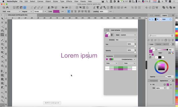
                        I will continue to use Tint because I am accustomed to the intuitive nature of Tint operations, but I will also use Opacity in some situations.

                        LIc. 0 OS10.15.8
                        MacBook Air (13-inch, Mid 2012) / Intel Core i5, 8GB / Intel HD Graphics 4000
                        LIc. 1 OS15.7.4
                        MacBook Pro (14-inch, 2023) / Apple M2 Pro, 16GB / Apple GPU

                        VectorStylerV 1 Reply Last reply Reply Quote 1
                        • VectorStylerV Offline
                          VectorStyler @861475_VctSt
                          last edited by

                          @861475_VctSt said in text color indicator:

                          I will continue to use Tint because I am accustomed to the intuitive nature of Tint operations

                          Tint is available with spot or global colors.

                          861475_VctSt8 1 Reply Last reply Reply Quote 0
                          • 861475_VctSt8 Away
                            861475_VctSt @VectorStyler
                            last edited by

                            @VectorStyler

                            Thanks for the advice
                            I see, it is convenient to register a spot color as a global color in the palette and use it. (A, B) Moreover, I can do CMYK conversion on the color palette. (C)

                            0_1733709744033_2024-12-09.png

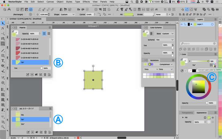
                            The concept of tint processing was an important method when film plate making was the mainstream, but in today's highly digitalized environment, the need for such processing may have diminished. The younger generation may be confused by the expression “color tint 20%. It may be more common to use transparency adjustment to dilute colors.

                            LIc. 0 OS10.15.8
                            MacBook Air (13-inch, Mid 2012) / Intel Core i5, 8GB / Intel HD Graphics 4000
                            LIc. 1 OS15.7.4
                            MacBook Pro (14-inch, 2023) / Apple M2 Pro, 16GB / Apple GPU

                            1 Reply Last reply Reply Quote 1
                            • 861475_VctSt8 Away
                              861475_VctSt @VectorStyler
                              last edited by

                              @VectorStyler

                              Thanks.
                              😃
                              ver. 1.2.052.
                              The charactor palete now has a slider bar to set the opacity of the text color.

                              LIc. 0 OS10.15.8
                              MacBook Air (13-inch, Mid 2012) / Intel Core i5, 8GB / Intel HD Graphics 4000
                              LIc. 1 OS15.7.4
                              MacBook Pro (14-inch, 2023) / Apple M2 Pro, 16GB / Apple GPU

                              1 Reply Last reply Reply Quote 1
                              • First post
                                Last post