Interface improvements
-
@postdes I don't see how ditching the rounded corners of the UI elements would take less space? Unless I misunderstood something.
Anyway, in my opinion, rounded corners and a bit of darker space between the main UI elements of the app (the toolbox, the context bar at the top, the panels, etc) help a lot with visual separation. VS is a complex app and better visual separation helps everybody, not just beginners, to figure out everything faster. (Or I could say "better visual grouping of the UI elements helps everybody").
And would you say that the lack of rounded corners in the Windows version makes for better visual separation?
(It also strikes me as a look that is too technical, a bit unfit for an app that is used to create art most of the time).
Again, it's my opinion — I'm not affiliated with NumericPath, and I do have my own niggles with UI details and inconsistencies, like…
- the top margin of the active document tab being lighter than the top margin of the toolbox,
- the color bar being flat (no raised 3D look like everything else),
- the front tabs of the panels being different than the document tab for no reason;
- some buttons having rounder corners than others, instead of being the same (less rounded).
Stuff like this… which I hope you agree with, and I'm sure the developer will get to improve.
…
But rounded corners? I love them! Dated? I disagree*.
The developer might very well offer both options sometime in the future, to please everybody (which will dilute the look of the VS brand a bit), but I hope it will keep the less-technical looking one as the default. Or at least keep the "contrasty" 4px space between the UI elements.
Ableton Live is a well-known app that has something similar — rounded corners everywhere but with even wider space between the panels. They are flat (no 3D raised edges unfortunately), but it still looks so good.
-
@postdes I agree with a lot of what you are sharing. It is awesome to see VS getting released and to see it getting tuned in so well with the ideas of the forum contributors. There's always a danger of over-developing, especially when we all have different design backgrounds and each of us use different vector software prior to VS. It's been fun to see the ideas turn into reality and the times you sit there and think,"it would be really helpful if I could do this or that on the fly or in this manner and then it gets added and you feel the app is more a powerhouse than ever. I assumed this stuff would get fixed up after most of the current tools and functionality of the program was set.
I much prefer the focus on usability and functions over UI. Affinity for example, has a polished UI and is efficient, but lacks a ton of features. but I understand and agree with your concerns. UI is important to the user experience for sure.
Your post made me take a closer look at the VS UI versus Illustrator and Affinity's. The first thing I noticed was that the wording and icons in the toolbar and in the panels are a smaller font size and I can see, especially in Affinity, that the rectangles that make up the tabs and panels and the like are not as rounded as in VS. Some of the panels (but not all ) have a down arrow on the left side that allows you to collapse a panel but still see the title of the panel and quickly reopen it again. the tabs are smaller and more minimalist. The panels in VS don't allow you to click and drag them consistently from anywhere in the panel title tab, the ruler numbers and measurements are not subtle in VS but they are in Affinity
-
I don't know if the current rounded corners in VS take up extra room or not - Each panel has an "x" in it to make it easy to close out those take up space - With affinity, you don't see the X unless you pull the tab out from it's nested position for what it's worth.
Even just shrinking the text and in some cases lowering the brightness could make more room and feel less crowded
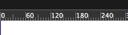
Affinity's ruler
Vectorstyler's ruler
Affinity's tabs:
Vectorstyler's tabs
-
Yes, the ruler numbers in VS should be smaller, but wow… those ruler numbers in Affinity are really small…
MacBook Pro (Intel) running Monterey 12.6.4
-
@b77 lol.I don't think VS NEEDS to be just like Affinity. It was interesting to compare and contrast... I do think some shrinkage to the text size and picking and choosing what parts are at full contrast and what parts can be reduced in brightness. When everything is equally bright, none of it stands out
🍎 macOS Tahoe 26.2, Mac mini (M1, 2020), Chip Apple M1, Memory 16 GB
Cintiq 27QHD Display and LG Ultra HD Display -
@Boldline No, I didn't think you suggested they should be that small.

A few other details:
- the Color Palette, for instance, has no expand/retract button before the name, so I think that tab and others like it can be made smaller;
- the current arrow cursors (for scaling or rotating) are too thin and narrow; it would be better to make them the same size and shape as the arrows used to resize the Finder/Windows Explorer windows.
- the horizontal space between the context bar and the toolbox/document tabs is 6 pixels wide, while the vertical space between the toolbox, the document view and then the panels on the right is 4 px wide;
- I'm not sure a separator is needed between the Stripe and Profile dropdown menus in the Stroke Properties popover.
…
Anyway, I'm glad @postdes started a thread about UI improvements. -
@Boldline said in Interface improvements:
When everything is equally bright, none of it stands out
Besides the ruler numbers, where else would this be needed?
(Btw, the names of hidden document tabs ARE slightly darker than the name of the active document tab. Same with the names of the hidden panels).
MacBook Pro (Intel) running Monterey 12.6.4
-
@b77 said in Interface improvements:
Yes, the ruler numbers in VS should be smaller, but wow… those ruler numbers in Affinity are really small…
Anyway, I'm glad @postdes started a thread about UI improvements.
That's what makes life interesting now doesn't it. The wide views and differing opinions people can have, on all subjects (not just a vector computer program of course), and certainly the UI is no exception.
First off, I'm not glad @postdes started the thread about UI improvements.
Second, no, I would not make the ruler numbers smaller.
.......Ok, I'm just just kidding about my first point.:
 All threads started by someone are important; otherwise they never would have started it.LOL. It's actually an excellent topic to discuss. It's amazing to see often there is not much census on a given topic.
Oh, and I really would not make the ruler numbers smaller, lol. I like them just as they are. There are way too many tiny things in VectorStyler as it is. There must be some eagle-eyed people hanging out in this forum
 . And this comes from a someone who has an Optometrist in the family..
We have some good people on this forum. It is both interesting and sometimes surprising to read what users say their preferences are or what is important to them.
That's why I think it's important, whenever possible, for the developer to continue to try to allow for as much User Customization Options as possible. That way, if the default "factory" settings are not ideal for a particular user, they can change it to meet their needs and tastes.
-
@b77 said in Interface improvements:
Besides the ruler numbers, where else would this be needed?
I would probably decrease the intensity of lighting on most everything a little more, maybe 20% less. I'm more of the opinion that the tools and panels are supposed to not compete with the design for attention.
🍎 macOS Tahoe 26.2, Mac mini (M1, 2020), Chip Apple M1, Memory 16 GB
Cintiq 27QHD Display and LG Ultra HD Display -
Strictly looking at other apps - @postdes is not wrong in what he brings up. Smaller UI font sizes, minimalist tabs and lowered brightness of the ruler the most and then the rest of the UI fonts are what make the user interface of VS look different from other programs today. Whether VS should change to be like those or not.... that's up for debate lol
-
@Boldline The contours of the icons in the toolbox are already 90% white when in Dark UI mode and 90% black when in Light UI mode. So they are not full white or full black. Is that still too "contrast-y"?
Or maybe you mean just the names of the panels and tabs, and the icons at the bottom of the panels? Those are indeed 100% white (or 100% black when in Light UI mode).
-
@b77 Yes I was primarily talking about the names of the panels and tabs, and the icons at the bottom of the panels. 100% is too much in my humble opinion. I'm also not opposed to reducing things to 80% overall
Not to beat a dead horse woth this - but I think the size of the text and the icons, for example in the toolbar in Illustrator, are smaller and that has an effect on how bright they look.

-
I'd leave things the way they are, for both Brightness and Icon and Fonts sizes.
I definitely would not want smaller Icons or fonts or less brightness. As far as Tab and Panel radius/roundness and such, I don't have any strong preference either way. @b77 "loves them!", and @postdes finds them bothersome and dated. They could be squared off as far as I'm concerned and it wouldn't really bother me either.
If a future VectorStyler Update adds the ability to allow for users to adjust those and other parameters, I'd be on board with that.
-
@Vector-Rock We hear you @Vector-Rock ! It's not up to any of us anyway...
I agree with you that much the way we can size the nodes to our personal preferences, it would be nice if we could adjust the overall font and icons brightness of VS.
I don't think font sizing could be customized as much since everything has a place
We'll just have to see what @vectoradmin decides ultimately. -
@postdes @b77 @Boldline @Vector-Rock
About the corner rounding: these are (as most of the UI style) in the theme, so it could be easy to have alternate themes. But it is worth noting that BigSur and Monterey MacOS are heavily using rounded corners. I add to the backlog the alternate theme request.
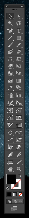
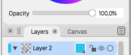
The color and contrast can also be addressed by alternate themes, if needed.About the sizes of the toolbox icons: these can be made smaller with the Panels -> Toolbox Style -> Small Toolbox Icons. I think a preference option to control this with a precise number could be added.
-
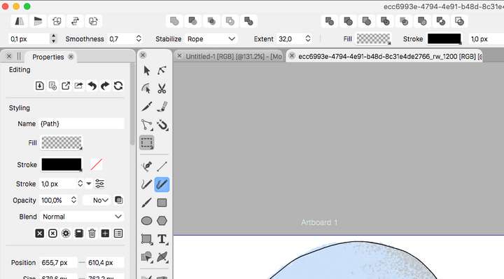
The reason I brought this up, and thanks for discussing it here, is to improve the overall experience of using VS. As this image shows, there is quite a lot of unused space because of the rounded corners.

This adds up over the entire interface and it is a bit distracting. I agree with the posts above that comment on the difference between several elements could be a bit bigger, especially with the tabs.I am all for the option of having the ability to pick a different theme.
-
@postdes I still don't understand how having this…

instead of this…
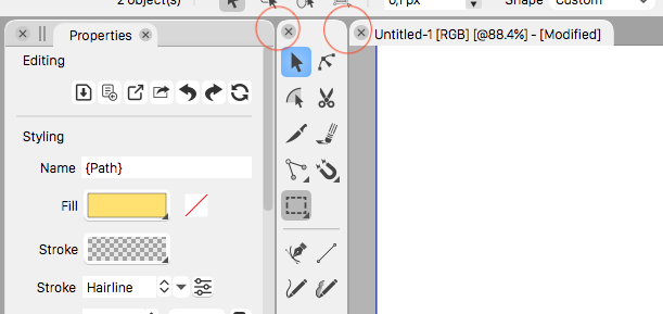
…would release more space for other UI elements? Because you said that "there is quite a lot of unused space because of the rounded corners".
-
I think it does make some difference when taking everything together, perhaps more visually than physically. I think all these rounded edges everywhere are distracting. Some rounded corners are OK in some places, but they are everywhere and they are too strong. If the roundness was less strong it would not be a real issue, but right now they are too noticable. See these screenshots:
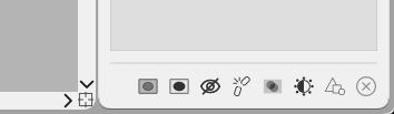
What a UI should strive for ideally, at least in my opinion, is to be as functional as possible whilst being as unnoticable as possible. Once the UI itself becomes very visible from a design standpoint, it is usually a bad sign. There is not one UI I think is perfect, but I think the Clip Studio Paint UI is very good, and comparable to the VS UI from a design standpoint. This is a screenshot from a part of the UI:
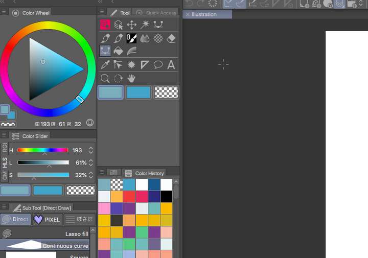
And a part of VS roughly the same size:
As you can see, the CSP UI manages to be more compact, with a more efficient use of the screen space. This is down to a couple of things, like font size, but also in icons for every panel. This means when several panels are docked to tabs, only the icon is visible for those tabs that are not selected (I hope this makes sense, see the screenshot at the color history panel) Of course these apps don't do the same things, but I believe lessons can be learned from it as these are both very complex apps with lots of features. Putting all these features in a UI that is both compact, easy on the eyes and practical to work with is very hard.
I don't want VS to copy existing apps, I just would like it to work as best as it can work, and I believe that sometimes seemingly little things like a fontsize, a color, an icon or a certain roundness of corner can make a big difference overall.
-
@postdes I was replying strictly to what you said about rounded corners, and I don't think ditching them would make more space for the rest.
I don't disagree that here and there a 1pt smaller font, or icons for the hidden panels would make the UI more compact.
Although… icons for the hidden panels… I don't know how user friendly is that. There are lots of panels in VS… close to 60.
I would also ask you, time permitting, to arrange the ClipStudio's UI in such a way that it matches the UI of VectorStyler as much as possible (toolbox on two rows, like the VS screenshot) and repost that. Those icons don't seem smaller that the ones from VS, and the panels in VS can be made narrower.
-
@postdes said in Interface improvements:
I think all these rounded edges everywhere are distracting. Some rounded corners are OK in some places, but they are everywhere and they are too strong. If the roundness was less strong it would not be a real issue, but right now they are too noticable.
It's supposed to be noticeable, for better visual differentiation of the main UI elements. That is the idea, as I explained in my first post.
Some rounded corners are OK in some places, but they are everywhere and they are too strong.
I don't think sharp corners for these main elements would go well with buttons with rounded corners. In that case the buttons would have to have sharp corners as well.
If the roundness was less strong it would not be a real issue, but right now they are too noticable.
If it was just slightly less rounded, I cannot disagree. Why not post a modified screenshot with less rounded corners.