Interface improvements
-
@postdes @b77 @Boldline @Vector-Rock
About the corner rounding: these are (as most of the UI style) in the theme, so it could be easy to have alternate themes. But it is worth noting that BigSur and Monterey MacOS are heavily using rounded corners. I add to the backlog the alternate theme request.
The color and contrast can also be addressed by alternate themes, if needed.About the sizes of the toolbox icons: these can be made smaller with the Panels -> Toolbox Style -> Small Toolbox Icons. I think a preference option to control this with a precise number could be added.
-
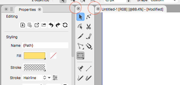
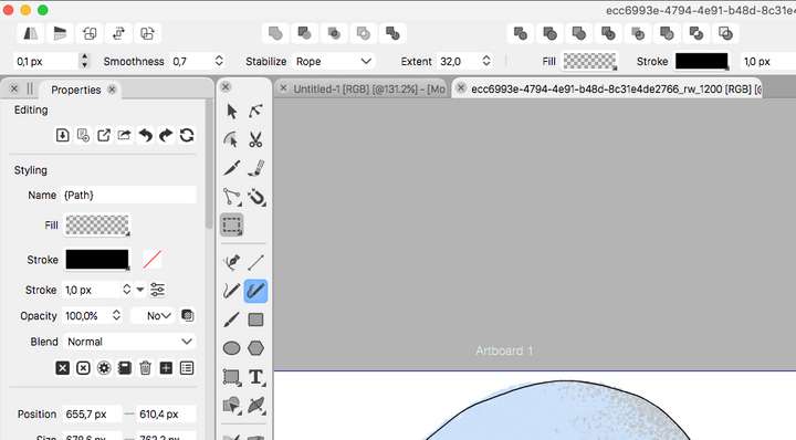
The reason I brought this up, and thanks for discussing it here, is to improve the overall experience of using VS. As this image shows, there is quite a lot of unused space because of the rounded corners.

This adds up over the entire interface and it is a bit distracting. I agree with the posts above that comment on the difference between several elements could be a bit bigger, especially with the tabs.I am all for the option of having the ability to pick a different theme.
-
@postdes I still don't understand how having this…

instead of this…
…would release more space for other UI elements? Because you said that "there is quite a lot of unused space because of the rounded corners".
-
I think it does make some difference when taking everything together, perhaps more visually than physically. I think all these rounded edges everywhere are distracting. Some rounded corners are OK in some places, but they are everywhere and they are too strong. If the roundness was less strong it would not be a real issue, but right now they are too noticable. See these screenshots:
What a UI should strive for ideally, at least in my opinion, is to be as functional as possible whilst being as unnoticable as possible. Once the UI itself becomes very visible from a design standpoint, it is usually a bad sign. There is not one UI I think is perfect, but I think the Clip Studio Paint UI is very good, and comparable to the VS UI from a design standpoint. This is a screenshot from a part of the UI:
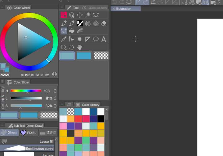
And a part of VS roughly the same size:
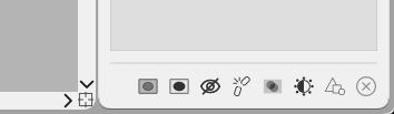
As you can see, the CSP UI manages to be more compact, with a more efficient use of the screen space. This is down to a couple of things, like font size, but also in icons for every panel. This means when several panels are docked to tabs, only the icon is visible for those tabs that are not selected (I hope this makes sense, see the screenshot at the color history panel) Of course these apps don't do the same things, but I believe lessons can be learned from it as these are both very complex apps with lots of features. Putting all these features in a UI that is both compact, easy on the eyes and practical to work with is very hard.
I don't want VS to copy existing apps, I just would like it to work as best as it can work, and I believe that sometimes seemingly little things like a fontsize, a color, an icon or a certain roundness of corner can make a big difference overall.
-
@postdes I was replying strictly to what you said about rounded corners, and I don't think ditching them would make more space for the rest.
I don't disagree that here and there a 1pt smaller font, or icons for the hidden panels would make the UI more compact.
Although… icons for the hidden panels… I don't know how user friendly is that. There are lots of panels in VS… close to 60.
I would also ask you, time permitting, to arrange the ClipStudio's UI in such a way that it matches the UI of VectorStyler as much as possible (toolbox on two rows, like the VS screenshot) and repost that. Those icons don't seem smaller that the ones from VS, and the panels in VS can be made narrower.
-
@postdes said in Interface improvements:
I think all these rounded edges everywhere are distracting. Some rounded corners are OK in some places, but they are everywhere and they are too strong. If the roundness was less strong it would not be a real issue, but right now they are too noticable.
It's supposed to be noticeable, for better visual differentiation of the main UI elements. That is the idea, as I explained in my first post.
Some rounded corners are OK in some places, but they are everywhere and they are too strong.
I don't think sharp corners for these main elements would go well with buttons with rounded corners. In that case the buttons would have to have sharp corners as well.
If the roundness was less strong it would not be a real issue, but right now they are too noticable.
If it was just slightly less rounded, I cannot disagree. Why not post a modified screenshot with less rounded corners.
-
@b77 About the last comment: I know the panels can be made narrower, but the problem is that in some situations, there are too many icons in a row and they would not fit in if I make the panel narrower. It would be welcome if in these cases VS would make two rows of icons instead of one, depending on the current width of the panel. This is the reason I can make the panels in CSP quite narrow and don't sacrifice functionality.
Perhaps an idea could be for VS could allow users to scale the UI to make better use of the space? Scaled at 90% I think it work better for me.
-
@postdes If I understand correctly, if you make a panel narrower in CSP, the app rearranges the bottom icons on two rows? (Obviously, I'm not asking about the toolbox here).
Anyway, the UI of VectorStyler is scalable — see Preferences > User Interface > Interface Scaling. There you can also make the text of the UI smaller.
Unfortunately, UI scaling doesn't affect the roundness of the corners at this time. I think it should.
-
@vectoradmin When docked horizontally, the panels could be less tall. Not by much — 4, 6 or maybe 8 pixels — but this would make a bit more space for everything else.
-
@b77 I think making the corners slightly less rounded in places, and discarding rounded edges in other places (like the rulers bar and the bottom of the panels) would be better. It would also create more differentiation in the UI, which would benifit overall legibility. I am talking from the perspective of an end user, I am no UI designer or back end developer.
How much rounding is up for debate, but it should just be more subtle. I cannot create a quick mockup right now, as I believe that changing the corners in most places affects other parts of the design as well, and it should be looked at as a whole.
-
@postdes said in Interface improvements:
@b77 I think making the corners slightly less rounded in places, and discarding rounded edges in other places (like the rulers bar and the bottom of the panels) would be better.
So the panels should have rounded corners at the top and straight corners at the bottom? Sorry if I misunderstand.
Also, the rulers bar is not rounded, or you mean something else.
……
It would also create more differentiation in the UI, which would benifit overall legibility. I am talking from the perspective of an end user, I am no UI designer or back end developer.
Some thinking went into this visual differentiation in the VectorStyler's UI — it goes like this:
- rounded corners for the main UI elements (panels, toolbox and the document view), with darker space between them;
- less rounded corners for the click buttons inside these panels and in the context bar ( @vectoradmin here click buttons can and should be made less rounded like the dropdown menus are, I totally agree);
- straight corners for the input fields and for scrollable areas inside these panels;
Straight corners for the main panels breaks this differentiation.
…
Anyway, let's agree to disagree — the developer said that he will probably offer a theme with straight corners. I for one dislike the general UI look of CPS and of CDR (VectorStyler's UI was similarly made only with straight lines and corners when in beta this time last year).Reposting this question that was addressed to you:
@postdes If I understand correctly, if you make a panel narrower in CSP, the app rearranges the bottom icons on two rows? (Obviously, I'm not asking about the toolbox here). -
@b77 This is what happens when a panel is resized in CSP:
https://recordit.co/nGpBwzn4Ki
There is a minimum width for a panel, and then certain aspects of the panel can scale.
Some panels with multiple icons will stack them if the panel is narrower
https://recordit.co/rxDnrPibqN
But let's bury this topic for now. I think I have made some of my preferences clear, and we tend to have different views on things. As I said I do not have the time to take a deep dive to redesign larger part of the UI, just put some things to discussion.
As for the roundness of some elements, I accidentally said rulers but I meant scroll bars

I think the roundness is superfluous here, it just adds noise.
And in other places, I would reduce the rounded corners or get rid of them on the edges of the panels (red) and keep them more or less the same for the Tabs (blue). Just my 5 Cts...
-
@postdes said in Interface improvements:
@b77 This is what happens when a panel is resized in CSP:
https://recordit.co/nGpBwzn4Ki
There is a minimum width for a panel, and then certain aspects of the panel can scale.
That's good, I like that.

Some panels with multiple icons will stack them if the panel is narrower
But I specifically said that I don't want to see the toolbox rearranging its icons when resizing it. I asked if any of the icons at the bottom of panels do this rearranging on two rows. If CSP has icons at the bottom of panels…
As for the roundness of some elements, I accidentally said rulers but I meant scroll bars
I think the roundness is superfluous here, it just adds noise.OK, but rounded scrollbars are standard on macOS…
@vectoradmin The scrollbars being too dark in Light UI Mode is a problem.And in other places, I would reduce the rounded corners or get rid of them on the edges of the panels (red) and keep them more or less the same for the Tabs (blue). Just my 5 Cts...
For consistency, I think the corners of these panels should have the same roundness as the toolbar and document tabs, reduced or not reduced. Is there a reason why they should be different, @postdes ?
Or maybe you meant the other way around — that the panel tabs should be less rounded.
(Btw, here in the Light UI you are using there should have been a darker space between the sets of panels, like the Dark UI has).
MacBook Pro (Intel) running Monterey 12.6.4
-
@b77 Will make the rounding the same.
-
@vectoradmin The corners of panels ARE the same now (same roundness as the toolbox and document tab), but unless I misunderstood, Postdes suggested them to be different.
-
@b77 said in Interface improvements:
For consistency, I think the corners of these panels should have the same roundness as the toolbar and document tabs, reduced or not reduced. Is there a reason why they should be different, @postdes ?
Or maybe you meant the other way around — that the panel tabs should be less rounded.No, I meant the panel to have less or no rounded corners, but the tabs should stay as is.
I think reducing the amounts of elements with these rounded corners would help make the UI less visible.As for consistency, I think a UI can have different corners IF there is enough difference and IF the way it is implemeted is consistent across all elements. If you look at the rounded elements in the latest versions of Mac OS you also have various corner radiuses for panels, boxes and buttons. It is a balancing act to make the elements consistent and harmonious, but the should not all be the same to make them consistent
-
I think it would be a neat thing to have 2-3 "skins" available so to speak, maybe options for overall font scaling and brightness if possible... that we could customize the app a little.
I like that we can custom size the nodes on screen and that as @vectoradmin pointed out in this thread, we can size the vertical toolbar. i went ahead and tried that today. -
@Boldline Overall font scaling is possible now in Preferences -> User Interface -> Text Size Scale
-
@vectoradmin nice!!!! I love it. I dropped the size to 75%. I already feel better about the user experience with those UI customization options you've mentioned recently. It's also good because others who were making their case for keeping the default text the size it was - can have that as well
-
@postdes build 1.0.045 added flat themes on Mac