Usability inconsistency - thumbnail-icon sizes in panels
-
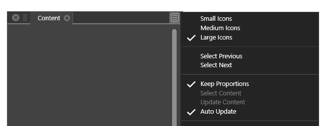
- In the content panel you can select small, medium, large icons from the top of the panel menu (where I would expect it in any panel and scenario)
- In the layers panel a similar options is (hidden) in the bottom of the panel menu
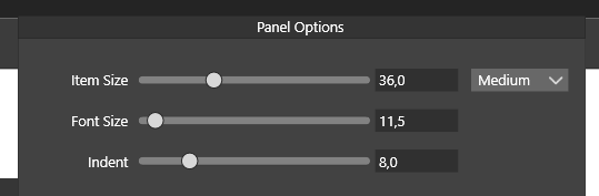
- Biggest issue here and now: that the layer option is almost invisible
- Logic solution IMO: panel options changed to work like content panel (too many font size preferences in the program as a whole, not really needed exactly here, the indent value will probably not be missed and with some sane, relative to screen resolution small, medium, large thumbnail sizes people will - probably - be happy. Reducing the number of options in the panels menu or using submenus for less used options.
- Optimal solution: to gather more customer (!!!) feedback and wait with a more radical fix until you have a better vision you can use to simplify, streamline and harmonize the interface across VS. It is a huge task.
Actually the panel menu in the content panel is a great example of a panel menu. The layer panel menu is... a lot of reading
")
🍏 macOS Sequoia Apple Silicon
-
@Ingolf I will think of a way to improve the Layers panel menu content. It is probably the most complex panel menu.
-
@Ingolf Layers panel menu has been improved in 1.1.002 (beta)