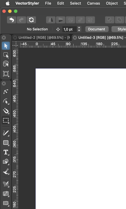
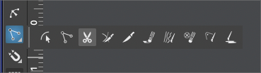
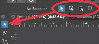
Put all selection modes as pullouts from the transform tool
-
@Ingolf said in Put all selection modes as pullouts from the transform tool:
@vectoradmin
The solution is simple - the approach used in Affinity Designer. Primary features for the selected object are listed FIRST in the context bar, secondary features (although the Transform Tool is selected)... second. That way button positions will always be static. Which is of course also a common usability principle.Yes, I think this prioritization can be done easily (this is how it works now, just have to adjust the priority values). One caveat: when a text is selected, it adds quite a lot to the context panel, so the selection mode buttons could be moved way too much to the right.
-
@vectoradmin said in Put all selection modes as pullouts from the transform tool:
Yes, I think this prioritization can be done easily (this is how it works now, just have to adjust the priority values). One caveat: when a text is selected, it adds quite a lot to the context panel, so the selection mode buttons could be moved way too much to the right.
Yeah, I noticed that. I think several items are wider than they have to be though and I see some blank areas, so I think you can chop of several pixels from these text items without sacrificing anything.
You also have excellent tooltips so symbols for labels like Size, Font, Character etc. is fine. If you need labels at all; users know what they are looking at when it comes to classic text options:

Personally I find the above easier to use with no labels because my eyes and mind have to decipher and sort less text information and other visual details.
🍏 macOS Sequoia Apple Silicon
-
@Ingolf It's a rare thing, but have to disagree on this one with you!
")
Knowing and using the selection key commands would be pretty straightforward and not part of the "100's". Like with learning any program, you start with the basic key commands and work your way into knowing the more complex ones. For selecting the basics, like transform tool or the shape editor tool , pen tool, brush tool, eraser, etc. I almost never click on it with a cursor - almost always with key commands. That method is always faster than moving the cursor and clicking and going back to the work at hand.
The purpose of the pull out menu from the toolbar is to give you that immediate "button" to click and to be able to place it anywhere on the screen you are working for shorter "commuting" across the screen from the work you are doing to the button and back again, etc....
Obviously the setup works for your desired workflow but it takes up a lot of space "unnecessarily" for others who desire a different workflow option.
@b77 made a good point about lack of screen real estate.@Ingolf what about making it like a panel so you could drag it up to your top section like we can currently do with things like the transform panel, alignment panel, etc? That way you could have it at the ready without it being a space filler for others?
@vectoradmin said in Put all selection modes as pullouts from the transform tool:
@b77 There is a task in the feature request backlog, about customizing the automatic part of the context panel (the row where the font name would show).
I think once that is done, and with some additional actions available (the old tools that were in the popup still exist, but not accessible), everything can be customized to different workflows.The advantage I see with these tools there is that if needed, it is faster to access them in this way. But of course they can be in the way if not needed.
This discussion reminds me a lot of the one we had about UI aesthetics and in the end adding numerous options for customization solved all disputes.
I like the idea of a section of the contextual menu bar being totally customizable. Like with the UI aesthetic disagreements, adding a certain level of customization with that may appease the masses -
@Ingolf Oh yeah, the 'Size' label in text/font settings at least can go.

Anyway… it's a long thread already and I didn't find what is the disadvantage of just being able to drag this as a group of four buttons from the toolbox as a floating panel which you can also dock under the context bar or anywhere if permanent quick access is needed.
I don't have the statistics to prove which group is more numerous — those who use all four often or those who use just the regular transform tool most of the time…
(I also don't have statistics about keyboard shortcuts memorization, although I'm certain it's getting harder for 40+ guys)…
But this approach lets the user decide what is important for him:
You need these four buttons always visible? Drag it as a separate floating panel from the toolbox, as with the other button groups — problem solved.
You don't need these four always visible? Then having them stacked in the toolbox is better, because it takes no space from the context bar.
-
@b77 said in Put all selection modes as pullouts from the transform tool:
I didn't find what is the disadvantage of just being able to drag this as a group of four buttons from the toolbox as a floating panel which you can also dock under the context bar or anywhere if permanent quick access is needed.
Agreed! Solves the issue for everyone I would think
-
I have to stand my ground here. You can easily turn VS into the mess that Affinity Publisher almost is and certainly will be with tons of panels for everything. That is because their usability strategy is weak - because they have no usability specialists hired (I just asked, they haven't). The software just grows and the complexity explodes.
No more panels please. This is very simple. This is options for a tool. It is not different tools. These options are exposed to the user via the context panel. They come and go automatically when the tool is activated and deactivated. Easy to use. Easy to predict. Easy to find. That is exactly why several programs use context panels / context bars. And that is exactly what will make migration from software XYZ to VS easier. Predictable, common behavior.
The toolbar itself must be simple. It is the worst part of a program to add complexity to.
No further comments on this topic - I have a busy month.
-
@Ingolf I hear you, but maybe you can explain why pulling the pullout from the toolbar and placing it where you want does not solve everyone's problem and meet your needs? If you want easy cursor click access to those transform tool options, wouldn't you prefer they be in the pullout and able to be moved anywhere on the screen you need them? It also helps reduce the busyness of the UI and makes more room available on the contextual bar. I'm not trying to argue I promise, I just don't understand how this option does not solve everyone's issues
We can be technical all day about whether the selection modes are different tools or not... I'm reminded of the text on a path tool and how there's a separate tool for moving the text along the path and that feature is not just built in to the text on a path tool itself - to me they could be one but in VS they are two...
-
Because it adds horrible non-standard complexity to the interface and this time to the precious toolbar. A key component. Suggestions are going against all known flows and standards out there. When I even get tons of options just looking at the simple transform tool in a toolbar something went wrong in the design process.
It is a classic too many chefs in the kitchen syndrome.
I simply cannot agree on this one.
-
@Ingolf said in Put all selection modes as pullouts from the transform tool:
I simply cannot agree on this one.
I can't see any issues with adding it to the toolbar - it's not like there's anything there right now.
I agree that we will have to agree to disagree on this one. lol We're all quite passionate about VS! -
Adjusting my chef toque here…

Well, if the developer would allow these small tool panels to be docked like this on top of the toolbox, would that be bad?