Improving layer color indicators aesthetically
-
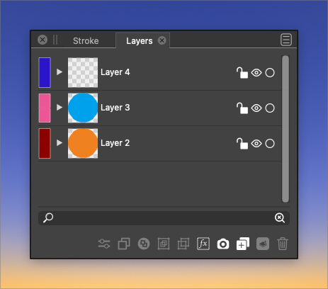
This is lower or the priority list, but could the layer color indicators fill most of the vertical height of the layer tab and align with the preview box? I feel like it would help with the aesthetics. the current small squares seem to get lost easily to the eye
-
@vectoradmin I realized when I was testing things on a different computer, that I had edited the layer settings and made the layers larger and that was why the square seemed small to me.
When I look at it with regular settings, the square seems fine. Is there an option to change the size of the rectangle/square based on editing the settings of the layer?
-
I think the height of the two should just be identical at all times - a preference would not make much sense.
-
@Ingolf I agree, that's essentially what I was asking for. Not that I'm a developer, but tying the size of the vertical height of the color box to the layer art preview box would seem do-able to me
-
@Boldline I added this to the backlog.
-
@Boldline This should be available in build 1.1.024