Display all node editing buttons in the context bar at the top
-
The Path panel has all the buttons for node editing, displayed neatly on three rows.
But since there is plenty of space for all these buttons* in the context bar at the top when switching to shape editing (shortcut: A), why not display all of them there as well?
* Excluding the Combine buttons, obviously.
MacBook Pro (Intel) running Monterey 12.6.4
-
A context bar has the same purpose that a context menu has - not to display everything (that is the purpose of the panel where you even have several options to filter out options - the context bar requires advanced tweaking to remove or add buttons) but:
What is a Contextual Menu?
Definition: A contextual menu is a type of menu that appears on demand and contains a small set of relevant actions related to a control, an area of the interface, a piece of data in the application, or a view of the application. Usually, this context is given by the current selection or has otherwise been specified by the user before invoking the contextual menu.VS is a very advanced programs blessed with options - also probably too many but not in the default view. Using all available screen estate like a teenage room is possible for the users preferring clutter (not many) while the default context bar setup should stick to good and proven UX practice and offer relevant and often used actions.
That is why it is called a context bar. Just like the contextual menu.
")
Clutter is the state in which excess items, or their representation or organization, lead to a degradation of performance at some task. Excess and/or disorganized display items can cause crowding (Stuart & Burian, 1962), masking (Legge & Foley, 1980), decreased object recognition performance due to occlusion, and impaired visual search performance (see Wolfe, 1998, for a review). More items can also stretch or exceed the limits of short-term memory (Miller, 1994). In the case of short-term memory, the relevant factor seems not to be merely the number of objects, but their features (color, orientation, etc.); the capacity for certain simple features is higher than for more complex features (Alvarez & Cavanagh, 2004).
Psst: I work together with a usability team of 6 on a daily basis on a major software project.
-
@Ingolf First I should mention that I like discussing these things with anybody, so by no means I want to have the last word with this (long) post. Time permitting, you are more than welcome to point where I'm wrong in all this.
With that said… since you bring up one of the definitions of the context menu…
Other definitions simply say that "a context(ual) menu offers a limited set of choices based on the application's current state".
To me this means that from the wealth of commands the app offers, the app can select to include in the context menu those that apply to the selected object(s), or to the current editing mode.
It doesn't say that it should include only the most used commands (or buttons) selected from all the commands that apply. This definition doesn't "prohibit" including all the available editing commands/buttons for the current context.
So which definition is right? Who knows for sure… It's not like Moses came down the mountain with this or that context menu definition as law
 , so I consider all of them man-made definitions, and I suggest we shouldn't be dogmatic about their details.
Anyway… to your second point and the quoted text about cluttered UI.
I know and understand that given the wealth of commands included in VectorStyler, displaying too many buttons by default can be a problem — the UI can look cluttered, some users (many or not many, who knows) can feel intimidated by an app that looks too complex for them, etc, etc.
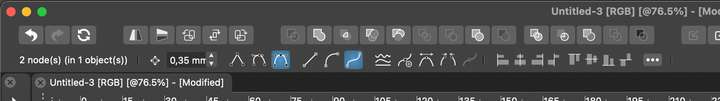
But is visual clutter an issue in this particular case? Here's the current context panel when in shape editing mode:
…and this is how it would look with all the node editing buttons:

If the buttons are grouped like this (the 3 node types, 3 segment types, 2 add/remove node, 3 join buttons, etc), it doesn't look cluttered, confusing or intimidating to me. It all makes (more!) sense visually if they are in groups of two or three buttons.
Also: it's great that you are involved with a usability team for a major software project and you get to learn in this specialized area.
But!
Is the app you mention similar to VS in the wealth of features and commands, and is its main target regular/home users, hobbyists or professional users?
I'm mentioning this important detail simply because it's not like one UI/UX concept (slimmed down to essentials) is good for any and all apps, is it?
And I'm not sure how hiding part of the relevant buttons for the task can help the user in regards to discoverability.………………………
Actually… I thought about it and… scratch all that.
I would prefer ALL these node editing buttons to be available in the right-click (context) menu when in shape editing mode. Yes, as buttons, not as text… I think it's so obvious why that I don't need to explain it.
So here's an imagination exercise:
If the developer would implement this awesome, wonderful, and marvelous UI improvement — buttons in the right-click menu — would most users want just part of these buttons to show in said right-click menu?
………………………
OK… that's all. My apologies for the long post.
-
@b77 said in Display all node editing buttons in the context bar at the top:
@Ingolf First I should mention that I like discussing these things with anybody, so by no means I want to have the last word with this (long) post.
Same. It is just good-hearted exchanges of opinions and ideas.
-
@b77 There are more path editing buttons in the context bar now. Is there anything missing?