Limiting detachment options for top panel bar
-
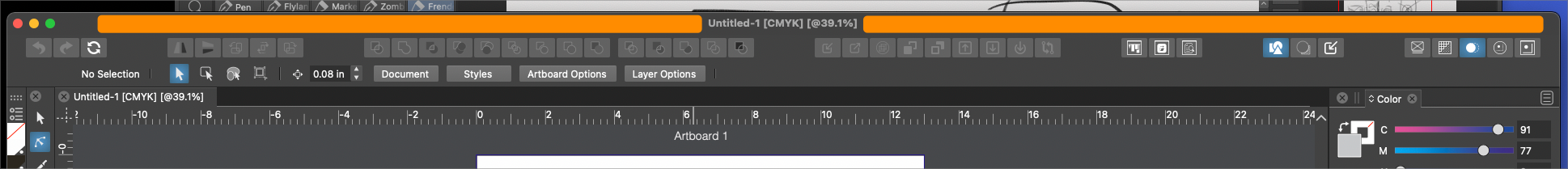
It's too easy currently, to accidentally detach the top panel bar. I think this is because the top section above it (set in orange in my pic) is often used for repositioning the open window panel during use. Would it make sense to add a divider line between the top name section and the top horizontal toolbar? and/or limit that very toolbar to being detached only from the far left side? Maybe adding the symbols used in other panels to denote where to grab in order to pull the entire toolbar?
-
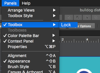
@Boldline Lock Context Panel in the app menu
-
@vectoradmin Thanks - that makes total sense. I should have locked it down a long time ago. I'm not sure why I did not put 2 and 2 together.
On a related note - speaking for myself, there is confusion knowing where to be looking for what option. For example there are panel settings under the app menu and then there are also more panel settings under the panel menu. Looking at things closer, it seems there's "panels" that go more with the UI and then specific task "panels" like those listed under the panels menu itself. Using the term 'panels" for all makes it harder for me to know where to go for what task. for example, locking that top panel as you suggested, I could see it being found under the app menu or under panels. I know there's a method to your planning and I'm probably not seeing it as I should - but if there's a way we can clarify that more with a descriptor, that would help -
@Boldline There are two Lock actions related to panels. Would these be better in the Panels or View menu?
The problem is that the Panels menu is a bit long. -
@vectoradmin my immediate thought would be to move the "arrange views" over to the view menu instead of being in the panels. Yes they are panels we are talking about but the focus is on how they are viewed, and going to the view menu, I'm expecting options for layout
To save more space, you could add the lock option to the toolbox, color palette bar, context panel, etc.. all as fly-out menus like in my crude mock up attached. This would save a lot of space and help further reduce the height of the panel bar - especially as it will likely grow in the future as you add new features down the road.
I don't see why "toolbox style" could not also be a fly-out option below "lock"
These are not options users are going to be changing often while they work, so if they are a little buried, it's not a detriment to the user experience.
-
@Boldline I think the Arrange Views could be moved to View (it is about Views)
I'm not sure about having sub menus under checkable menu items, I have never seen that kind of UI pattern.But the lock actions could also be placed in the View menu, maybe into their own submenu:
Lock Panels ->- Lock Floating Panels
- Lock Context Panel
- Lock Color Palette
-
@vectorstyler I defer to you on proper UI pattern. I like the idea of moving arrange views to the view menu and adding the lock panels submenu to the view menu as well.
Thinking ahead, if and when you add the options to reset panels to a default position, add the ability to save panel layout presets, and option to close out all panels not in the default or chosen preset layout, I'd think those could all go under the view menu