Spacing arrangement idea
-
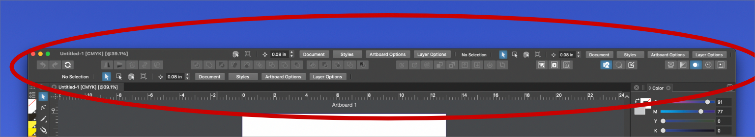
I was thinking about spacing and wondering if the unused space at the top of the UI could be used differently - or if it's too cluttered this way.
If we moved the title of the document over to the far left side and made room for icons and tools filling the rest of the space to the right. I copied some existing tools there but if this was done I'd think more spacing and fewer up there.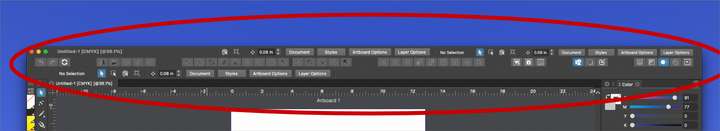
-
@Boldline In this case the titlebar needs to be taller.
On the Mac apps either have a normal height titlebar that includes only the three buttons and the document name (Final Cut, Motion, Logic, etc, etc), or they have a taller titlebar with the three buttons, the document name and a couple buttons on the right, like Preview has. (Ignoring the current Music app -formerly iTunes, which doesn't need to display a document name).
Anyway, the reason for Preview's taller titlebar is that cramming buttons in a titlebar of normal height makes it look cluttered.
But I like Preview's UI…
So if you make the titlebar taller you could have the document name on the left and move the four buttons on the right side of it, and maybe add a dropdown menu with different UI configurations.
In any case, if something like this gets implemented the four buttons really should be the same color as the titlebar, not lighter or darker, and flush with the titlebar (no protruding effect). The text also needs to be light gray, not white. Something like this:

MacBook Pro (Intel) running Monterey 12.6.4
-
@b77 Thanks for sharing your ideas. I knew the layout I mocked up was too busy and cluttered. I was trying to get the general idea out of my head and onto the screen. You took it to the next level and I appreciate that. I really love the way you have it set up with those action buttons at the top right -I love the new document icons on the far left... and still plenty of room for the name of the file to display. It leaves a lot of room for other things to be added later as VS keeps maturing.
-
@b77 @Boldline I think, if the title bar would contain some tools, that should not be context dependent.
So I think a specific set of buttons would suit better (and then those would not be in the dynamic part of the context panel).But would these be customizable (what buttons to show), and @b77 what would be under the Typography drop down?
-
@vectoradmin said in Spacing arrangement idea:
@b77 @Boldline I think, if the title bar would contain some tools, that should not be context dependent.
So I think a specific set of buttons would suit better (and then those would not be in the dynamic part of the context panel).Yes, some context independent buttons also might work but those buttons need to be smaller than the regular buttons in the context bar and their icon light gray like the Document / Styles / Artboard Options / Layer Options text and not white.
But would these be customizable (what buttons to show), and @b77 what would be under the Typography drop down?
Workspaces, or preset/custom UI configurations.
In my mockup that would be a 'Typography' workspace, which let's say can display the Character/Paragraph panels in place of the Layers panel, and have the Layers panel be displayed on its own column, maybe paired with the 'Canvas and Artboards' panel. -
@b77 said in Spacing arrangement idea:
Workspaces, or preset/custom UI configurations.
In my mockup that would be a 'Typography' workspace, which let's say can display the Character/Paragraph panels in place of the Layers panel, and have the Layers panel be displayed on its own column, maybe paired with the 'Canvas and Artboards' panel.This ties in with a future addition request I had made about resetting the workspace to a default or designated arrangement similar to what is available in illustrator.
Illustrator has a number of default layouts based on intended design use. There is also the option to create your own.I like the location of this option @b77's mockup and then it could potentially also be added to the view menu as we discussed in another recent thread