Easier legibility of file names by putting the main file name at the top and the breadcrumb location below?
-
When I am going through and deciding what open files to save, save updates to, not save and close, etc... I appreciate that the warning box comes up to be sure I want to actually close the open file - it can be difficult to read through and check the entire breadcrumb location for each - especially the deeper the file sits inside the system of folders.
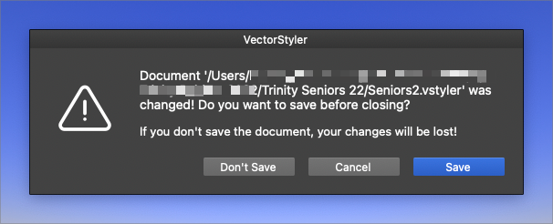
What about putting the main name of the file at the top with the breadcrumb location details smaller and right below it?
🍎 macOS Tahoe 26.2, Mac mini (M1, 2020), Chip Apple M1, Memory 16 GB
Cintiq 27QHD Display and LG Ultra HD Display -
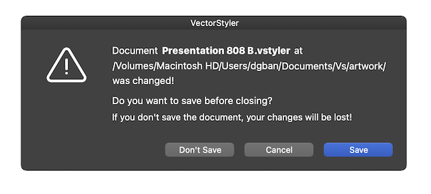
@Boldline Something like this?
………………
@vectoradmin Btw, the labels on the buttons need to be moved 3 or 4 pixels to the right, and the tip of the triangle should be in line with the first row. -
@b77 Thanks for mocking that up. That was the general idea... or even making it a little more obvious by quick glance sort of like this:
So it's really easy to read the main title of the file and if I want to check the breadcrumb trail - I can still easily do that
In the example I have below, the main sentence makes sense as it's all on one line (unless the document title is very long), the main document title itself is larger font for easy reading and recognition of what file is being addressed - the sentence can be read in full.
Right now the actual point to the message is listed after the long breadcrumb.
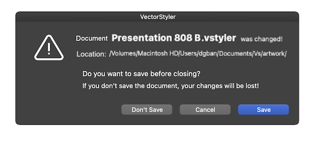
The file location is a smaller font and has it's own dedicated line with the word "location" before it so everything makes sense at a quick glance. everything is broken up by relevant sections.
I'm guilty of not looking close enough at the text and not realizing the close warning box I think is for the job currently in front of me on screen actually pertains to another open tab not fully displayed and I'm saving or not saving a different file - that has cost me at times.
I'm open to other people's ideas on this. I just think the current layout is hard to read and grasp quickly
-
@Boldline Added this to the backlog.