Some thoughts on tool organisation UI
-
After working for some time with Vectorstyler and exploring its features some thoughts came to my mind about the way some tools are organised. I am quite overwhelmed with the amount of features in VS, which is a good thing, but I do believe that the interface and the way the tools are set up make some things more complicated than they could be. Let me explain:
I really like using the brush and pencil tools, especially the shape sketch, but when I select what I would call the "drawing tools" there are 7 different ones, and several that are almost the same bar some specific characteristic. This is very confusing as it is not very clear what the differences are with some. My suggestion, also based on Affinity Designer would be to combine certain tools to reduce clutter, and make buttons in the contextual toolbar to switch a specific function on or off. For example, the shape sketch and the pencil tool could be combined, with a toggle to do the shape sketch or normal drawing. Same for the brush tools: I believe that all 3 of these can be combined into one tool, with the option in the toolbar to toggle pressure sensitivity on/off. I am not even sure what the difference is between the variable width brush and stroke? As for the pen tool, I think this should not be in the drawing category but deserves its own spot on the tool bar. The straight line does not need to be a separate tool in my opinion, but could just be a sub-tool of the pen tool. This is how its organized in Affinity, and it makes more sense to me. Also, it makes it easier to set shortcuts if there are not so many specific tool with only minor differences.
Perhaps using presets for these tools could be an option, ideally with the ability to set a shortcut to these? So if I need a specific tool with a certain setting, I can save this preset to quickly access it another time.
The selection tool is also too confusing with 4 different options with specific functions. Why not make these options contextual switches to one select tool? Don't get me wrong, I can see why having these specific tool directly accesible can be useful in some workflows, but would it really be that much quicker if I have to click on the toolbar to open the tear-off menu and select the specific tool? If I can pick the Select tool, then switch on the the specific function in the conxtual toolbar, it would be the same amount of clicks, but with a less cluttered interface.
As for the functions like rotate, mirror, scale that are also separate tool menu items: what is the use of having these when the same functions can be performed with the select tool? The only good use I ever found for these specific tools for rotation, scale etc. in Illustrator was that by clicking return, I could specify exact values for the transformation, as well as set things like copies or random values. This does not seem to be possible in VS though, so why not just add some kind of transformation dialog (perhaps on CMD+T?) with all these options available?One other tool category that needs another look is the secondary editing tools incl. scissors, knife, etc. I can see this category reduced to 4: the corner tool, knife, scissors and eraser. the other 4 seem to be of lesser importance to me, too specific. Though there are use-cases for these tools, they feel more like subtools. The erase points could be a sub-tool of the regular eraser. As for simplify: perhaps the option to use a brush can be in the "simplify path" dialog window, so it does not have to be a tool in the toolbar?
I don't want to be negative about the job you have done with VS so far as I really admire the software, but I hope this feedback can improve the experience even more. Please get in touch if you have questions regarding these suggestions.
-
I agree that it would be far better to combine some of the tools, particularly the brush vs. pressure-sensitive brush - that division into two different tools just doesn't seem to make any sense to me, particularly since it eliminates the option of using something other than pressure (velocity perhaps?) without introducing even more redundant tools and clutter to the collection.
Is there some reason why the view pan, zoom and rotate tools could not be combined, and modifier keys used to determine which behavior to apply?
Also, if some of the extraneous tools may be useful to some users with specific needs and workflows, why not provide combined tools for the rest of us and hide the redundant ones by removing them from the default set that is presented, allowing users to customize and add them back if they really need them for some reason?
-
@fde101 said in Some thoughts on tool organisation UI:
Is there some reason why the view pan, zoom and rotate tools could not be combined, and modifier keys used to determine which behavior to apply?
Panning and zooming the view is used so much in graphics apps that their shortcuts (spacebar to pan, scroll wheel or Option-swipe to zoom) became second nature to most of us and it would be a mistake to change them. Unless you mean something else?
In any case, letting the user customize the toolbar would be nice to have but not essential for version 1.0. I think the developer is trying to have a Release Candidate before the end of the year. (Or he’s having a laugh when reading this).
@postdes The Line tool is needed as a separate tool, especially if the app gets canvas scaling and dimensioning later down the road.
Also: if you would write a short Tl;dr, would it be something along the lines of “Tool modes in the context bar at the top instead of tear-off tools”?
-
It's very apparent the VS dev team has a vision for what they want their app to be. I try hard to not let my familiarity with Illustrator taint what is best for VS. I have to remind myself that just because Illustrator chose one solution does not mean it's the best answer or the only acceptable answer. (For the record there are many things I prefer about VS over Illustrator, so I'd be the last to say Illustrator got it all right).
All that said, when it comes to VS, it's hard at times to follow or understand the way some things are laid out. I almost always assume it's me needing to play around more with it all, but sometimes it's hard to know where to go next to solve the issue or finish the tasks I am working on. I think there needs to be a streamlining of features and a way to know where the options all are. I know for me I need to gain a familiarity and an efficiency to grabbing my brushes, using them, editing the designs and pumping out projects. If I have that comfortable workflow down, then I feel like I can safely explore more of the features and things it offers that are not currently in my workflow or could contribute to it. VS has SO MANY awesome options available to the user and I love that - but it also needs to be efficiently usable by a newbie so the learning curve isn't too high that it scares off users. VS gets better all the time and I'm excited by what it offers - streamlining the UI is something I think we all hope to see more of -
The toolbox can be customized with the Customize Toolboxes command from the app menu.
You can customize both the toolbox (docked on the left) or the top toolbar with commands.
But it is recommended, to save these customization to backup files, as some updates (not all) may reset all settings.Many of these issues are new app problems. Tools are different, arranged differently.
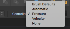
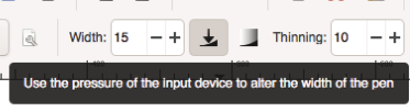
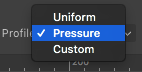
The reason of having separate pressure pen and brush tools was to have quick access and better visibility of these tools.
The pressure (maybe variable width is not a good name), tools use the tablet pressure input to generate variable width profiles for the outline.
These could be merged, but then a clear option is needed to turn on / off pressure sensitivity. For example, there are cases when the tablet is used to draw shapes, but pressure should be ignored.I would keep the pen and brush tools separate for now, I think this is a classical arrangement.
I would also keep the new path sketch tool separate from the pen tool. I think there are too many options as it is, to merge with the options of an other tool.
But I agree that given a new app with many features, it will have a learning curve. This was also the reason why some tools were kept separate. It is more visible, and discoverable, than some hidden option.
-
@vectoradmin I can see what you mean that by not merging these features you can make them more visible, show the user it has more options than a more familiar tool from other software. By doing this, new users are perhaps more likely to buy the software. The side-effect of this for a new user is though, that he/she might not see the forest through the trees. I was happy to discover the shape sketching tool, which I might not have found as quickly if it were combined with the pencil tool. But perhaps there is another way to bring these features to the attention? Perhaps if the the pencil tool were integrated as an option into the shape sketch tool, thus highlighting the difference between VS and other vector apps it would work better?
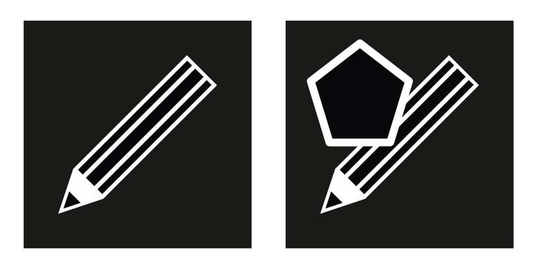
I am no Ui/UX designer by any means, so you can take my opinions with a pinch of salt, but I am an avid user of vector and raster software and this has given me some preferences as to what works well or not so much. What Vectorstyler lacks to me is some clarity in the tools, as I adressed above. This is partly caused by some tools being new and having to be discovered, but also partly by the design of the icons and sometimes the naming conventions, which are not always very clear. Some icons look quite alike and it is not very clear what a tool does. This is also caused by the fact they don't have a unified style. The differences in style between the three brush tools icons or the two pencil tools icons are very big, but the icons do not really clarify its function. By having a more unified style it would make it easier to highlight the differences. I just made a quick sketch to show what I mean:
By having a combination of familiarity with a new component added it might make it easier to see the differences in what the tools do.
-
@b77 I can see that the developer wants to be able to release this software some time soon, however I think it would be more difficult to fundamentally change the way tool are organised when it is released, as opposed to when it is still in beta. So perhaps this is the right time to consider these things?
-
@b77 said in Some thoughts on tool organisation UI:
Panning and zooming the view is used so much in graphics apps that their shortcuts (spacebar to pan, scroll wheel or Option-swipe to zoom) became second nature to most of us and it would be a mistake to change them. Unless you mean something else?
I am referring to the actual tools in the tool"box" along the left side (by default) of the window, toward the bottom.
You are in a way making my point: you are so used to the shortcuts that work regardless of tool that the tools themselves are entirely redundant and may as well not be there at all.
@Boldline said in Some thoughts on tool organisation UI:
VS has SO MANY awesome options available to the user and I love that - but it also needs to be efficiently usable by a newbie so the learning curve isn't too high that it scares off users. VS gets better all the time and I'm excited by what it offers - streamlining the UI is something I think we all hope to see more of
I agree. Right now the tools in particular are so numerous and there are so many with seemingly minor differences between them that I take one look at it and almost have to force myself to even try working with the program. I spend so much time digging through the tool flyouts and trying to decipher the (to me) cryptic icons representing the tools which are so similar to each other that the icons don't really tell you anything about what they do, that it is hard to get anything done sometimes.
@vectoradmin said in Some thoughts on tool organisation UI:
Many of these issues are new app problems. Tools are different, arranged differently.
That isn't an issue and should clearly be expected when working with any new software.
The reason of having separate pressure pen and brush tools was to have quick access and better visibility of these tools.
The pressure (maybe variable width is not a good name), tools use the tablet pressure input to generate variable width profiles for the outline.
These could be merged, but then a clear option is needed to turn on / off pressure sensitivity. For example, there are cases when the tablet is used to draw shapes, but pressure should be ignored.Agreed - both options should clearly be there - but when I opened the program for the first time and tried deciphering the icons for the tools, I saw so many tools with such similar icons that it actually reduces discoverability. Why so many tools that have icons that simply look like brushes or pencils? With those tools merged it becomes clear: one brush tool so I can find it. Then I can have options for the brush in the context bar.
With multiple tools with brushes as icons it primarily adds confusion for new users, it is not really all that helpful.
I would keep the pen and brush tools separate for now, I think this is a classical arrangement.
Sure... but there should be one pen tool, one pencil tool, and one brush tool. The problem is that there are so many tools that are so similar to each other that users will take longer to come to terms with which icon represents which brush tool than they would to figure out how to turn pressure sensitivity on and off with an option on the context bar.
The Affinity products do put it on the context toolbar:
As does Inkscape:
Amadine:
All of those are quite discoverable and provide ready access to this option.
Meanwhile with Krita and Corel Painter it is actually a property of the specific selected brush (rather than the tool), as those applications are designed for natural media painting and thus try to mimic the behavior of real-world art tools.
But I agree that given a new app with many features, it will have a learning curve. This was also the reason why some tools were kept separate. It is more visible, and discoverable, than some hidden option.
This is backfiring though.
As others have stated, the app has a very nice feature set, but there is so much potential to reduce the learning curve and make it much more approachable that it would be a shame to release it like this. First impressions are important and right now it is kind of daunting to dig through all the clutter when I start seeing all of the numerous far too similar-seeming tools.
For a time I was left wondering why there were effects brushes, why there were both Shape Effects and Image Effects panels (rather than just an Effects panel) in addition to the various effects options on the Appearance panel - but I think I am coming to terms with those at least. They add a bit to the confusion when just starting out and I think some of the bugs early on made it a bit harder but it seems to have cleaned up a fair bit by now, though it still took a bit for me to wrap my head around how all of those pieces interact with each other.
It might actually be kind of nice if the effects brushes worked on the selected entry in the Appearance panel when there is one selected rather than always applying to the main shape. Perhaps the Image Effects and Shape Effects panels could similarly reflect the selected entry in the Appearance panel?
Trying to look for ways for those things to play nicer together and be a bit more fluid... right now there is not only a lot of apparent overlap at the beginning but also a lot of different ways of working with otherwise very similar things.
-
@fde101 I see your point.
I think the various brush tools will be merged, and we will have a pen, pencil and brush tool (plus the sketch).
I added this to the backlog. Will have a width mode in the context panel.As for the effect panels, I think keeping Shape and Image effects separate is important, as they are substantially different things, and have different impact on the result. Shape effects will always result in scalable curves (even when exported), while image effects must always be flattened to images (with a small exception for SVG export).
The Appearance panel + shape effect brush tool combination is an interesting idea. The only problem is that effects on individual style items must be nondestructive, while those brushes are destructive. Maybe assigning different shapes per style (with the possibility of clearing it up) could solve this. But then it is almost like a group
")
As for the active effect view in the Shape/Image effect panels, these already consider the selection in the Appearance panel, and show/edit the effect of the selected style (not the object).
The only problem, that the interactive editors will not handle the appearance panel selection (it is in the backlog). -
@vectoradmin said in Some thoughts on tool organisation UI:
@fde101 I see your point.
The Appearance panel + shape effect brush tool combination is an interesting idea. The only problem is that effects on individual style items must be nondestructive, while those brushes are destructive.Not sure that I follow how those are destructive?
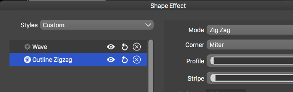
For example, I create a simple rectangle and give it a plain black fill; there are no effects showing in the Appearance panel or in the Shape Effects panel:
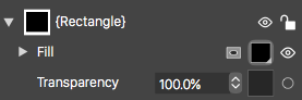
Now I select one of the brushes and click on the rectangle, maybe manipulate it a bit with the resulting handles:

The effect shows up in the Shape Effects panel and an icon appears for it in the Appearance panel:
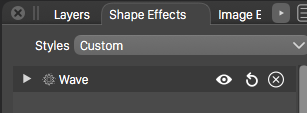
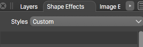
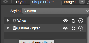
With nothing selected in the Appearance panel, if I choose the button to add a new shape effect which appears at the bottom of the appearance panel and select a new effect, that effect appears right next to the one from the brush in the Shape Effects panel and pops up a window that shows both the effect from the brush and the one newly added from the Appearance panel:
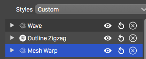
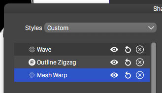
If I use the add button at the bottom of the Shape Effects panel I similarly see the effect in both the Shape Effects panel and the window that pops up when I click the icon in the Appearance panel:
That being said, I previously missed that the Shape Effects and Image Effects panels do indeed follow the selection in the Appearance panel. I thought I had been confused previously when that did not happen, but maybe that was an earlier bug or I just wasn't looking at it right - in any case it is working now, which is VERY nice.
There are five problems or omissions from what I can see:
- If I have an entry selected in the Appearance panel and use the Add button on the Shape Effects panel, the effect gets added to the selected entry from the Appearance panel, but the entry gets deselected which effectively hides the added effect in the Shape Effects panel until I reselect the entry in the Appearance panel. The entry in the Appearance panel should remain selected.
- If I have an entry selected in the Appearance panel and a shape effect selected in the Shape Effects panel, then use the button on the panel to edit the effect interactively, the entry on the Appearance panel becomes deselected and the wrong effect gets edited (not the one I had selected). The entry on the Appearance panel should remain selected and the selected effect be the one that is edited.
- If I have an entry selected on the Appearance panel and use one of the shape effects brushes, then when I click on the shape to apply the effect to, the entry in the Appearance panel becomes deselected, and the effect is applied to the shape rather than to the entry in the Appearance panel. The entry on the Appearance panel should remain selected and the effect of the brush applied to that entry.
- If I switch from the Appearance panel to another panel that is a tab in the same area (Transparency for example) the entry in the Appearance panel remains selected; when I switch back to the Appearance panel, the entry is deselected. Switching tabs should not clear the selection.
- If I close the Appearance panel while an entry is selected, the entry remains selected, leaving the Shape Effects panel (for example) showing the content of the selected entry which is no longer accessible by the closed panel; closing the Appearance panel probably should clear the selection. (Curiously, re-opening the panel does clear the selection, which seems to serve no purpose?)
-
I added these to the backlog.
A destructive effect means that the object shapes are changed as curves by the brush, and there is no editable effect to change the parameters. In this case no effect shows up in any of the panels. The object shape is changed as if it was changed by the node tool.
A nondestructive effect is when we get an editable effect attached to the object or a style. This shows up in panels, and the parameters can be modified any time, or the effect removed.
-
@vectoradmin said in Some thoughts on tool organisation UI:
I added these to the backlog.
A destructive effect means that the object shapes are changed as curves by the brush, and there is no editable effect to change the parameters. In this case no effect shows up in any of the panels. The object shape is changed as if it was changed by the node tool.
A nondestructive effect is when we get an editable effect attached to the object or a style. This shows up in panels, and the parameters can be modified any time, or the effect removed.
Thanks, evidently we were thinking of different brushes, as the ones I was referring to do show up in the Shape Effects panel.
Or maybe it is my terminology?
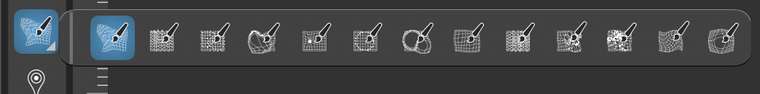
I am referring to these:
-
@postdes said in Some thoughts on tool organisation UI:
@b77 I can see that the developer wants to be able to release this software some time soon, however I think it would be more difficult to fundamentally change the way tool are organised when it is released, as opposed to when it is still in beta. So perhaps this is the right time to consider these things?
I was just replying to the specific request of @fde101 about toolbox customization, which would have taken time to implement if it wasn't already available.
So that doesn't mean I disagree that improvements can be made to the way tools are organized (also their icons) — I would just say let's not get to extreme measures like combining too many tools into one or hiding essential tools from the toolbar, as this can create problems for new and maybe also experienced users.
-
@fde101 Those are interactive editors
and indeed they don't work with content selection now.
this is an open bug. -
Forgot to add: these are the destructive shape effect brushes. These tools paint an effect to a local part of a shape (or shapes).
-
Some improvements in this area are in build 194.
The pointer tool has been simplified, the various selection modes are available in the context panel now.
The pencil and brush tools were also simplified. The pressure mode can be selected in the context panel.
-
Thanks, that is a big improvement. You even got the velocity option in there!
-
Forgot to add here, but the Appearance panel selection should be considered now by the shape and image effect editors.
-
@vectoradmin
The tools are working well now with the appearance panel items; however, am I missing something or is the elastic warp tool broken?
-
@fde101 There seems to be a regression here, added to the backlog.