Toggling center point node on and off - easily
-
I have experienced many, many times when working with small objects (which I do a lot) that I accidentally move the center point node. To avoid this I have to zoom in and out, which is firstly annoying and time consuming, secondly I lose the whole picture while doing so.
I use the center point node every so often, but not often enough that it makes sense for it to be active all the time.
I might recommend considering something like the Affinity model, that the display of the center point node can very easily be turned on or off. In Affinity this is done in the Context Toolbar, which makes sense as that is exactly what a context toolbar is for.
")
Light theme used to make icon more visible:
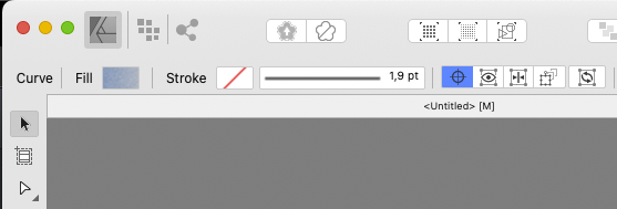
Other options next to this icon is:
- Hide selection while dragging (This one can be useful as well)
- Show alignment handles
- Transform objects seperatly
- Cycle selection box
I don't recall using the last three options, ever.
🍏 macOS Sequoia Apple Silicon
-
@Ingolf I will add this to the backlog. What is "Cycle selection box" doing?
-
@VectorStyler said in Toggling center point node on and off - easily:
@Ingolf I will add this to the backlog. What is "Cycle selection box" doing?
It makes everyone on the planet wonder what "Cycle selection box" means.
I think it is the same function that is activated when you press the period key in AD.
Longer explanation here:
-
@Ingolf What if the app would take care of this — when the object looks small because of the zoom level, the center point and the skew handles should not be shown at all, without buttons for this.
And when it looks really really small, allow only moving of the object — no center point, scale and skew handles and also no possibility to enter inside the object as a container by double-clicking.
Same with text objects — when zoomed out, double-clicking text could be restricted to entering text editing mode, not like it is now where you risk entering the text shapes as a container on double-click. (I was going to write about this text double-clicking issue to the developer anyway).
MacBook Pro (Intel) running Monterey 12.6.4
-
-
@b77 The problem is that in this case, the user interface is left to algorithms based on general assumptions about the user's preferences. If the assumptions are wrong, the algorithms need to be adjusted. And we lose the freedom to configure the application individually and from design type to design type.
In this specific case, it is precisely the assumptions that take up space in the user interface. The assumption that I want to see a blue center point over the selected object, and the assumption that on top of this center point I want to see the red center point node.
Personally, I use them both extremely rarely, and they are therefore visual noise the rest of the time. But it makes sense to be able to turn them on and off zoomed in or out, quickly and easily. In general, I want to see as few control elements as possible in addition to nodes. But I want to have quick access to them.
By the way, it's not just the zoom level that means the objects appear small. They can be small at 100% zoom - side by side with large objects.
Have a nice weekend
🍏 macOS Sequoia Apple Silicon
-
I know Illustrator has an option to be able to toggle the visibility of the selection bounding box, highlighting paths, etc. If it's not already in VS, what about that option being added under the view menu? The red dot could also be added to that list.
Maybe under the view menu is a general "show selection" with flyout menu with options to check; rotation red dot, bounding box, node highlight, etcEveryone's workflow is different for sure - the contextual menu feels to me like a place for things that need changing frequently. I don't see toggling the visibility of these selection guides as something most users would be doing frequently in one session. It seems like something you would either have on a lot or have off a lot.
-
@Ingolf said in Toggling center point node on and off - easily:
@b77 The problem is that in this case, the user interface is left to algorithms based on general assumptions about the user's preferences. If the assumptions are wrong, the algorithms need to be adjusted. And we lose the freedom to configure the application individually and from design type to design type.
I don't know… the algorithm for greeking text does a good job, and it can be adjusted in View > Display > Display Options > Precision.
I guess a similar algorithm could work for the other object types — progressively hiding some of the handles or all of them.
Have a nice weekend!
-
@b77 said in Toggling center point node on and off - easily:
@Ingolf said in Toggling center point node on and off - easily:
@b77 The problem is that in this case, the user interface is left to algorithms based on general assumptions about the user's preferences. If the assumptions are wrong, the algorithms need to be adjusted. And we lose the freedom to configure the application individually and from design type to design type.
I don't know… the algorithm for greeking text does a good job, and it can be adjusted in View > Display > Display Options > Precision.
I don't really think there is a comparison with greeking in particular. It's certainly not a setting I've changed more than once in any program I've used. If at all.
But
- Then it will be a semi-permanent setting in all documents without a visible toggle
- View > View Settings > Precision is an obscure and hidden place far away to enable/disable it, and the user is assumed to have to know about this setting to change it
I'm more into an on-the-go solution for a functionality like this, where I can quickly - and exactly when I want it regardless of zoom level etc. - turn viewing on or off directly from e.g. the context toolbar.
Hence the central and easily accessible location in Affinity.
-
@Ingolf said in Toggling center point node on and off - easily:
Hence the central and easily accessible location in Affinity.
Comparing this to Affinity is a little like comparing apples and oranges because Affinity lacks a lot of the tools found in VS and therefore more UI can be dedicated to more obscure features.
If everything is accessible with a dedicated place right on the UI then nothing is accessible in reality because it gets crowded and overwhelming.
@Ingolf - how often would you be swapping the view on and off for these selection guides/red dot, etc.? You mentioned hardly using them or needing them. I could be wrong, but it sounds like it's not likely to be a frequently toggled option even for you.
The UI contextual space should be reserved for options related to the tool at hand and for quick toggle options. I occasionally would want to work with the selection guides off, and going up to the view menu to toggle it does not seem like too many steps. the view menu is an intuitive clue as to where to find the toggle for these selection guide options for new users