setting objects into perspective without unwanted funky warping
-
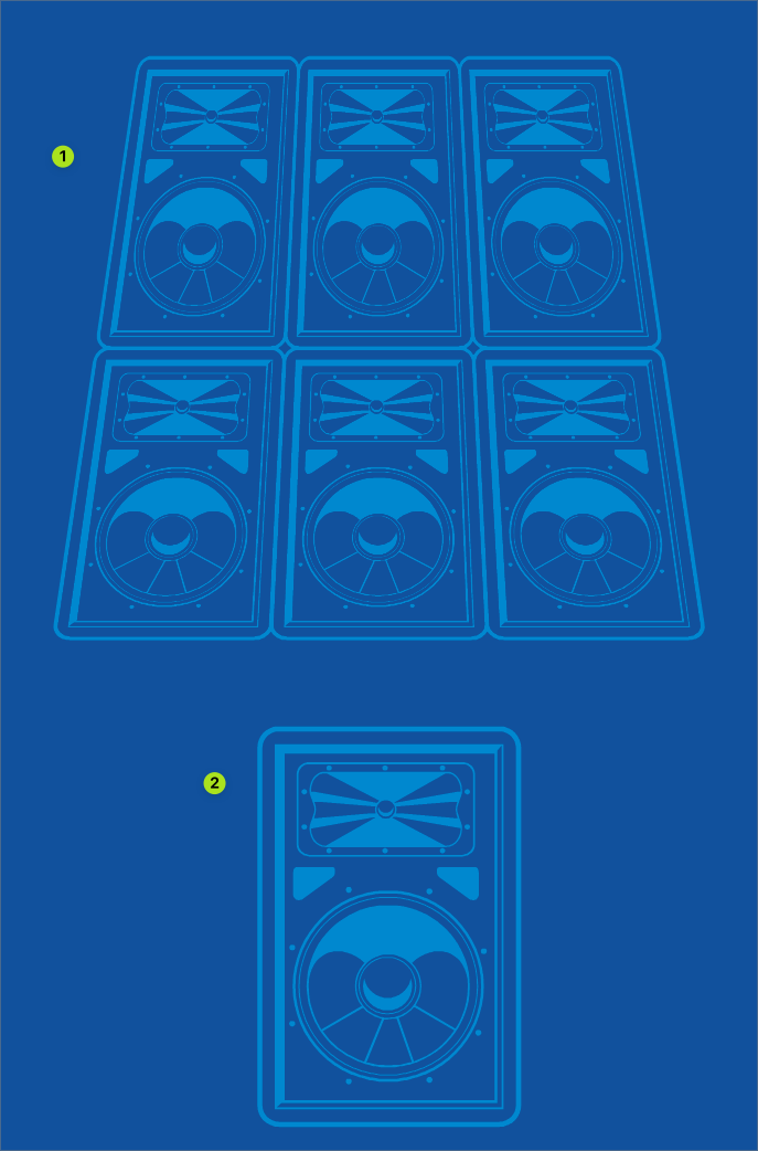
I created a speaker (#2 in image below) and then proceeded to duplicate it into two rows. I wanted to give it a change of perspective to make it look like they were not flat but towering over the viewer. I used the warp tool to edit the speaker grouping to get that tilted in effect, but the speakers look warped in a bad way in the new result. (#1 in image below) The main circles inside the speaker do not look right with the bottom set being squished one way and the top set being stretched the vertical way. Is there a better way in VS I could achieve the result i wanted without the strange extra warping?
Here is the file itself: 0_1657408652003_warped speakers.vstyler
-
@Boldline There is no one-click-solution if you want a realistic effect. You need to…
- move the rounded center of the woofer and the tweeter downwards (the tweeter more), then…
- duplicate the speaker two times to have three speakers in a row;
- Shift-nudge the round center of the woofer and the tweeter of the 1st speaker to the right;
- Shift-nudge the round center of the woofer and the tweeter of the 3rd speaker to the left;
You should have this now:

Now you just need to…
- select all three and group them;
- scale them down vertically a bit, so they don't look so tall;
- apply the 4-point distortion effect to this group;
- duplicate the distorted group and move it on top, then scale it down so you can get the perspective effect you need;
AND!… I would click the 'eye' button of the 4-Point Distortion in the Shape Effects panel to nudge the rounded center of the woofers and the tweeter of this group on top, then click the 'eye' again.

-
I think that the worm's eye view or view from below always involved some distortion. To me it's part of the effect. The only thing I would improve is the proportions since the upper row should be smaller. So like @b77 said you may scale things vertically. Finding the middle (the perspective one) could be useful too. Then you adjust the warping to the shape that suits you (the circles may be very warped).
In the below example I primarily used a dummy as a reference but you could probably make it with a clone (warping the clone with 4 points tool and paste all the speakers inside the original, same method that @Subpath taught in the isometric topic here).
Example images here
File : 0_1657420581793_warped-speakers_Fred.vstyler -
Yep, applying the distortion effect to a group of three speakers then duplicating and scaling down that group instead of applying one effect to all six speakers is needed because the 4-Point Distortion effect does not move (distort) the center of the 6 speakers closer to the top side where you moved the control nodes closer to one another.
In other words, 4-Point Distortion is not a perspective effect (in Boldline's original file the height of the top row is the same with the bottom row), that's why you have to group the speakers 3 by 3 and scale down the group at the top.
-
@b77 @Devil-Dinosaur
Thank you both for your help and taking the time to share ideas and directions. I had not considered the 4 point distortion tool and clearly there's a lot I need to look into, in order for things to look correct in perspective.
i also have some questions and ideas on how to improve the 4 point distortion tool. I need to play with it more, but for example, it would be nice to be able to completely control how much of an edit is made instead of guessing by hand. I'll make a new post on that topic in case there are things I missed.
For now, following your advice and given some time constraints getting this sent off to the client, I ended up with this result:
To me it looks a whole lot better than where I started, and in this situation, the speakers are in the background, so even if it's off a little, it won't hurt the design overall. This was the end result:

Did everything inside VS except for using Illustrator CS6 to create the offset path on "Let's Rock-n-Roll" because VS offset path does not always love detailed fonts yet! and also used it to create the 3D effect on the "CCMS" at the top -
Cool poster


-
@Devil-Dinosaur said it already
impressive Result
-
@Subpath @Devil-Dinosaur thank you! I appreciate it. This was a fun one to do. The school wanted a unique design for the students instead of the overused bulldog mascot. They suggested a rock poster theme instead. It's always fun to see a rough idea turn into a final design because while the idea is there, you never know exactly how it will turn out in the end! I learned more about stacking speakers from @b77, at least making them look a little more authentic.
I always get inspired seeing what others create in VS, socially since there's a diverse collection of styles and interests amongst the forum contributors. I'm going to try to post more examples of things I make in VS on the forum and I hope anyone who feels comfortable doing so will share as well.
It would provide opportunities to talk about the ways things get created, show off what VS can do, and learn from each other.
-
@Boldline Nice! I wonder did you find a way to space the guitar frets automatically?
LATER EDIT: Never mind, it can be done by adjusting the Blend Transfer curve.

-
@b77 I had not thought to do that with the Blend transfer curve - that's a tool I know about and what it can do but have no played around with yet. In this case I had the guitar standing upright and made the first and using copy and paste, just dragged them down to each location expanding their width as needed.
This is why I want to see more art shared - so many opportunities to talk about the best tool for the job. -
@Boldline said in setting objects into perspective without unwanted funky warping:
This is why I want to see more art shared - so many opportunities to talk about the best tool for the job.
I agree. Maybe a "Work" or "Work in Progress" or "Case study" section on the Forum would be a good thing. (for forum members only?)
-
Would plead more for a gallery
Btw. I don't think we would really need a new section for this.
Someone could open a thread and call it "Gallery".
And every forum member could post in it.I am also interested in what other users think about this topic.
Is this Thread Idea for a "Gallery" ok ? Or what is your opion ? -
@Subpath @Devil-Dinosaur I asked @VectorStyler about this and while he was supportive, he was also concerned of the amount of storage space the images would take up. (correct me if I'm wrong in my summation of your thoughts @VectorStyler)
Maybe if we had a rule that images in that section would be linked instead of embedded?🍎 macOS Tahoe 26.2, Mac mini (M1, 2020), Chip Apple M1, Memory 16 GB
Cintiq 27QHD Display and LG Ultra HD Display -
@Boldline said in setting objects into perspective without unwanted funky warping:
@Subpath @Devil-Dinosaur
Maybe if we had a rule that images in that section would be linked instead of embedded?Sure. It's fair. My only (little) concern is to find a storage place that is compatible with the forum and everyone's browser. I remember that my own website doesn't appear to some of the members (probably because my hosting is not https) and Google drive storage neither works here for images (but is apparently OK for videos).
If someone has a clue. I may also consider Dropbox if it works. -
Well, I have already assumed that the storage space
might be a problem.Apart from the imagehosters, Recordit could also be used
for this maybe unusual, but possible.