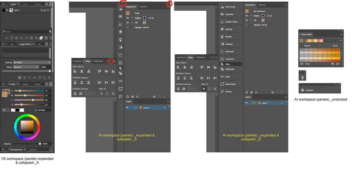
Streamlined VS Workspace
-
Firstly, I will start off with a disclaimer: I am no UX / UI expert…
I do have some requests though which I believe can help produce a more enjoyable and aesthetic user experience in VS. I am specifically targeting these two:- The ubiquitous spread of the exit or close button (X) on all the panels in VS. Their visibility is eating up space on the panels and somehow gives the impression of a crammed UI.
For inspiration check out AI’s which only appears on undocked panels. See attached image.
- The docking of the panels in VS also eats up a lot of space with no option of docking and collapsing panels to the sides of the program window.
For inspiration check out AI’s docked panels. See attached images.
I am hoping this is already on the table and will soon appear in future updates. If these issues have been raised before, I apologize for repeating them.
