VectorStyler
    • Categories
    • Unread
    • Recent
    • Tags
    • Popular
    • Register
    • Login

    Inspired Letter Logo

    Scheduled Pinned Locked Moved Features and Ideas
    8 Posts 4 Posters 7.2k Views 3 Watching
    Loading More Posts
    • Oldest to Newest
    • Newest to Oldest
    • Most Votes
    Reply
    • Reply as topic
    Log in to reply
    This topic has been deleted. Only users with topic management privileges can see it.
    • Victor VectorV Offline
      Victor Vector
      last edited by Victor Vector

      Hi,
      I was feeling inspired by the tireless work of @VectorStyler so I thought I would play with a couple of ideas for a VectorStyler letter-based logo.
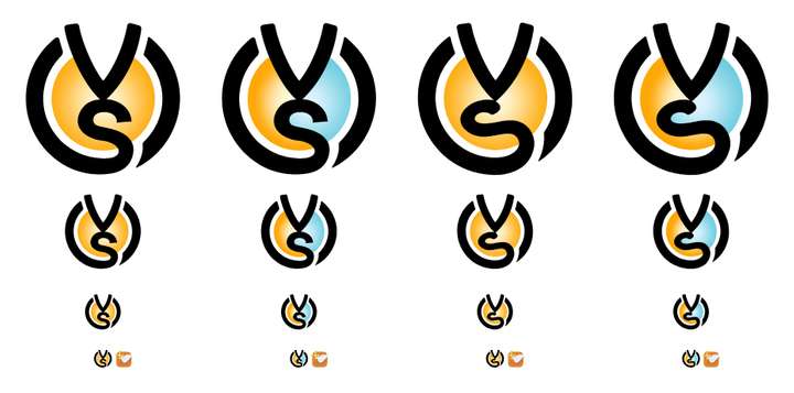
      I like the VectorStyler splash screen abstract logo, and that it uses many of the powerful features of the app to create it.

      In this version I was attempting to incorporate the idea of the "V" being the nib of a pen, or the tip of a brush, and the "S" being a freshly created stroke.
      One version features an "S" that is more letter-like, and the other is more casual, like a pen stroke on a flat surface.

      Finally, I tried a color variation, keeping with the orange (love orange!), but also a version with some contrast, giving it a slight yin-yang vibe.
      The various size comparisons show how it would scale down for legibility if it was a taskbar or desktop icon.

      I attached the .vstyler file for anyone who is interested in it.

      0_1704558553296_VV Logo Inspiration 1.1.jpg

      VV Logo Inspiration v1.2.vstyler

      S 1 Reply Last reply Reply Quote 4
      • S Offline
        Subpath @Victor Vector
        last edited by

        @Victor-Vector

        nice work, like the second from
        left to right a most

        Win 11
        CPU: AMD Ryzen 5 9600X, 6-core.
        GPU: Nvidia Geforce RTX 5070.

        Victor VectorV 1 Reply Last reply Reply Quote 2
        • F Offline
          FastVector
          last edited by FastVector

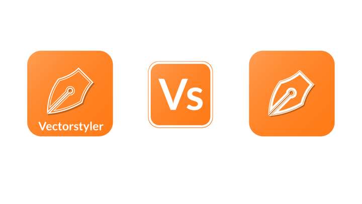
          Like the idea of the pen, so here also a alternative logo.

          0_1704569891798_Logo.jpg

          Windows 10 | 1920x1080 | 125%

          Victor VectorV S 2 Replies Last reply Reply Quote 4
          • Victor VectorV Offline
            Victor Vector @Subpath
            last edited by Victor Vector

            @Subpath
            Thanks! I like the second column version as well.

            1 Reply Last reply Reply Quote 2
            • Victor VectorV Offline
              Victor Vector @FastVector
              last edited by

              @FastVector
              That is a very pleasing pen shape! Thank you for sharing your inspirations.

              1 Reply Last reply Reply Quote 2
              • S Offline
                Subpath @FastVector
                last edited by

                @FastVector

                difficult to choose
                like the idea with the double outline
                and the shadow

                tend most likely for the first one
                but I'm not so happy with the shape of the pen
                and the pen could also be a little bigger

                the last one looks a little empty to me

                Win 11
                CPU: AMD Ryzen 5 9600X, 6-core.
                GPU: Nvidia Geforce RTX 5070.

                1 Reply Last reply Reply Quote 1
                • F Offline
                  fde101 Global Moderator
                  last edited by fde101

                  It looks nice (I too favor the second from the left), but consider that a lot of current software is used in different countries with different languages and even different alphabets. A logo based on letters which represent the English name of the software may not translate well.

                  Just because Adobe is doing it doesn't mean it is a good idea (the fact that they went subscription-only is significant proof of that...)

                  S 1 Reply Last reply Reply Quote 2
                  • S Offline
                    Subpath @fde101
                    last edited by Subpath

                    @fde101

                    Can follow your thoughts and also agree with them.

                    But in my opinion that it does not necessarily depend on the
                    translatability of a company name.

                    Ultimately, a term / word can also be seen simply as a graphic
                    and differs in this way.

                    Win 11
                    CPU: AMD Ryzen 5 9600X, 6-core.
                    GPU: Nvidia Geforce RTX 5070.

                    1 Reply Last reply Reply Quote 2
                    • First post
                      Last post