Improving the stroke alignment icons
-
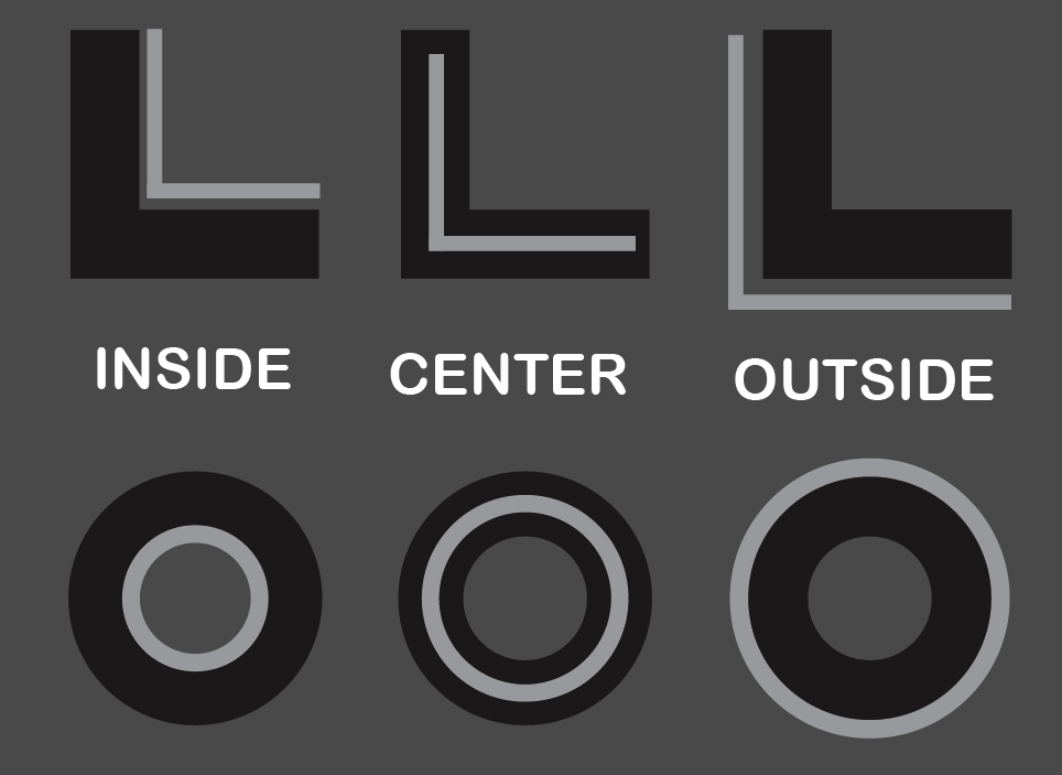
It could be that my Illustrator brain is kicking in - but when I look at the stroke alignment icons - it's hard for me to understand what they are showing me. I get what they do and maybe part of it is being used to what illustrator has:
I don't think Illustrator's are the best by any means and I think they could be improved upon as well.
The version in VS are hard to read I think in large part to their sizing - they are really small on the screen and the parts of each symbol that define the role blur together for me
Here is what I am proposing - I'm not partial to the "L" shape or the circle. I think either one of these would be easier to understand than the current set in VS. Especially if the icons themselves could be a little bit larger than they are now.
What are people's thoughts?
🍎 macOS Tahoe 26.2, Mac mini (M1, 2020), Chip Apple M1, Memory 16 GB
Cintiq 27QHD Display and LG Ultra HD Display -
Yes, there are icons in the case that I'm waiting for a tooltip to make sure I'm thinking right.
I generally understand the concept of such an interface in grayscale. It is uniform, austere, less distracting, perhaps giving the impression of being professional. Personally, I am not a great proponent of such interfaces. We get rid of the incredibly important information carrier that is color. With many icons, the color would dispel any doubts.
Color accentuation makes it easier to navigate the interface and you find elements faster without focusing your eyesight. I refer here to AD. Even now, when I use this program much less for VectorStyler without running it, I remember that the arrangement of objects on layers is yellow, that I should look for text tools just under the shape icons that are blue, snapping icons are red, etc. Then I don't even have to wonder what icon to look for.
In this regard, color could also bring more readability.
This is just an opinion that has been in my mind from the beginning.
This is just as important as arranging the elements in the same place. I am referring to the font selection field. When I use the Text tool it is on the left side, but when I switch to the Transform Tool the font selection field moves to the right. Now I got used to it, but it was weird for a long time. -
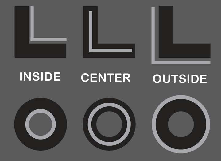
@Boldline Deciding to use circles for these buttons forces you to make them small, which makes it difficult to see their details, no matter how good the drawing is.
So if instead of using circles the app would use the same model like the Corner buttons it would be easier to see what each one does:
.
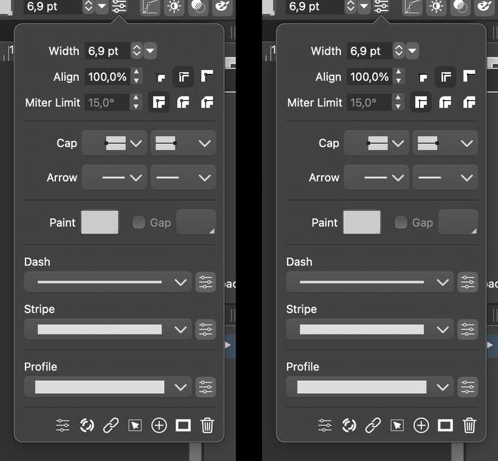
Would something like this be better? The spine needs to be black — darker than the background here for maximum contrast (or white or very close to white in Light UI Mode), and I would go with smaller nodes (I made two versions — smaller and even smaller).…………………………………
@vectoradmin The third Corner type button needs to have the same "inner spine" and node as the first two, and the Miter Limit name and field could be aligned with the other input fields. I also made the panel slightly wider because I moved the Corner buttons after the input field.MacBook Pro (Intel) running Monterey 12.6.4
-
@b77 Added this to the backlog.
-
@b77 This has been implemented in build 1.0.044