Add Object Origin, Position, Size, and Rotate Capability to the Context Toolbar
-
User Interface Improvement:
@vectoradmin,
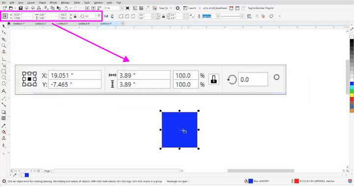
I’d like to see VectorStyler add a 9-Point Reference Object Origin button, Horizontal & Vertical Position Coordinates, Size, and Rotation Editor Entry Fields to Context Toolbar with any Object selection.
In addition to being convenient, it would keep the Workspace less cluttered by allowing you to edit all of those parameters without the need to take up extra space by opening up a separate floating Panel.
Here is what it looks like in CorelDRAW:
.Bonus:
I would also like to see the Positions of X and Y Coordinates of selected Nodes appear in the Context Panel so you can set the exact positions of a node on a Path using the Editor Fields.
-
@Vector-Rock Already exists, if the panel is dragged from its title label to a horizontal docking area. Only works for panels that do not contain a vertical list (i.e. can dock transform, color, alignment, etc. but cannot dock layers, styles or presets).
-
Some of us would prefer this to be there by default, and the Stroke panel after it.
-
@b77 I understand your thought on this. I had a similar request a few weeks back concerning the align panel. I wanted it available in the contextual menu anytime multiple shapes and text were selected. Then I discovered the shortcut option at the top right and that for now, seemed like a better option. I can click once to get a drop-down menu and easily align from there. I wonder if the same could work for you with transform? It's also up there in the same area as align.
I know there have been numerous conversations with @vectoradmin about what should be in the contextual menu and what can fit. It might be worth all of us taking a deeper look at what matters most. I also think the same could be said for use of the right click sub menu. If we right click on a shape, the menu opens and one option is transforn, then align, etc.
-
@Boldline I didn't mean the contents of the Transform panel should be moved to the context bar, oh no. Just that the Transform panel could be visible by default, docked horizontally under the context bar, along with the Stroke panel.
And I said 'Some of us would like that"…
 (Me with my motte-and-bailey).
OK, I thought about it and I reminded myself that when creating "freeform" artwork users don't need the Transform panel most of the time because they adjust sizes, location and rotation visually.
I guess this is the group that the VS (and AI) developers had in mind by relegating the Transform panel under a button — it's not always needed, this is not a CAD app, some people run the app on 13" screens, so why take a slice of it with this panel they don't need and also potentially scare beginners by making the app look too complex.
But others like the Transform panel to be always visible, so they can do precise adjustments quickly and check things instantly. Mostly users who design for print or create technical drawings, I suppose.
So it's different approaches, and the developer cannot guess which group to accommodate best.
Until a way to estimate how to best adjust the UI to user's preferences (by checking a few boxes on the first run maybe?) it can stay this way, I guess.
@Vector-Rock Any ideas about what such checkboxes should ask? I guess if the user can check that the 'Artwork is intended for print', the app can create a CMYK document and display the Transform panel by default.
(Anyway, I would take the opportunity to suggest the developer that all the panels in their horizontal state can be made a bit more compact and less tall as a result).
…………………………………………
But how about the Stroke panel? It would be nice to be always visible, for both freeform work and for more technical drawings, IMO.
-
@b77 said in Add Object Origin, Position, Size, and Rotate Capability to the Context Toolbar:
I didn't mean the contents of the Transform panel should be moved to the context bar, oh no. Just that the Transform panel could be visible by default, docked horizontally under the context bar, along with the Stroke panel.
Can you explain a little more what you mean by this? It's me, not you! I'm just trying to understand. You said you didn't want the contents of the transform panel moved to the context bar, but that you did want the transform panel visible by default.
Or did you mean you want to keep the transform panel but also offer a permanent docked smaller panel that appears in the context bar?
Illustrator provides the visible sizing as a permanent part of the upper menu. In some ways, I prefer that because a quick glance tells me size. I'm also not often relying on exact precise measurements most of the time. if i was, I can see how important it would be to always have that information at my fingertips.
What about the option to just dock the transform panel yourself at the top of the screen? Would that not solve the problem?"(Anyway, I would take the opportunity to suggest the developer that all the panels in their horizontal state can be made a bit more compact and less tall as a result)."
I agree with you that the transform panel (most panels really) that are able to be docked at the top of the screen have a lot of empty space that could be reduced to save room. this is one reason I do not dock the align or transform panels myself. They seem really blocky and do not work well in that space.
Speaking only from my viewpoint, it seems to value of panels in VS is that a lot of options can be organized inside of it without overtaking the entire interface. When I use panels in VS, I feel like I'm going into a specialized world for that specific task at hand. I love the power and options all organized and available inside one panel.
My guess is that there's always a balancing act as far as what shortcuts to offer in the contextual menu and what to options are worth having the user take added steps to access.
-
I didn't have in mind an "ultra-compact" version of the Transform moved to the context bar. Is there any space left for that?
I just thought it would be better if the entire Transform panel should be visible by default, docked horizontally under the context bar when you first run the app, like the image @vectoradmin posted above.
But on second thought I can't say it's better and preferable for everybody.
So… I guess a possible solution would be to offer a few UI configurations when you first run the app (Print, Art, Technical, etc?) and let the user choose one.
And yes, I can just dock the Transform and the Stroke panels myself and have the UI I want — no problem adjusting VS to our preferences and even saving that configuration. It was just one of the suggestions for better UI defaults.

……………………………………
@Boldline said in Add Object Origin, Position, Size, and Rotate Capability to the Context Toolbar:I agree with you that the transform panel (most panels really) that are able to be docked at the top of the screen have a lot of empty space that could be reduced to save room. This is one reason I do not dock the align or transform panels myself. They seem really blocky and do not work well in that space.
Not by much because of the four buttons of the header, but yes, it can be done.
-
Let me first start off by noting that, of course there may be differing opinions on what should be in the Context Toolbar (or anything else in VectorStyler for that matter,
 LOL). Part of that is because of what people are using VectorStyler for, but interestingly, even for people who may be doing very similar things, their preferences still may differ.
For myself, I am suggesting the that the Transform Panel be available by default in the Context Toolbar whenever an Object is Selected, as CorelDRAW does very effectively.
@b77 said in Add Object Origin, Position, Size, and Rotate Capability to the Context Toolbar:
But others like the Transform panel to be always visible, so they can do precise adjustments quickly and check things instantly. Mostly users who design for print or create technical drawings, I suppose.
Interestingly, even though CorelDRAW does this by default, I doubt most people would consider it a CAD or Technical drawing program- although some may use it for this.
So it's different approaches, and the developer cannot guess which group to accommodate best.
Until a way to estimate how to best adjust the UI to user's preferences (by checking a few boxes on the first run maybe?)
@Vector-Rock Any ideas about what such checkboxes should ask? I guess if the user can check that the 'Artwork is intended for print', the app can create a CMYK document and display the Transform panel by default.
I suppose that check boxes such as “Artwork” is intended for Print” and other “Preset” options could be one way to do it, but because further customization may be needed for some, it may not be the ideal way. Of course presets like these might be a good starting place as long as further customization options were made available.
Below is another suggestion that is very flexible (although maybe a separate new post would be better for this).
.
@vectoradmin,
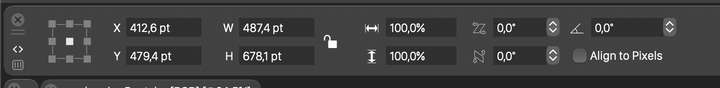
I think CorelDRAW has a pretty simple and easy to use method to add and remove Tools/Commands available in the the Context Toolbar (they call it the Property Bar) that would work well for VectorStyler.*At the far right of the Property Bar, there is a + Icon (see image in my original post). The + Icon is called the Quick Customize button and brings up a long list of Tools/Commands that have Check Boxes next to them. Simply put a Check Mark next to the ones you want to appear in Context Property Toolbar and they are added (or removed if unchecked).
If possible, I would make it so that if you checked more items than would fit into one row of the Context Toolbar, that it would automatically create a "Second Row" of Context Toolbar below it to accommodate additional tools to be added if the user desires.
*Footnote:
You can also customize the Context Property Bar By Tools->Options->Customization. Then in Dialog Box, click Commands, then from the list of commands, drag the Icon to the Property Bar. To Remove a Command from the Property Bar, drag the Icon anywhere outside of the Property Bar.** You can Copy one Toolbar Item (Status Bar, Context Property Bar, Standard Toolbar) into another Toolbar by Holding down Ctrl & Alt and click and drag the Icon to another Toolbar.
.While I personally prefer the Transform Panel to be a Context Panel by default, I think in the bigger picture, the ability for users to add any tools/commands to any toolbar in the most flexible way would help satisfy users with any specific preferences.
That’s why I hope @vectoradmin will consider adding the capability to customize the Context Toolbar for things like this, and maybe the above method would be an easy and effective way to accomplish it.
-
@Vector-Rock I will think about some mechanism to customize the context panel content.
There are some issues specific to VS: currently, the context panel content is dynamic, depending on the selection. If customizable, it must still be dependent on the selection.
Also: the height of the context panel is one row, and the height of the horizontally docked panels are two rows. So these must be in different rows.
-
I agree that it will be hard to find a happy medium with such a variety of uses.
Personally, I like the Move window style called by the Enter key
When the object/group is selected, you press the key that activates the window, you can move around with the Tab key.
That's how I see it- First press Enter
- a Transform window with typical properties appears
- there should not be many of parameters so that moving between them without using the mouse would be fast and efficient.
- 9-Point Reference Object Origin - also possible to highlight with the Tab. Points can be selected with the 1-9 buttons
- Second press Enter
- The Move window appears
- Press Enter for the third time
- The Move window disappears
I think it would be a relatively intuitive and practical system that quickly becomes a habit.