VectorStyler
    • Categories
    • Unread
    • Recent
    • Tags
    • Popular
    • Register
    • Login

    update 1.1.080

    Scheduled Pinned Locked Moved Release notes of past builds
    20 Posts 6 Posters 2.5k Views 4 Watching
    Loading More Posts
    • Oldest to Newest
    • Newest to Oldest
    • Most Votes
    Reply
    • Reply as topic
    Log in to reply
    This topic has been deleted. Only users with topic management privileges can see it.
    • S Offline
      Subpath @VectorStyler
      last edited by

      @VectorStyler

      thanks, got it now
      the "guidline" was the missing thing

      Win 11
      CPU: AMD Ryzen 5 9600X, 6-core.
      GPU: Nvidia Geforce RTX 5070.

      1 Reply Last reply Reply Quote 0
      • b77B Offline
        b77 @VectorStyler
        last edited by

        @VectorStyler said in update 1.1.080:

        @b77 said in update 1.1.080:

        however I'm not sure about that circle — red and small.

        Is this when the node is snapped? It should also display an orange line.

        Sorry for not being clear: it's when a node snaps to another node.

        MacBook Pro (Intel) running Monterey 12.6.4

        VectorStylerV 1 Reply Last reply Reply Quote 1
        • VectorStylerV Offline
          VectorStyler @b77
          last edited by

          @b77 said in update 1.1.080:

          it's when a node snaps to another node.

          Got it! How should this be indicated with two lines (cross)?

          S b77B 2 Replies Last reply Reply Quote 0
          • S Offline
            Subpath @VectorStyler
            last edited by Subpath

            @VectorStyler said in update 1.1.080:
            @b77 said in update 1.1.080:

            it's when a node snaps to another node.

            The size of the orange circle seems to me to be a bit too small.
            But thats a very minor thing to me, have no problem with other
            solutions.

            here a comparison with the closing indicator (blue circle)
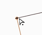
            see video here

            0_1683017614982_orange-circle.png

            0_1683017624564_closing circle.png

            Win 11
            CPU: AMD Ryzen 5 9600X, 6-core.
            GPU: Nvidia Geforce RTX 5070.

            IngolfI 1 Reply Last reply Reply Quote 2
            • BoldlineB Offline
              Boldline @VectorStyler
              last edited by

              @VectorStyler said in update 1.1.080:

              Better path closing in pen tool.

              Really love the improvements to the pen tool! It's smooth and the path closes efficiently even when I'm using the stylus and moving quickly. It's a joy to use now. Noticed you also updated the pen tool cursor

              🍎 macOS Tahoe 26.2, Mac mini (M1, 2020), Chip Apple M1, Memory 16 GB
              Cintiq 27QHD Display and LG Ultra HD Display

              1 Reply Last reply Reply Quote 1
              • b77B Offline
                b77 @VectorStyler
                last edited by b77

                @VectorStyler said in update 1.1.080:

                Got it! How should this be indicated with two lines (cross)?

                A filled opaque circle, slightly bigger than the node so that it covers it?

                Light blue, like the indicator for closing a path?

                Other opinions welcome.

                MacBook Pro (Intel) running Monterey 12.6.4

                BoldlineB 1 Reply Last reply Reply Quote 0
                • IngolfI Offline
                  Ingolf @Subpath
                  last edited by

                  @Subpath said in update 1.1.080:

                  The size of the orange circle seems to me to be a bit too small.

                  Well it is too small 🙂

                  🍏 macOS Sequoia Apple Silicon

                  1 Reply Last reply Reply Quote 0
                  • IngolfI Offline
                    Ingolf
                    last edited by

                    I also personally recommend a few pixels (literally, 1 or 2 px) between the pen tool and closing circle. On this Mac they touch each other. Otherwise I am very satisfied with that part.

                    🍏 macOS Sequoia Apple Silicon

                    VectorStylerV 1 Reply Last reply Reply Quote 1
                    • BoldlineB Offline
                      Boldline @b77
                      last edited by

                      @b77 I'm not intentionally seeking to disagree I promise! 🙂

                      I can see making it similar to the blue circle close indicator in size. I like that orange represents snapping and the light blue represents nodes and paths.

                      I like the ring effect because it still allows me to see the node itself, it's not obscuring the node

                      I've not been a fan of the previous attempts to use a cross as an indicator but I'm open minded

                      🍎 macOS Tahoe 26.2, Mac mini (M1, 2020), Chip Apple M1, Memory 16 GB
                      Cintiq 27QHD Display and LG Ultra HD Display

                      1 Reply Last reply Reply Quote 0
                      • VectorStylerV Offline
                        VectorStyler @Ingolf
                        last edited by

                        @Ingolf said in update 1.1.080:

                        I also personally recommend a few pixels (literally, 1 or 2 px) between the pen tool and closing circle.

                        Do you refer to the blue closing circle or the small circle next to the pen cursor? (this could be made larger).

                        The blue circle can be made a bit larger if needed (yes it can be a visibility issue). The problem here is that both the pen cursor tip and the blue circle center must be exactly on the node.

                        BoldlineB IngolfI 2 Replies Last reply Reply Quote 0
                        • BoldlineB Offline
                          Boldline @VectorStyler
                          last edited by

                          @VectorStyler The pen tool blue circle and ring setup for the close indicator looks and feels near perfect to me right now. If it gets too large it's going to go back to looking clunky in my opinion. The current look and feel, the transparency level and the amount of magnetic pull when closing a pen tool path is perfect. I'd love to see the snapping indicator look and work the same way while retaining the orange color.

                          🍎 macOS Tahoe 26.2, Mac mini (M1, 2020), Chip Apple M1, Memory 16 GB
                          Cintiq 27QHD Display and LG Ultra HD Display

                          1 Reply Last reply Reply Quote 1
                          • IngolfI Offline
                            Ingolf @VectorStyler
                            last edited by

                            @VectorStyler said in update 1.1.080:

                            @Ingolf said in update 1.1.080:

                            I also personally recommend a few pixels (literally, 1 or 2 px) between the pen tool and closing circle.
                            Do you refer to the blue closing circle or the small circle next to the pen cursor? (this could be made larger).

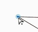
                            This is what I am referring to:

                            alt text

                            🍏 macOS Sequoia Apple Silicon

                            1 Reply Last reply Reply Quote 1
                            • First post
                              Last post