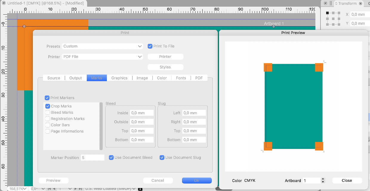
Printer marks do not work correctly
-
@vectoradmin said in Printer marks do not work correctly:
Do we need an adjustment for crop marks?
Yes, I think so. It can be user-defined (as most of the settings you have are), like it is e.g. in InDesign, or it can be automatically adjusted by the app (as e.g. in CorelDRAW).
But think about a scenario where you need e,g, a 17mm bleed (like with covers for a hard-bound book) -- you need to have all print marks (including crop marks) drawn off the bleed area to avoid having any print marks showing in print area (like printed color on the inner side of the cover paper of a hard-bound book when it is folded over the edge of the cover).
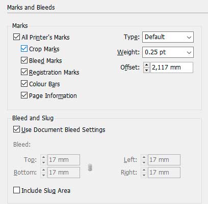
The default should also be more than zero, I think, to avoid problems with small registration misalignments, e.g. in InDesign the default offset for print marks is 2,117mm.
The result, when using the default offset, would be this when having a bleed area the width of which is 17mm:
Defining the offset at 17mm (the same as bleed area) would resolve the problem and would draw the print marks off the bleed area (a gap is not needed in this case as the edge of the bleed would be glued under end sheet so there is no danger that misaligned cover paper would show any print marks):
CorelDRAW would handle the same situaion without user intervention (and would also add the standard gap between the bleed and the marks):
I think that the label "Adjust Slug" for this setting, if it is meant to be used for adjusting the offset of print marks, should be changed to e.g. to "Mark offset" (or just "Offset", as in InDesign), and the default could be something like in InDesign, so that standard jobs that have a 3mm bleed would show the print marks with a small gap to avoid print marks showing in case of misaligned registration.
Note that if there is stuff to be printed in the slug area, as well, there is normally no need to adjust print mark offset for the slug area, as typically the slug area would be trimmed off from the final product so it can normally also contain print marks -- for this reason I would not call the setting "Adjust Slug" (if its operation is to offset print marks).
-
@vectoradmin said in Printer marks do not work correctly:
@Arde First thing to try is to start VS with Command+Option+Shift to reset the workspace and settings (may contain printer settings for new documents).
I just noticed there are new release versions. What would be the key combination for resetting the Windows version, or manually removing a print preview (I have a stuck print preview in the Windows version and cannot therefore test the bleed setting fixes in the Windows version)?
-
Btw, the grayed out values for custom bleeds and slug area could show the current document defined values, as in InDesign (instead of zero values), so that the user would immediately see whether there is need for custom settings!
-
@Arde Control+Alt+Shift can be used to reset Windows.
Maybe we should have a Reset button in the printer settings? -
@vectoradmin
Since the discussion was paused, I would like to give my personal opinion from the side.
As mentioned earlier, printmarks are now working.
But the setting is like a puzzle.
At this rate, it will bother printing workers in the future.
I expect VS to have smarter specs. Currently, the placement of objects in the slug is fuzzy, and I think it's difficult to operate as you wish.Which is VS aiming at, whether it is easy to process or finely detailed and manually set? Don't hurry, can you improve with the opinions of more professional users?
Output work is the final stage of art production. Depending on the industry, printmarks may not be so important. However, people in the printing industry are even more nervous about print than the creators.
VS is neither InDesign nor Affinity. I think it should be improved according to the development policy. -
@861475_VctSt If by "setting is like a puzzle" you mean they are unnecessary complex, write what can still be improved/streamlined.
@vectoradmin A couple of issues with printer marks:
-
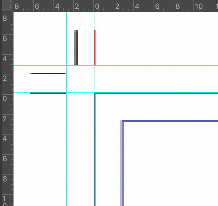
the crosses of the registration marks are too large, overlapping the trim line;
-
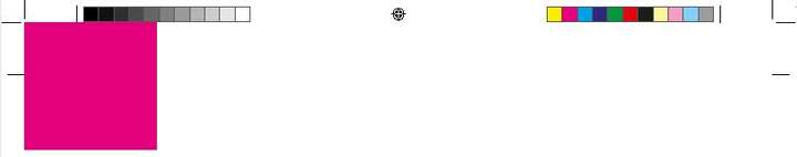
the tint bar with the gray levels (part of the 'Color Bars' category) doesn't go in 10% steps, from white (0% black) to 10% black, then 20% up to 100% black;
-
also: the tint bar should be only on the blacK plate;
-
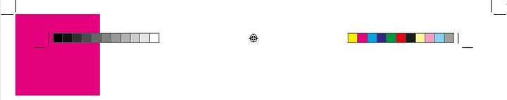
when 'Color bars' is checked, there is no actual color bar with the process colors (or any Pantones) and their usual combinations:
Blue ……………… [C100 M100 Y0 K0]
Red …….………… [C0 M100 Y100 K0]
Green …………… [C100 M0 Y100 K0]
Pure Black …… [C0 M0 Y0 K100]
Registration … [C100 M100 Y100 K100]
-
-
@b77 These will be fixed.
-
@vectoradmin
(ver1.0.039)
I think the basic problem has been cleared. How do people in each field evaluate the results?

The black of the crop and bleed mark is not richy black. Please fix it.LIc. 0 OS10.15.8
MacBook Air (13-inch, Mid 2012) / Intel Core i5, 8GB / Intel HD Graphics 4000
LIc. 1 OS15.7.4
MacBook Pro (14-inch, 2023) / Apple M2 Pro, 16GB / Apple GPU -
@861475_VctSt said in Printer marks do not work correctly:
The black of the crop and bleed mark is not richy black. Please fix it.
@861475_VctSt I guess you mean they should be in Registration Color, so they will include any Spot colors that might be present.
-
@b77
@vectoradminsorry.
I was in a hurry and omitted the explanation, so it seems that my true intention was not conveyed.Here. I will rewrite it.
I output the VS document as a PDF (by japan color coated2001) and checked the separation with Acrobat.
issue:
The "Bleed Marks" and "Crop Marks" in the corner were single color K100 (grey100 depending on the environment).
The Registration color (100% of C, M, Y, K) is desirable for these marks.On the other hand, "Registration Marks" was output at 100% of C, M, Y, K. This was correct.
From another point of view, K100 may be possible with the intention of using ink eco-friendly.
Then, what about the idea of rich black (C40, M40, Y40, K100)?EDIT:
The above two marks on the issue have a line width of 0.14 mm and are a little thick. I think about 0.09mm is good. -
@861475_VctSt The bleed / crop mark color (and width) is fixed in build 1.0.041.
-
@vectoradmin
(1.0.041)
The basic functions seem to have been fixed.
As I mentioned in the previous post, it is better to fix the line widths of marks.
Improvement: Each of the following should be set to 0.09mm.
-Crop:0.18mm <- too thick
-Bleed:0.18mm <- too thick
-Resistration:0.02mm <- too thinIn actual printing, various data are pasted on the outside of the Artboard as needed depending on the process.
However, I think this is sufficient for small office.