Your ideas for improvement Boolean operations panel
-
@b77
I wanted to propose this in the first post. I had no idea we had a preview right now. Thank you!
I agree with you regarding the reordering.
Your design is neat.
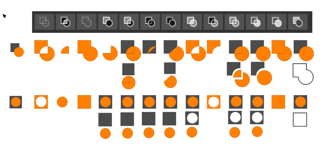
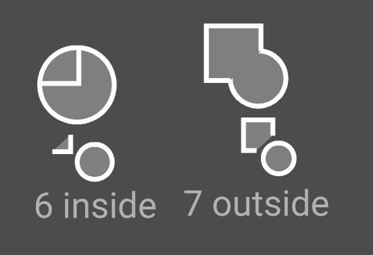
No 6. and 7(Inside / Outside) - the result of 6 is a circle and a corner, and the icon looks like the element from number 5 , but with no 5 we get different result. Is it good idea to show that this is an open path? By thicker stroke or something?
No 7. Wrong icon. Below results of Inside and Outside
No 10. (Divide) - Would it be better to move the elements apart so that it could be seen that they are separate (so that it would be an analogy to No.5)?What do you think about moving the square back and the circle forward. I know it's just a cosmetic change, but most of the time we start on the left and end on the right (coordinate systems, axes, reading, progress bars and much more). Even in VS, when I copy the icon we are now working on, I start with a square and then draw a circle. As a result, the circle covers the square. Have I already exaggerated? If you think this will make a mess, then ok.
@vectoradmin Bug. When preview is on tooltips don't want to appear or randomly. (Windows 10)
-
@encart Thanks for testing these. You're right that Divide (10) should have the elements apart, and 7 (Outside) is not correct.
@vectoradmin A possible problem with 6 and 7 (and 5) is that I get one result if I select both objects at the same time (with click-and-drag) and a different result if I select one after the other (with Shift-click), depending on which one is selected first.
Maybe the top object should always be the one that acts as the first selected object, for consistency and to avoid confusion?
So… I'm not sure if this would be entirely correct:
Any other corrections to the above are welcome.

MacBook Pro (Intel) running Monterey 12.6.4
-
@b77 You're welcome. I have so that I often see that something is not working as it should and needs to be changed. But I try to make it a constructive criticism. We are here to polish this diamond together
Agree with you, the top one should act, but in this case of Inside /Outside, it also has disadvantages. Let's assume that the top object is a knife and the bottom one is a sheet of paper. So in the case of the number 6, I would expect the knife to cut the covered edge of the paper and the rest will disappear. The opposite is currently happening. On the other hand, when the object is at the top, it is more difficult to determine if the cut is correct because the object is covered. After all, this form makes logical sense and people could predict what will happen.I would change also a bit order of first 4:
- Union
- Exclude
- Intersect
- Divide
.These are numbers 3, 4, 2, 10 from your mockup.
-
@encart Yes, but which order (and its result) should the icon depict is the question for a few of the Combine buttons.
There are lots of suggestions in this thread already (thanks for starting it, btw
 ), so let's wait and see what improvements brings the next build. I'm sure the developer is on it.
 -
@b77
Sorry, I edited my post instead of write a reply
-
@b77 About the selection order: this of course affects the boolean operation result.
In case of box selection the order of selection is the object stacking order.This of course affects how Exclude works (top object is selected last).
-
@vectoradmin The exclude operation drives me crazy. Most programs, Illustrator included, subtract the object that's on top in the layer stack no matter the order you select the objects. And it makes sense - typically you draw the main object first, then, draw the one you want to subtract, not the other way around - so it makes sense the object on top should be the one subtracted from the main shape independently the order you select them. The way it works now is a bit confusing - i never get it right because all other programs work as described. It would be nice to at least have an option to always exclude (subtract) the one on top in the layer's stack if you wish to keep the current behavior.
-
@Aegis7 Illustrator (at least CS5.5) has two buttons for Subtract/Exclude:
- a 'Minus Top' button (the second one on the first row of the Pathfinder panel) that subtracts the top object from the one on the bottom, and…
- a separate button ('Minus Back') on the second row that does the reverse.
"Trouble" is VS has a few other special Combine commands (and their buttons) where the result depends on the selection order. Should each of them become two buttons for each case? The developer mentioned in another thread about using keyboard modifiers (Option, Shift, etc) for the Combine buttons — maybe the next build will bring that.
IIRC, CorelDraw has one button that subtracts the top object from the bottom by default, and I think it has the other option in a dropdown menu in a special panel.
I'd rather not have to open or keep open a special panel to access all the options.
So it's not that easy.
That doesn't mean I disagree — I also prefer the "visual" rule (which object is on top), not the selection order, and maybe use the reverse (bottom object subtracting from top object) when you Option-click the same button.
And if that button would change its icon to reflect the different result when you press Option…
-
@b77 The default Illustrator behaviour for subtract (Minus Top) is as I described and it's included in the four main pathfinder shape operations (add, subtract, intersect, xor - those are not the labels used in Illustrator, they describe the operations themselves). Depending on where you check, the other options (Divide, Trim, Merge etc) may not even be displayed without expanding/clicking somewhere else (for example in the PathFinder section in the Properties tab when you have more than one object selected). VectorStyler however uses the select order which typically ends up picking the object on top as the last one giving a result similar to Minus Back (in Illustrator) as a "default" which is counter-intuitive and confusing. That's what I'm trying to bring attention to. I'm all for using a modifier to access the "less" common operation or criterium if select order is critical but the default behaviour should follow the "convention".
Off topic: Transparency doesn't have any dedicated tool similar to CorelDraw, Xara Designer Pro and others, unless I've missed it - is it hidden somewhere? Relying on masks alone is a bit cumbersome, less practical. I'm aware of the Gradient Mask Editor Tool but seems it only deals with linear masks?
-
@Aegis7 Again, for the Exclude button in VS I also prefer the top/frontmost object to subtract from the other object by default, no matter the selection order (so I don't disagree with you), but we have to take into account that sometimes the reverse is needed and seven or more separate buttons for the reverse action of the other buttons would be too much.
So what I hope is that the developer will instead use Shift- or Option-clicking the button if the user wants the bottom object to subtract/cutout/etc from the topmost object.
Would that be good? Bad? What do you think? That's what I'm asking.
MacBook Pro (Intel) running Monterey 12.6.4
-
@Aegis7 said in Your ideas for improvement Boolean operations panel:
I'm aware of the Gradient Mask Editor Tool but seems it only deals with linear masks?
All gradient types and presets can be selected as transparency mask from the top right corner of the 'Gradient Styles' modal window: https://recordit.co/KgK4HiSPfu
-
-
-
@vectoradmin Could the boolean operation icons be the same height as the other icons in the row?

-
@Boldline They should be. At least here they are. I will check on other MacOS versions.
-
@vectoradmin I'm still using El Capitan - if that helps narrow down the issue
-
@Boldline This is what I get on El Capitan:

-
@vectoradmin hmmm
I closed the app and restarted it - it appears smaller again on my end.... maybe it's something on my end?
-
@Boldline Send me the workspace.xml file from ~/Library/Application Support/NumericPath/vecvtorStyler1.0/vector/data/resources/ folder by email
-
@vectoradmin Thank you.