Brighter checkerboard and customisable color + size
-
The thumbnails in the layers panel are really too small. I recommend something like a small-medium-large setting. The double click to see a preview has no use to me. It is too slow, click intensive and awkward for me to use. I just need to see a representation of the object instantly.
Further the checkboard pattern is too dark - I recommend brighter tones and preferably another option, a user definable thumbnail color.
Right now I struggle to identify the small thumbnail and the checkerboard pattern is mostly what I see.
VS:

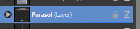
Affinity small:
Affinity medium:

Affinity large:
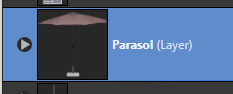
Affinity large, checkerboard:
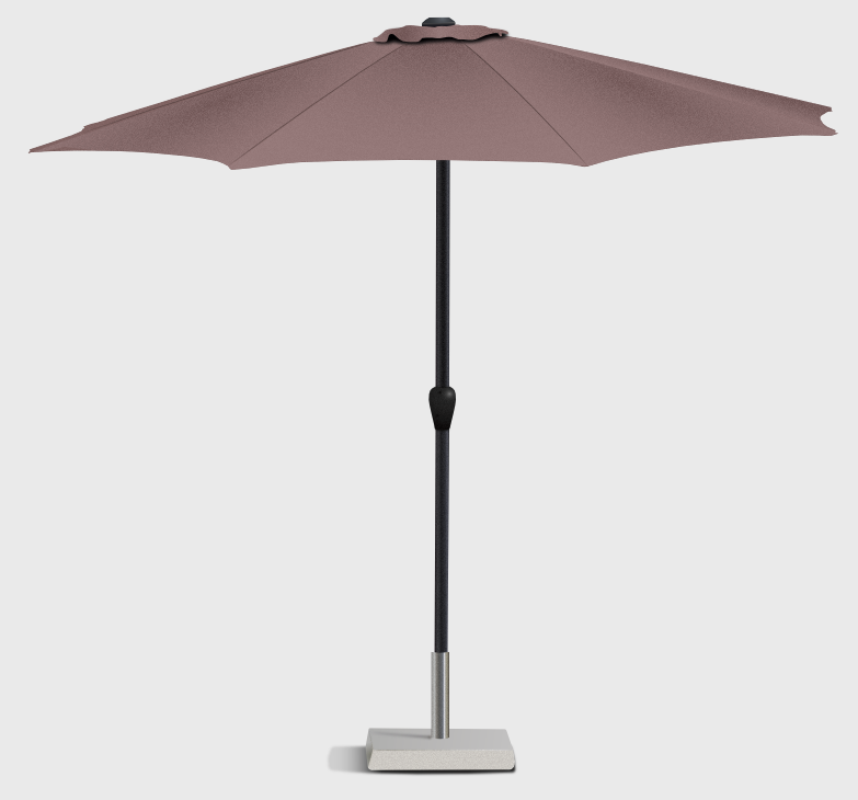
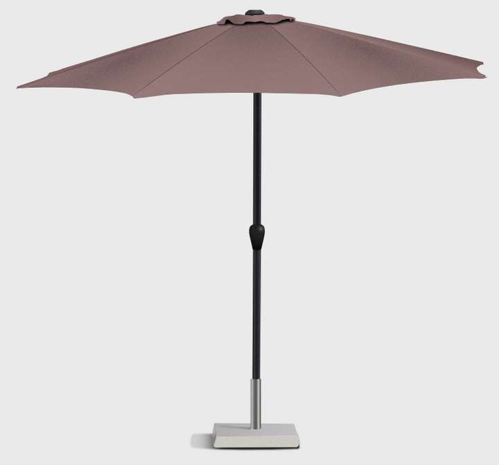
And finally the object for reference (OMG JPG compression):
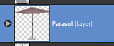
I disable the checkerboard and prefer the black in the dark theme in Affinity because it is enough for me to clearly identify the object and the checkerboard contradicts the UI simplicity that focus requires for me.
")
-
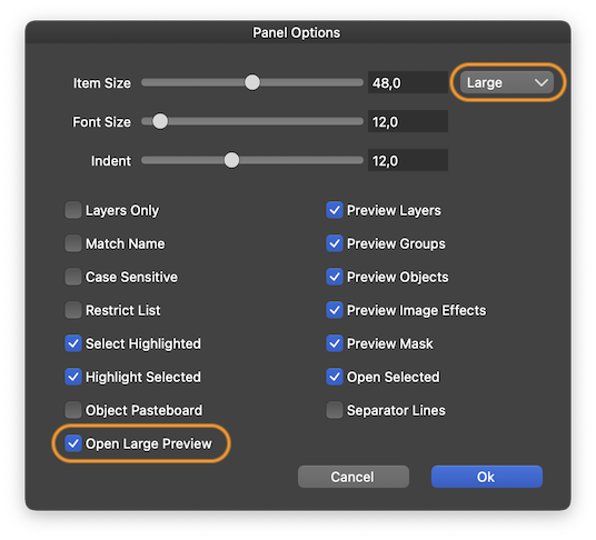
@Ingolf Panel Options has 'Small', Medium' and 'Large' thumbnail size options, and if 'Large' is not enough you can enable 'Open Large Preview' which lets you single-click the thumbnail to see it larger:
-
Thx. Ah, still getting used to the newly discovered Panel Options
A shame so important settings are buried so deep.Excellent, then I am only suggesting a custom background color and/or lighter checkerboard.
🍏 macOS Sequoia Apple Silicon
-
@Ingolf I second the lighter checkerboard request. It can be hard to see what is actually on the thumbnail currently.
-
Ideally and if possible, a checkerboard pattern that adapts to the color of the object would be nice — if the object is black or dark, a slightly brighter checkerboard pattern would work better and if the object is white or light, the opposite.
…and maybe a bit less contrast between the dark and light squares of the checkerboard?
-
@Ingolf I will try to find a good solution for the preview background issue.
-
@Ingolf I will try to find a good solution for the preview background issue.
You did! Options in beta 1.1 elegantly solved the problem. Thanks again!