Panel Sizing - The often overlooked customization
-
One of the many things VectorStyler excels at is customization. Once becoming familiar with the software, inevitably we find ourselves wanting to tailor the interface to make it our own.
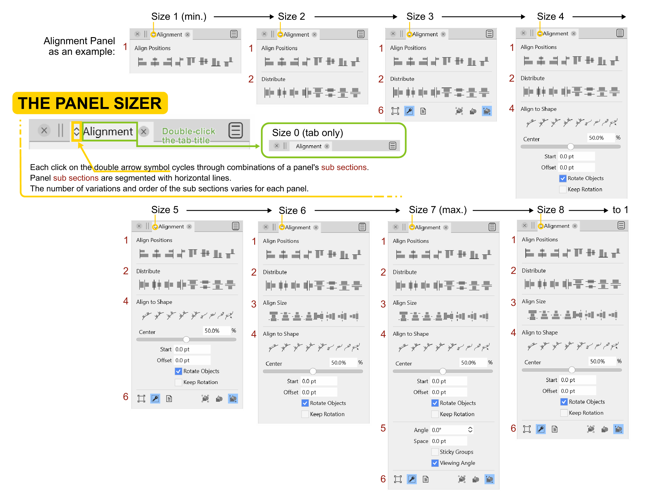
After playing around with Panel layouts for a bit, I was particularly intrigued to discover this tiny "up & down" double arrow icon next to the title tab of each panel. I started clicking on it, and it took my brain a moment to understand what was going on. After an embarrassingly drawn-out period of time,
 I started to understand the logic, which evolved into an "Ah-ha" moment, and then the feature started to grow on me.
As a result, I thought I'd share a simple reference guide with the community to bring attention to the feature and attempt to illustrate its functions.
I welcome all feedback. I am no authority, this is just the result of self-discovery. If you have any extra insights or edits, please let me know how I can improve!
Click on the image for a larger version.
-
@Victor-Vector said in Panel Sizing - The often overlooked customization:
After an embarrassingly drawn-out period of time

I actually use it a lot. I think the symbol is overlooked when several panels are lined up, but I immidiately tried it out the first time a made a panel floating. Then it begs for a click.
My first guess was that the icon meant 'Minimize panel' (like the double click on the panel title) but I clickly learned and memorized it.
My only issue with the method used to toggle between the different setups is that I never remember my favorite because there are no numbers or anything that can be used for reference. It is also not always immidiately obvious that it is the same panel - just another configuration.
To avoid complexity that end in the majority of users using the defaults anyway I would recommend just three views per panel: minimum, medium and maximum - unless one of the panels obviously could need one or two more for certain scenarios: handtracing, drawing, flowcharts - you get the general idea.
A tooltip would certainly help.
-
@Ingolf Thinking of your ideas to simplify...
What if the icon was like a config function, so when you click once on the double arrow icon (or insert icon idea here), it opens the Panel in its maximum size, with all the subsections exposed. Beside (or on top of) each subsection is a visibility eye. The user clicks on each section to toggle it visible or invisible.
Clicking back on the double arrow icon (or insert icon idea here) collapses the Panel showing only the selected visible choices.Advantages of this idea is maximum configurability for each Panel's subsections.
Disadvantage is it might not be as efficient as moving through a cycle.It's fun to bounce these ideas off each other!
-
@Victor-Vector said in Panel Sizing - The often overlooked customization:
@Ingolf Thinking of your ideas to simplify...
What if the icon was like a config function, so when you click once on the double arrow icon (or insert icon idea here), it opens the Panel in its maximum size, with all the subsections exposed. Beside (or on top of) each subsection is a visibility eye. The user clicks on each section to toggle it visible or invisible.
Clicking back on the double arrow icon (or insert icon idea here) collapses the Panel showing only the selected visible choices.
Advantages of this idea is maximum configurability for each Panel's subsections.Great idea. Something along those lines sound great to me.
")
It may be quicker to cycle (not a whole lot though) but on the other hand hard for @vectoradmin to make presets that satisfy the majority.
-
In itself, i find the Panel Resizer ok and a good idea.
But it bothers me that it only works in one direction.
Would he work in both directions forward and backward
i would have more fun with it.At least it is nice that it keeps a once set state
even after a program restart. -
@Subpath I see what you are saying. The double arrow icon makes the user think it is actually TWO icons: one for expanding the sub sections, one for contracting the sub sections. I was initially duped by that as well.
-
It's not just about the arrows. In my eyes it also makes
sense if you could step backwards.Instead, you "always" have to go through all the steps if you
clicked wrong to get to the state you wanted. And that one
may be only only one step back. -
If the button would display two downward arrows when the panel can still be expanded and two upward arrows when it's at max size and clicking it will contract the panel, that would be enough for me:

Same with the horizontal panels, but with arrows pointing right if they can be expanded and left when at maximum size.
MacBook Pro (Intel) running Monterey 12.6.4
-
There simply isn't enough space for a more meaningful icon, and when I think about it the icon is quite meaningful; "make me bigger or make me smaller". That is always TRUE with the cycling forever algorithm at play.
Spending precious time on the icon itself is to me a great example of the Law of triviality (Just breaking balls here, relax!)
What could in fact be improved is how the panel can be customized easily (and with easily I mean both in interface and code)
I think @Victor-Vector has a great idea. I would probably only need to customize one view and if I needed more for other use cases, they could be saved in different workspaces designed for these use cases.
Still, low priority far down in the backlog. If I need a panel, I show all of it. If it is too big I minimize it (double click the title) when I do not use it. Workarounds ad libitum.
-
@b77 The icon (and the feature) actually means "moving along a number of states" of the panel. In most cases of course these states result in smaller panel layouts, but this is not always necessary (and might change for some future panels).
I would suggest using a modifier key to move backward among the panel states, keep the icon as it is (up/down, left/right), move forward with regular click, and backward with shift+click. Would this work?
-
@vectoradmin
The shift key for the backward movement
would work, of course and that would be better
than now.How about using the mouse scroll wheel ?
Would be an idea of mine.Position the mouse pointer over the arrow and then
use the scroll wheel to move forward and backward
through the different states of the panel ?Seems a bit too much, but is just an idea.
-
@vectoradmin said in Panel Sizing - The often overlooked customization:
I would suggest using a modifier key to move backward among the panel states, keep the icon as it is (up/down, left/right), move forward with regular click, and backward with shift+click. Would this work?
Yes, keep the icon. I find it quite meaningful even with a personal interpretation. It makes sense.
It would work - but I think only if the shortcut is revealed in the interface, otherwise no one will discover it. A bit too much information for a tooltip, better for a status bar (I think you once said you are considering one with dynamic help).
But honestly - cycling through a handful of states is something I can easily live with for decades.
-
@vectoradmin said in Panel Sizing - The often overlooked customization:
I would suggest using a modifier key to move backward among the panel states, keep the icon as it is (up/down, left/right), move forward with regular click, and backward with shift+click. Would this work?
Yes, Shift- or Option-click would work (with a tooltip?), but if possible display an upward arrows button when the panel is maximized and downward arrows when is at minimum size. If it's not too much trouble.
Speaking of 'minimum size':
This would be the panel showing only its tab, when you still want it in the column of panels, but not gone. This would also minimize (show just the tab of) all the other panels stacked under it. -
What I mean:
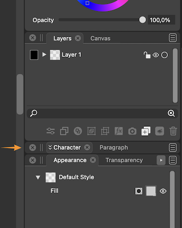
LATER EDIT: Double-clicking the panel's tab does this already.

Btw, the white text of active panel tabs and also the one inside the panels could be 90% white. It's too bright now, IMO.
-
@b77 said in Panel Sizing - The often overlooked customization:
Btw, the white text of active panel tabs and also the one inside the panels could be 90% white. It's too bright now, IMO.
Well, that should be a user setting.
On my Eizo screen the balance between the text and panel brightness is perfect.
-
@Ingolf Eizo makes great monitors no doubt, but the screen of my MacBook is nothing to sneeze at
, and I feel like there would be just enough contrast against the dark grey with text and panel icons at 90% white. Having text at 100% white like the artboard is too contrast-y and a bit distracting IMO.Same with panel text and buttons when in Light UI Mode — it should not be 100% black. 90% is better. (100% black text and icons in UI looks like burnt matches).
All right… UI details…

MacBook Pro (Intel) running Monterey 12.6.4
-
Shift clicking the icon for changing the panel size is a good idea.
I also like @Subpath's idea of using the hover scroll wheel. It would be super fast, and require a degree of mouse precision.
And to incorporate @b77's idea, how about a Shift double-click to instantly minimize the panel to the tab only state? -
@Victor-Vector I just double-clicked a panel's tab and it does what I suggested…

So tab-only is implemented already.MacBook Pro (Intel) running Monterey 12.6.4
-
@b77 said in Panel Sizing - The often overlooked customization:
@Ingolf Eizo makes great monitors no doubt, but the screen of my MacBook is nothing to sneeze at
, and I feel like there would be just enough contrast against the dark grey with text and panel icons at 90% white. Having text at 100% white like the artboard is too contrast-y and a bit distracting IMO.Of course not but it may appear brighter. My screen brightness is pretty relaxed here, even at 100% strength, perhaps because of the monitor profile I use (created by me with my own colorimeter). Monitor profiles tend to dampen the harsh icecold default profile that is the factory default on most devices (It is mostly a profile suited for office software and youtube). I often get more eye strain from the brightness of my new Lenovo laptop (uncalibrated) than from this far bigger monitor.
I really think this should be an option in preferences. Some with reduced sight may prefer even more contrasty settings.
🍏 macOS Sequoia Apple Silicon
-
@b77 said in Panel Sizing - The often overlooked customization:
@Victor-Vector I just double-clicked a tab's panel and it does what I suggested…
So tab-only is implemented already.I have always said, the best requested features are the ones that are already there. Haha!
I am grateful our discussion has lead us all to a new discovery.